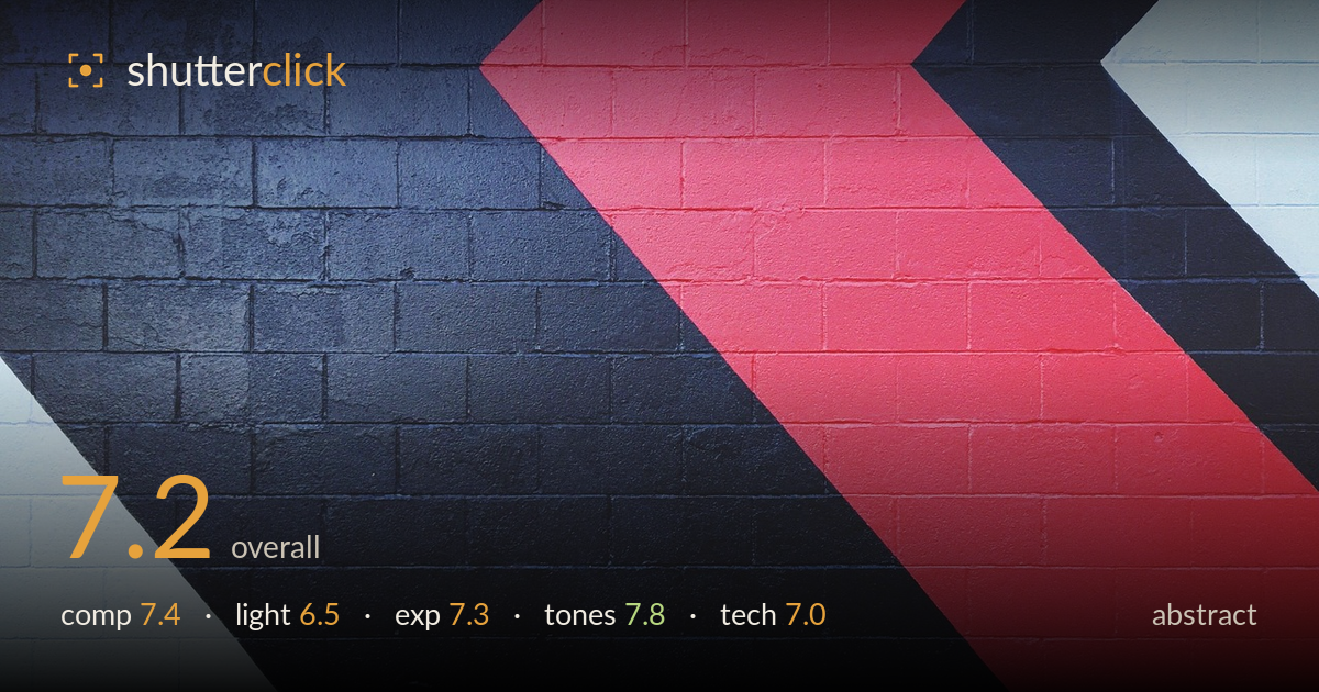
Red chevrons on a painted wall
Photo by Pexels

No EXIF metadata in this file
Technical analysis based on visual assessment only.
A clean, graphic study of painted chevrons on cinderblock that works on colour and diagonal energy. The red, black, and white blocks create strong visual rhythm, and the brick texture keeps the flat colour fields from feeling sterile. What holds it back most is the placement of the chevron apexes near the frame edges — the red peak crowds the top and the composition would resolve more decisively with the angles balanced against the borders. The lighting is flat and even, faithful to the wall but adding no dimensional interest. As a bold, confident abstract it succeeds; refining the geometry's relationship to the frame edges would lift it further.
The diagonal chevrons drive strong movement across the frame and the three colour zones balance well by weight. The white wedge lower-left anchors against the red mass upper-right. The weakness is edge management: the red apex is cropped tight against the top and the black-on-white transitions run right into corners without breathing room. The angles are compelling, but where they meet the frame feels arbitrary rather than resolved. Slightly repositioning so the apexes sit cleaner against the borders would give the geometry a more deliberate lock.
Flat, even, diffuse light — likely overcast or open shade — renders the wall faithfully without hotspots or distracting shadow. For a graphic abstract this neutrality serves the flat colour fields, keeping them clean. It does, however, add nothing: the cinderblock texture is present but muted, and a lower raking light would have carved the mortar lines and painted surface into far more tactile relief. The lighting is competent and appropriate but represents a missed chance to add dimension to an otherwise two-dimensional subject.
Exposure is well judged across a demanding range of tones. The white blocks hold texture without blowing out, the black zones retain block and mortar detail rather than crushing to void, and the red sits saturated but not clipped. The histogram spans the full range with intent. Only in the deepest blacks lower in the frame does shadow detail begin to thin, but it never becomes a problem. A balanced, deliberate exposure that respects both extremes.
The tonal palette is the image's strongest asset — a punchy red against deep near-black and cool white, a classic high-impact combination. White balance leans slightly cool, which reads well against the warm red and lends a clean modern feel. Contrast is strong without looking forced, and the red holds saturation without smearing into the surrounding blocks. The brick texture keeps the flat colours honest. A very deliberate, graphic colour statement executed with control.
Execution is clean. Focus is even across the flat plane of the wall, sharp enough to resolve individual mortar lines and the slightly rough painted surface, which is exactly what a graphic abstract of this kind needs. No visible motion blur or camera shake, and noise is well controlled in both the shadow and highlight zones. The frame appears free of significant lens distortion, and the parallel block courses read straight, suggesting the sensor plane was kept reasonably square to the wall — worth confirming, since even slight keystoning would skew the diagonal geometry that carries the shot. Depth of field is a non-issue on a flat subject, so aperture choice matters little here beyond staying in the lens's sharp range, which it appears to. The main technical opportunity is subject-driven rather than corrective: a more raking light angle or a polariser to deepen the red and control any sheen would have added surface interest. As it stands, the capture is technically sound and does justice to the wall.
What would elevate it
Tags
Shot something like this?
Expert photo critique, on demand — scored across six categories, EXIF-aware. Start with 3 free critiques, no credit card.
critique my photo — free