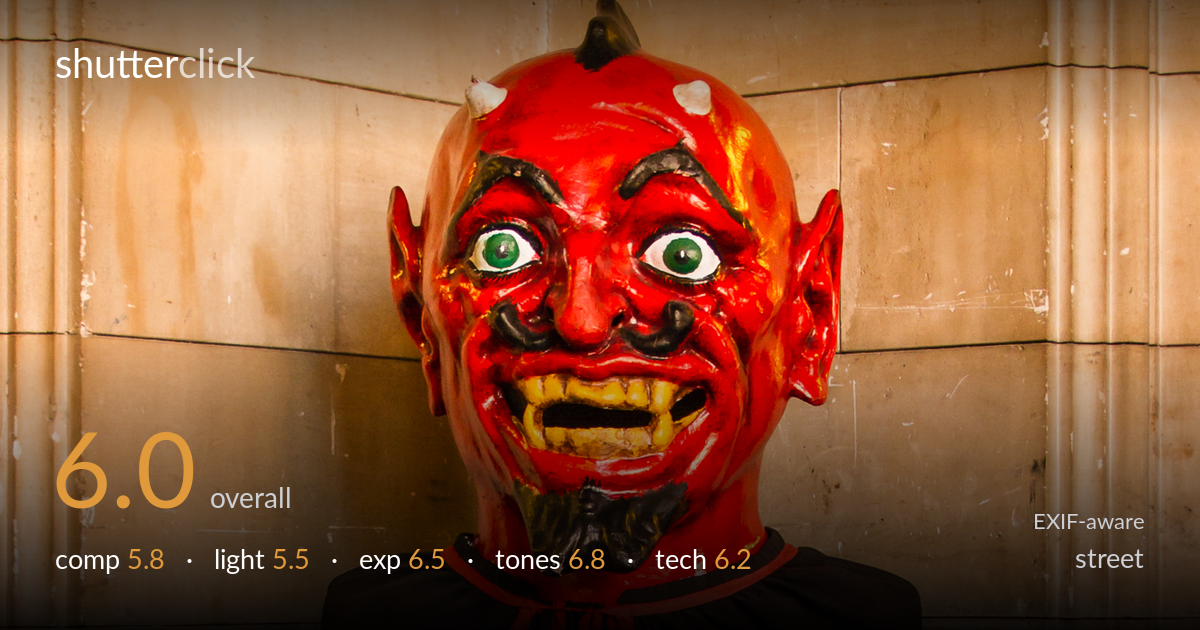
Red devil mask against stone
Photo by Friedrich Haag

| Focal length | 24 mm |
| Aperture | f / 2.8 |
| Shutter | 1/25 s |
| ISO | ISO 400 |
| Exp. comp. | 0.0 EV |
| Shot at | 12:40 · Mar 18, 2014 |
A striking subject — a red-faced devil mask atop a black-and-red cape figure — carries this frame on colour and character alone. The vivid red against the warm sandstone and the deep black cape creates strong graphic contrast, and the mask's exaggerated grin is genuinely arresting. What holds it back is the centred, frontal placement and the dead space of the cape's lower half, which eats nearly half the frame without adding interest. The 24mm width introduces mild perspective stretch and includes distracting wall edges. A tighter framing on the upper figure and a slight angle would lift this from a record shot toward a portrait with presence.
The figure is planted dead-centre and shot square-on, which suits the symmetry of the costume but flattens the result into a catalogue-style record. The lower third — a wide expanse of black cape — carries little visual information and pulls weight away from the expressive mask. The stone wall behind is busy with joints and edges that compete at the frame margins. Placing the mask higher with the cape cropped sooner, or working a three-quarter angle, would give the figure dimensionality and tighten the eye's path to the face.
The light is soft, flat and frontal — likely diffuse interior daylight — which renders the mask evenly but without modelling. The glossy red surface picks up highlights that hint at directionality, yet there's little shadow to carve form or drama from what is an inherently theatrical subject. The black cape sits in flat shade, losing fold detail. A raking side light would reveal the cape's texture and give the mask's sculpted brow and grin the sinister depth the subject invites.
Exposure is well controlled across a tricky range. The bright red mask holds its saturated highlights without clipping into flat patches, and the warm stone retains tonal detail. The black cape stays genuinely dark while keeping enough information in the upper folds. There's some lost shadow detail in the deepest cape recesses, but that reads as a reasonable trade rather than an error. Midtones in the wall are nicely placed. Overall a deliberate, balanced read of a high-contrast scene.
Colour is the strongest asset here. The fire-red mask, jet cape and red trim form a tight, deliberate palette set against warm sandstone neutrals — the complementary tension works. White balance leans warm, which flatters the stone but slightly oranges the reds. Saturation is high but largely controlled, though the mask edges into a poster-like intensity. The black holds depth without crushing. A touch less warmth and a hair less red saturation would keep the mask menacing rather than cartoonish.
At 24mm, f/2.8, 1/25s and ISO 400, the settings are reasonable for a static subject in dim interior light, but each involves a compromise worth noting. The 1/25s handheld shutter is borderline — fine for a motionless mask but unforgiving of any camera shake, and the image shows a faint softness consistent with that marginal speed. Stopping down to f/5.6 with a tripod, or accepting ISO 800 for a faster shutter, would have firmed up critical sharpness on the mask. The 24mm focal length stretches perspective and exaggerates the wall geometry; something in the 40–50mm range would render the face more naturally and compress the background. f/2.8 wide open offers little depth-of-field margin, though the flat subject plane forgives it. Focus appears placed on the mask, which is correct. ISO 400 keeps noise negligible. Sound choices overall, but a tripod or faster shutter would have removed the last trace of softness this otherwise sharp subject deserves.
what would elevate it
tags
Shot something like this?
Expert photo critique, on demand — scored across six categories, EXIF-aware. Start with 3 free critiques, no credit card.
critique my photo — free