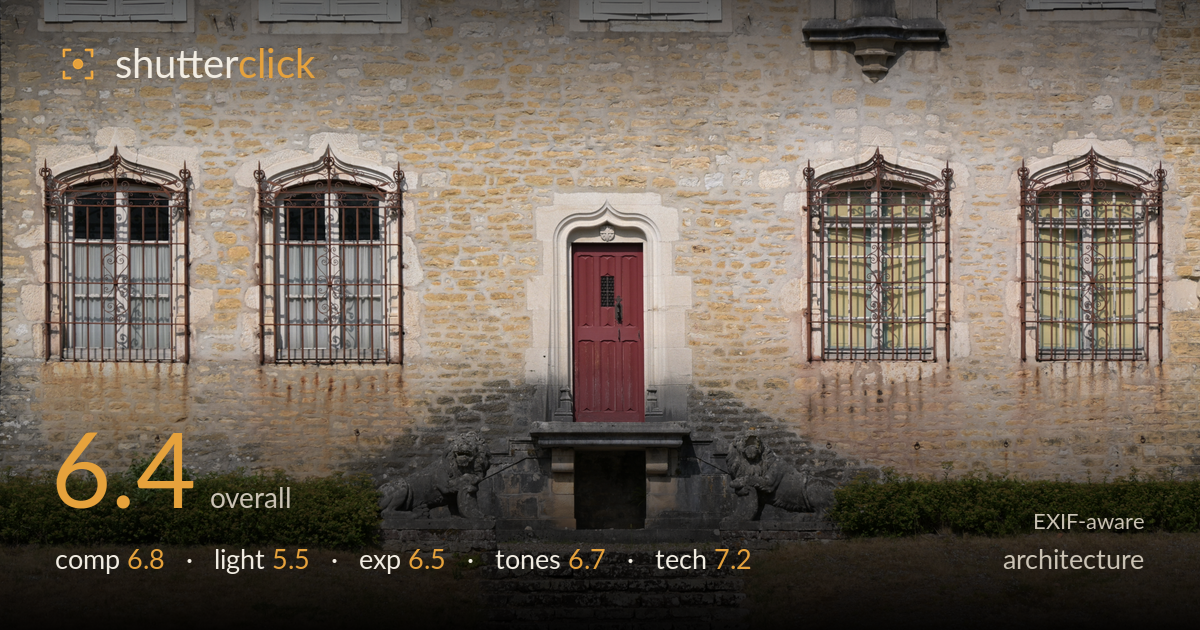
Red door on a stone facade
Photo by DimiTalen

| Focal length | 71 mm |
| Aperture | f / 6.3 |
| Shutter | 1/640 s |
| ISO | ISO 100 |
| Exp. comp. | 0.0 EV |
| Shot at | 15:16 · Jul 15, 2026 |
A cleanly organised, symmetrical facade study anchored by the red door and the flanking stone lions — the strongest structural idea in the frame. The centred composition suits the subject, but the flat midday light is the main limiter: it flattens the stonework's texture and does little to model the sculptural relief of the lions or the ironwork. The lower foreground of dry grass and gravel eats a third of the frame without contributing, and slight verticals drift. Tightening the crop, returning in raking side light, and correcting the perspective would elevate a competent record into something with real presence.
The symmetry is the backbone here — the red door dead-centre with a paired window on each side and the two stone lions bracketing the staircase reads as a deliberate, balanced facade study. That centred approach is defensible for architecture. What weakens it is the foreground: the band of dry grass and gravel occupies the bottom third without adding interest, and the staircase leads the eye down into dead space. A tighter crop that trims that empty apron and lets the door-and-lion arrangement fill the frame would concentrate the impact considerably.
This is the shot's biggest constraint. The high, hard midday sun casts thin, unflattering shadows and flattens the very things worth showing — the coursing of the stonework, the relief of the carved lions, the scrollwork of the ironwork. The overall light is even but lifeless, with no directional modelling to give the facade depth. Late-afternoon raking light skimming across the wall would rake out the mortar lines and give the sculpture volume and shadow, turning texture into a feature rather than a flat surface.
Exposure is handled competently. Highlights on the pale limestone hold detail without clipping, and the shadow inside the doorway recess and beneath the staircase retains information. The histogram sits in a safe midtone range with no obvious crushing. It's a slightly bright, flat rendering overall — a consequence of the light more than the metering — and a touch more contrast in the raw would give the frame more punch. Nothing here reads as accidental; the exposure decisions are sound for the conditions.
The warm sandstone palette is pleasant and the red door provides a clean, saturated focal accent against the neutral wall. White balance looks accurate, with the greenery reading naturally. Where the tones fall short is contrast and separation — the various stone hues blend into a fairly uniform beige, and the lower gravel and dry grass are muddy and similar in value. A gentle contrast lift and some selective dodging on the sculptural elements would create more tonal distinction across the frame.
The settings are well matched to the subject. At 71mm, f/6.3 gives ample depth of field for a flat facade shot at this distance, keeping the wall, door, and lions all acceptably sharp — no wasted resolution on a needless narrow aperture. ISO 100 keeps the file clean with no visible noise, and 1/640s is more than enough to eliminate any shake on a static subject, comfortable handheld. Focus appears accurately placed across the facade plane. The chief technical shortfall is not the settings but perspective: the verticals drift slightly and the framing wasn't squared perfectly to the wall, so lines aren't dead parallel. Shooting from a bit further back with a modest movement, or correcting keystoning in post, would true the geometry — critical in architecture. A 71mm focal length introduces minimal distortion, which is a sound choice over a wider lens here. Overall the execution is solid; the discipline just needs to extend to perspective control.
What would elevate it
Tags
Shot something like this?
Expert photo critique, on demand — scored across six categories, EXIF-aware. Start with 3 free critiques, no credit card.
critique my photo — free