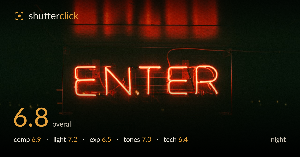
Red neon enter sign glowing
Photo by StockSnap

No EXIF metadata in this file
Technical analysis based on visual assessment only.
A confident, moody neon study that leans hard into darkness and lets the red glow carry the entire frame. The strongest asset is the interplay between the sign and its reflection above — a repeating band of vertical smears that echoes the letterforms and adds a second layer of interest most neon shots miss. What holds it back is placement and sharpness: the sign sits slightly low and centred, and the glass tubing looks soft, robbing the letters of the crisp bite neon deserves. The tonal palette is nearly monochromatic red, which is atmospheric but limits depth. Tighter framing and cleaner focus would lift this considerably.
The sign is anchored low-centre with a heavy void of black beneath it, and the reflected light band across the top gives the frame a useful upper anchor, creating a rough symmetry between glow and reflection. That reflection is the real find here. However, the huge dead space below the sign feels unresolved rather than intentional negative space, and the sign's slight rightward drift leaves the composition a touch unbalanced. Cropping some of the lower black would concentrate attention on the glowing letters and their reflection.
The single source of neon doing all the work is well suited to the subject, and the spill onto the surface above — those soft vertical smears — is the image's best lighting feature, revealing texture in an otherwise flat wall. The falloff into pure black is dramatic and reads as deliberate for the mood. The letters themselves glow evenly without blooming out completely, which shows restraint. A touch more ambient fill on the surrounding frame would give context without diluting the atmosphere.
Exposure is judged to protect the neon, and the red tubing holds colour rather than clipping to white, which is the right priority for this subject. The deep blacks are largely intentional and support the mood. That said, the shadows swallow nearly everything — the sign's housing, the mounting hardware, the wall texture — leaving little to read in the lower two-thirds. Lifting the shadows slightly in post would recover just enough structure to ground the sign without breaking the darkness.
The palette is almost entirely red and orange, which suits neon and gives a cohesive, warm-hot mood. The gradation from the intense red core of the tubes to the softer reflected glow above is handled well and carries a pleasing roll-off. The near-monochrome approach is atmospheric but also limits tonal range — there is little cool or neutral to play against the red, so the image can feel one-note. A whisper of a cooler tone in the deep shadows would add contrast and dimension.
The most noticeable technical weakness is focus. The neon tubing, which should read as sharp glowing lines, looks soft — the edges of the letters lack crisp definition and the glow feels slightly smeared even accounting for the natural bloom of neon. Whether that stems from missed focus, a slow shutter with camera shake, or a wide aperture missing the plane, the letters never achieve the precise bite the subject calls for. There is also visible grain and colour noise in the shadow regions, consistent with a higher ISO in low light, which is understandable but adds mush to the darker areas. Depth of field appears shallow enough that the sign's frame and hardware fall away, which works, but the key subject needing to be tack-sharp is not. A steadier support or faster shutter with careful focus confirmation on the tubing would sharpen the whole image. Stopping down slightly might also help hold the full plane of the letters.
What would elevate it
Tags
Shot something like this?
Expert photo critique, on demand — scored across six categories, EXIF-aware. Start with 3 free critiques, no credit card.
critique my photo — free