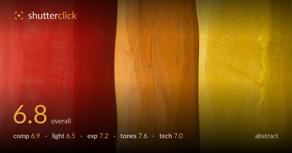
Red orange and yellow forms
Photo by Hans

No EXIF metadata in this file
Technical analysis based on visual assessment only.
A confident study in warm colour and vertical division — red, orange, yellow read as three painted wooden forms sharing a raking side light that lifts the grain. The palette is the real strength: a coherent, saturated warm triad with genuine surface texture. What holds it back is the rigidity of the division. The three bands fall into near-equal thirds with hard vertical seams, which reads as evenly cut rather than composed, and the central orange form dominates without a clear reason. A less symmetrical weighting between the colours, or a slight angle to break the strict verticals, would give the eye somewhere to travel and turn a pleasant colour arrangement into a stronger graphic statement.
The vertical division into red, orange and yellow gives immediate order, and the wavering seams between the painted forms add welcome irregularity against the strict verticals. But the three bands sit in near-equal thirds, which flattens the tension — the arrangement reads as evenly sliced rather than weighted. The central orange claims the most space without a compositional payoff. Letting one colour dominate decisively, or introducing a diagonal to break the rigid verticals, would create the rhythm and movement abstract work relies on.
A raking light from one side skims across the surfaces, revealing brushwork, grain and the subtle undulations in the wood — that texture is what saves the frame from being flat colour blocks. The light is fairly even across all three forms, however, so no single area carves out with real dimension. A harder, lower-angled light would deepen the shadows in the seams and give the forms more sculptural relief, heightening the sense of three-dimensional objects rather than painted panels.
Exposure is well judged for a high-saturation subject. The yellow, the most easily blown channel, holds detail across its brightest areas, and the reds retain gradation rather than clipping into flat blocks. Shadow information survives in the seams between forms. There's no sense of an accidental miss here — the brightness sits where it needs to for the colours to sing. If anything, marginally more separation in the darker red on the left edge would preserve the last of its shadow texture.
The strongest element. A tight warm triad — red, orange, yellow — held together with real coherence and saturation that stays rich without tipping into oversaturation or colour bleed. White balance keeps each hue distinct and true. The tonal range within each band shows the painted, weathered surface honestly, with grain and brush marks reading clearly. Contrast between the three is enough to divide them but not harsh. This is a disciplined, appealing colour statement that carries the image on its own merits.
Focus is accurate across the picture plane, with the wood grain, brush texture and small surface flecks rendered crisply from edge to edge — appropriate for a flat-on abstract where the whole surface is the subject. Depth of field appears sufficient to keep all three forms sharp, suggesting a well-chosen aperture for the near-parallel plane. No motion blur or visible camera shake, and noise is well controlled with clean, smooth colour fields free of blotching even in the saturated reds. Sharpening looks restrained and natural rather than crunchy. The main technical consideration is that the frame relies entirely on texture and colour to hold interest, so any softness would have been fatal — and it's avoided. The execution is clean throughout. The only refinement worth noting is that a very slightly closer working distance, filling the frame with fewer forms, would let the surface detail carry even more of the image's weight.
What would elevate it
Tags
Shot something like this?
Expert photo critique, on demand — scored across six categories, EXIF-aware. Start with 3 free critiques, no credit card.
critique my photo — free