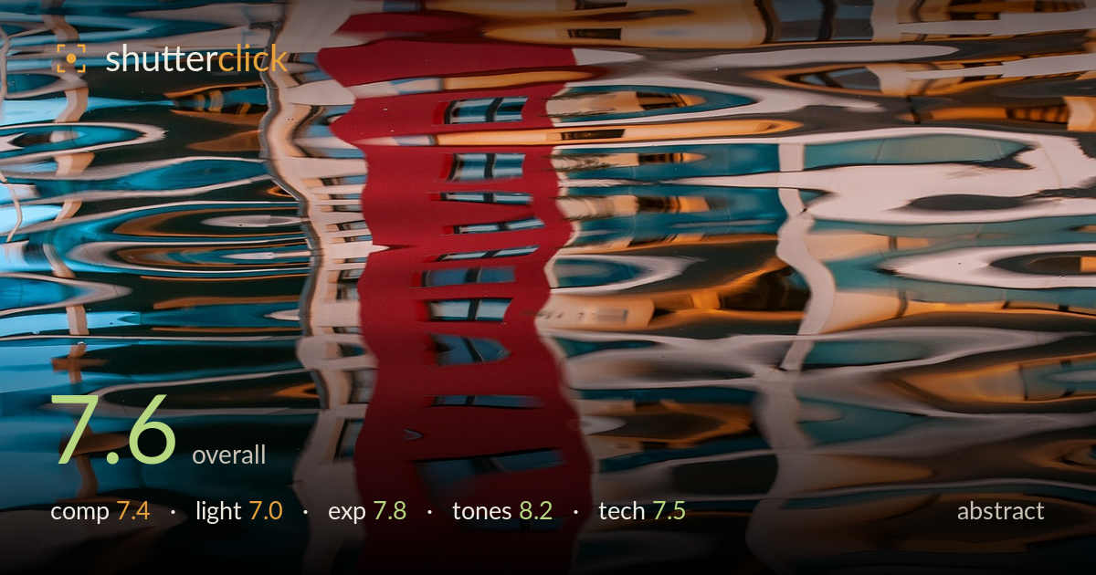
Red reflection dissolving in rippled water
Photo by wal_172619_II

No EXIF metadata in this file
Technical analysis based on visual assessment only.
A confident abstract built on water reflection, where the vertical red band anchors an otherwise dissolving field of ripple distortion. The colour interplay — warm rust and terracotta against cool teal and steel blue — is the real strength, and the rhythmic horizontal wave patterns give the frame genuine visual music. What holds it back is a slightly divided composition: the red column sits near centre and splits the frame into competing halves rather than integrating. The upper edge, where reflections tighten into near-recognizable architecture, feels less resolved than the fluid lower two-thirds. Strong graphic instincts throughout.
The vertical red stripe is a strong organizing element, drawing the eye down through the churning reflections. Its near-central placement, though, divides the frame into two halves that compete rather than converse — an off-centre position would have let the surrounding ripples breathe. The horizontal wave rhythm running across the width is the composition's best feature, creating layered bands of movement. The upper strip resolves into tighter, busier detail that fights the calmer flow below. Cropping tighter on the fluid mid-section would concentrate the abstraction.
The light here is inherited from whatever scene is being reflected, and it delivers a pleasing warm-cool split — golden highlights against shadowed blues. The soft, diffuse quality of reflected light on rippled water suits the abstract dissolve, avoiding harsh specular blowouts. There's little directional shaping to speak of, which is inherent to the subject, but the overall luminosity feels even and readable. A moment with stronger raking light on the source would have deepened the contrast between the warm and cool zones and added more punch.
Exposure is well controlled across a tricky high-contrast surface. The bright white highlights on the ripples hold detail without clipping to paper, and the darker teal troughs retain colour and information rather than blocking up. The red band sits richly saturated without losing its form. The midtones carry the bulk of the tonal information and are placed sensibly. A touch more highlight restraint in the upper-right warm patches would recover the last of the texture there, but overall the dynamic range is used deliberately and cleanly.
The tonal palette is the image's standout — a sophisticated complementary interplay of warm oranges and rust against cool teals and slate blues, unified by the assertive crimson stripe. White balance reads neutral enough to let both temperature families sit convincingly. Saturation is pushed but stays credible for a reflection, and the contrast between the smooth glossy passages and the broken ripple detail adds tonal texture. The colour rhythm carries the whole frame. If anything, the reds edge slightly hot in the top band and could be reined in fractionally.
Focus and sharpness are largely academic here, since the subject is a rippling water surface with no fixed plane — softness is intrinsic to the abstraction rather than a fault. What matters is that the shutter appears fast enough to freeze the ripple edges crisply, preserving the wave detail without smearing it into mush; that freeze is what gives the pattern its graphic bite. Noise is well controlled, with clean shadow passages in the teal troughs and no obvious high-ISO grain. The framing fills the sensor edge to edge with pattern, a sound choice for this kind of subject. If a reshoot were on the table, a marginally slower shutter could have produced a more painterly smear, or an even faster one a sharper mosaic — either would be a deliberate stylistic fork worth exploring. As executed, the technical handling serves the image without drawing attention to itself, which is exactly right for abstract reflection work.
What would elevate it
Tags
Shot something like this?
Expert photo critique, on demand — scored across six categories, EXIF-aware. Start with 3 free critiques, no credit card.
critique my photo — free