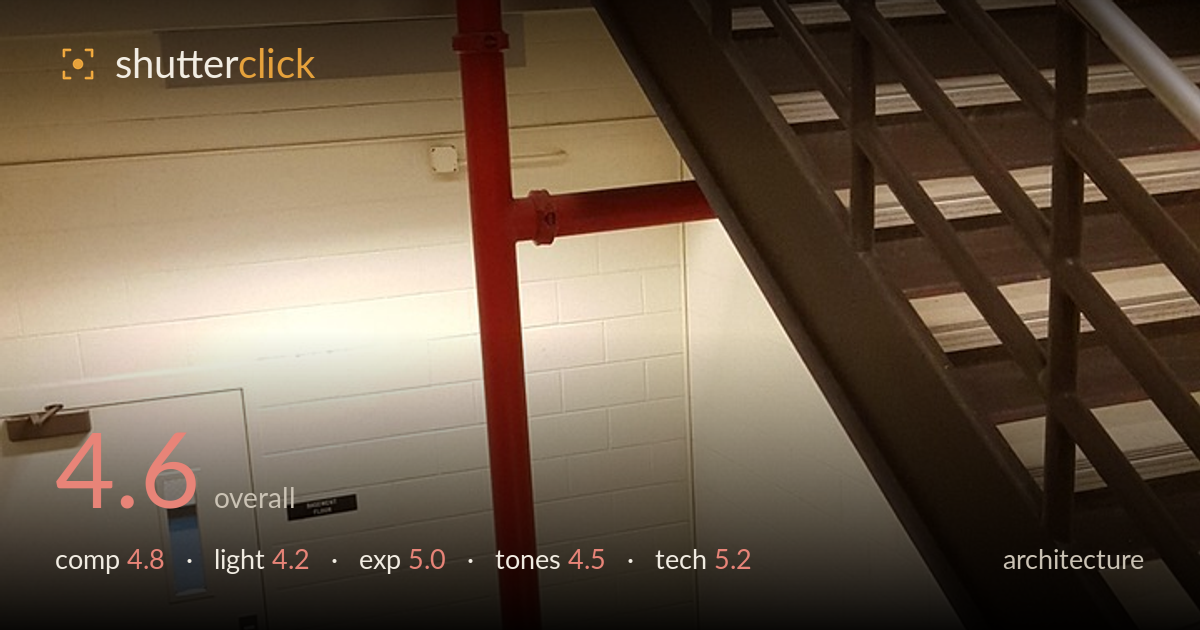
Red standpipe in the stairwell
Photo by jsgarnerauthor

No EXIF metadata in this file
Technical analysis based on visual assessment only.
An institutional stairwell rendered as a documentary snapshot rather than a considered architectural study — the red standpipe is the one strong graphic element, but the frame doesn't commit to it or to any clear geometric idea. The competing diagonals of the two stair flights create energy but also confusion, with no single organizing line. Verticals lean and the horizontal handrail tilts, undercutting the discipline architecture rewards. The flat, mixed artificial light flattens the concrete-block textures that could have carried interest. The bones of a strong minimal composition are here in that vertical red pipe against neutral walls; it needs a deliberate viewpoint to release them.
The vertical red standpipe is the natural anchor, but it sits awkwardly between the two crossing stair flights, so the eye is pulled in three directions without resolving. The descending stair, the ascending stair, and the pipe compete rather than cooperate. The lower handrail tilts noticeably, and the frame includes a lot of dead ceiling and wall that adds no information. A tighter decision — either isolating the red pipe against the block wall or aligning to the strongest diagonal — would give the frame the geometric clarity architecture asks for.
The light is flat, overhead artificial fill that spreads evenly and reveals little of the concrete block's surface texture. Nothing rakes across the walls to bring out the grid of the masonry or model the metal treads. A hot patch of glow on the wall near the door pulls attention with no purpose. Without directional light there is no shaping of the stair geometry, so the volumes read as flat planes. Architecture like this benefits from a moment where side light or a stronger single source defines the forms.
Exposure is broadly serviceable — the white block walls hold detail and the highlights on the metal handrails are controlled rather than blown. The darker stair structure on the right sinks toward black but retains just enough separation in the treads. There is a slightly muddy quality to the midtones, and the warm glow near the door edges toward clipping. Overall brightness reads as an accurate record of a dim interior rather than a deliberate tonal statement, which is acceptable but not expressive.
The white balance leans warm and slightly yellow, typical of interior fluorescent or tungsten fill, which mutes the whites into cream and dulls the scene. The one saving grace is the saturated red standpipe, which provides the only real colour accent against an otherwise neutral grey-and-beige palette. Contrast is soft in the midtones, leaving the concrete block flat. A cooler, more neutral white balance would clean up the walls and let the red read even more decisively against them.
The image is reasonably sharp across the frame, with adequate depth of field holding both the near steps and the far stairwell — consistent with a small-sensor or phone camera stopped down by its fixed optics. Focus lands acceptably on the mid-ground pipe and door. Noise is contained in the brighter areas but creeps into the shadowed underside of the upper stair. The most significant technical shortcoming is perspective: the verticals converge and lean, and the horizontal handrail in the lower frame tilts, betraying a handheld, uncorrected viewpoint. For architecture, keeping the camera level and the verticals true is fundamental, and here they wander. There is also mild wide-angle stretching at the edges. None of this is catastrophic — the capture is clean enough — but the discipline that separates an architectural photograph from a phone snapshot of a stairwell is absent. A level, a considered tripod position, and attention to keystoning would elevate the execution substantially.
What would elevate it
Tags
Shot something like this?
Expert photo critique, on demand — scored across six categories, EXIF-aware. Start with 3 free critiques, no credit card.
critique my photo — free