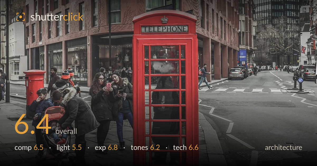
Red telephone box on the corner
Photo by dimitrisvetsikas1969

No EXIF metadata in this file
Technical analysis based on visual assessment only.
The red telephone box against the curved red-brick building is a strong colour-and-form anchor, and the corner architecture reads as the clear subject. What most holds the frame back is competing interest: the cluster of pedestrians at lower left and the pillar box pull the eye against the telephone box, so the composition never fully commits. The flat, overcast light flattens the building's textured facade and mutes its dimensionality. The verticals lean slightly and the wide lens stretches the edges. A tighter framing on the corner and box, plus a moment when the foreground is less crowded, would sharpen the statement considerably.
The curved corner of the building anchors the frame well, and the red telephone box gives a strong colour focal point at the base. The issue is division of attention: the pedestrian group and pillar box at lower left compete with the box, splitting the eye rather than building a hierarchy. The building fills the upper frame handsomely, but the bottom is busy and cluttered. Placing the phone box more deliberately against clean negative space, or waiting for the foreground to clear, would let the corner architecture and the box work as a single statement.
The heavy overcast sky delivers soft, even, shadowless light that renders detail evenly but does little to shape the building. The textured, patterned facade of the corner tower has real relief that flat light suppresses — nothing rakes across it to reveal the carved surface. The white sky is featureless and takes up a large share of the frame. Directional light late in the day, or even breaks in the cloud, would model the brick and add the dimensionality the architecture deserves. As it stands the lighting is functional but inert.
Exposure is well handled given a bright, blown-white sky that could easily have dragged the building into underexposure. The brick facade retains detail across its full height, and the shadowed ground-floor recesses hold texture. The sky is clipped but, under solid overcast, there was little to recover there. The red telephone box holds its saturation without the reds blocking up. Midtones sit sensibly and the histogram appears controlled. Overall a balanced exposure that prioritised the subject correctly rather than chasing the empty sky.
The muted, slightly desaturated grade suits the grey London mood, and the red box and pillar box punch through as intended accents. White balance leans cool-neutral, appropriate for overcast conditions. The brick tones are a little flat and muddy, though, lacking the warmth and separation that would give the facade life. Contrast is restrained, which keeps the scene soft but also somewhat lifeless. Lifting the mid-tone contrast and giving the brick a touch more warmth would separate the building from the grey sky and strengthen the overall tonal read.
Focus is accurate across the scene with good sharpness on both the telephone box and the building facade, indicating a sensible aperture for the depth required. Noise is well controlled in the flat light. The main technical concern is the wide lens: the edges stretch, the building's verticals lean inward slightly, and the perspective exaggerates the near foreground relative to the background. For architecture, this keystoning and the slight tilt undercut the geometric precision the genre rewards. A modest correction of the converging verticals in post would straighten the tower and settle the frame. A longer focal length from further back, or a shift lens, would reduce the edge distortion and keep the parallels true. Detail retention in the brick and glass is good, and the overall capture is technically clean — the execution issues are about lens choice and perspective control rather than sharpness or exposure. Levelling the horizon and squaring the building would be the highest-value fix.
What would elevate it
Tags
Shot something like this?
Expert photo critique, on demand — scored across six categories, EXIF-aware. Start with 3 free critiques, no credit card.
critique my photo — free