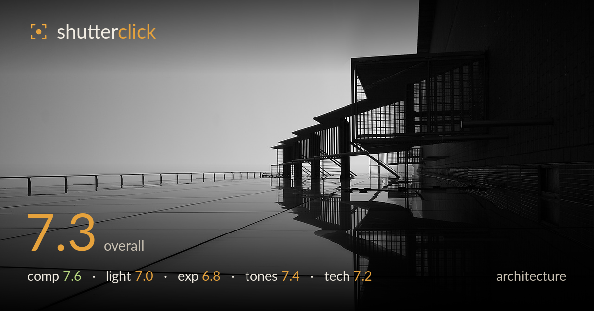
Reflected balconies in monochrome
Photo by MarcVanduffel

No EXIF metadata in this file
Technical analysis based on visual assessment only.
A strong graphic reading of a facade, built on the diagonal thrust of the balcony structures and the wet ground plane that mirrors them. The reflection doubles the geometry and gives the frame real depth. What most holds it back is orientation ambiguity — the sideways framing reads as disorientation rather than deliberate abstraction, and the eye searches for a true vertical. The vast bright wedge of sky/wall on the left is underused negative space that tips toward emptiness. Tightening the balance between the strong right-side structure and that open expanse would sharpen the intent considerably.
The receding line of balconies creates a powerful diagonal that pulls the eye deep into the frame, and the reflection below mirrors it into a near-symmetrical wedge — a genuinely graphic idea. The problem is the left half: a large flat expanse of sky and paving carries little information and unbalances the weight heavily to the right. The perspective line running through the ground plane is a nice anchor. The 90-degree rotation reads more as accidental disorientation than a committed abstract choice, leaving the true structure hard to parse.
Flat, diffuse overcast light keeps contrast low and shadows soft, which suits the minimal, moody register but robs the metalwork of the raking definition that would make the railings and struts sing. The bright, featureless sky offers no directional shaping, so the balconies stay silhouetted masses rather than modelled forms. The reflection on the wet surface is the light's saving grace, adding a second luminous plane. A shaft of low, directional sun grazing the facade would carve out far more texture and dimensionality.
Exposure is placed to protect the bright sky and let the structure fall dark, which is a defensible choice for this high-key minimal look. The sky sits just short of clipping in most areas, retaining a faint tonal wash. The deep shadows within the balcony framework hold almost no detail, which reads as intentional silhouette here but flattens the near-black masses on the right. The midtone gradation across the ground plane is smooth and well controlled. A touch more shadow recovery would reveal structural detail without breaking the mood.
The black-and-white treatment is well suited to this geometric subject, with a clean tonal separation between the pale sky and the dark structure. Highlight roll-off in the sky is gentle and avoids a harsh blown edge. Shadow depth is strong, though the darkest passages verge on featureless. Mid-tone gradation across the reflective floor is the quiet strength — a delicate ramp from light to dark that carries the reflection. A slightly deeper black point on the structure would add punch without sacrificing the airy upper register.
Focus appears accurate across the receding balcony line, holding sharpness deep into the frame, which suggests a well-chosen aperture for the wide-angle perspective. The wide lens exaggerates the diagonal convergence effectively and keeps the whole scene crisp front to back. Noise is not an issue in the smooth sky, and the image looks cleanly captured. The 90-degree rotation is the chief execution question — as an architecture frame it disorients rather than clarifies, and the eye works to reconstruct the real orientation. Verticals within the structure are consequently hard to assess, but the lines themselves stay clean and undistorted for the focal length. The reflection is rendered sharply enough to double the geometry convincingly. Overall the capture is technically sound; the decisions that matter most are compositional and orientational rather than any fault in focus, sharpness, or exposure control.
What would elevate it
Tags
Shot something like this?
Expert photo critique, on demand — scored across six categories, EXIF-aware. Start with 3 free critiques, no credit card.
critique my photo — free