Reflected shop window scene
Photo by Martin Sojka

| Focal length | 35 mm |
| Aperture | f / 4.0 |
| Shutter | 1/100 s |
| ISO | ISO 400 |
| Exp. comp. | 0.0 EV |
| Shot at | 19:26 · Mar 31, 2013 |
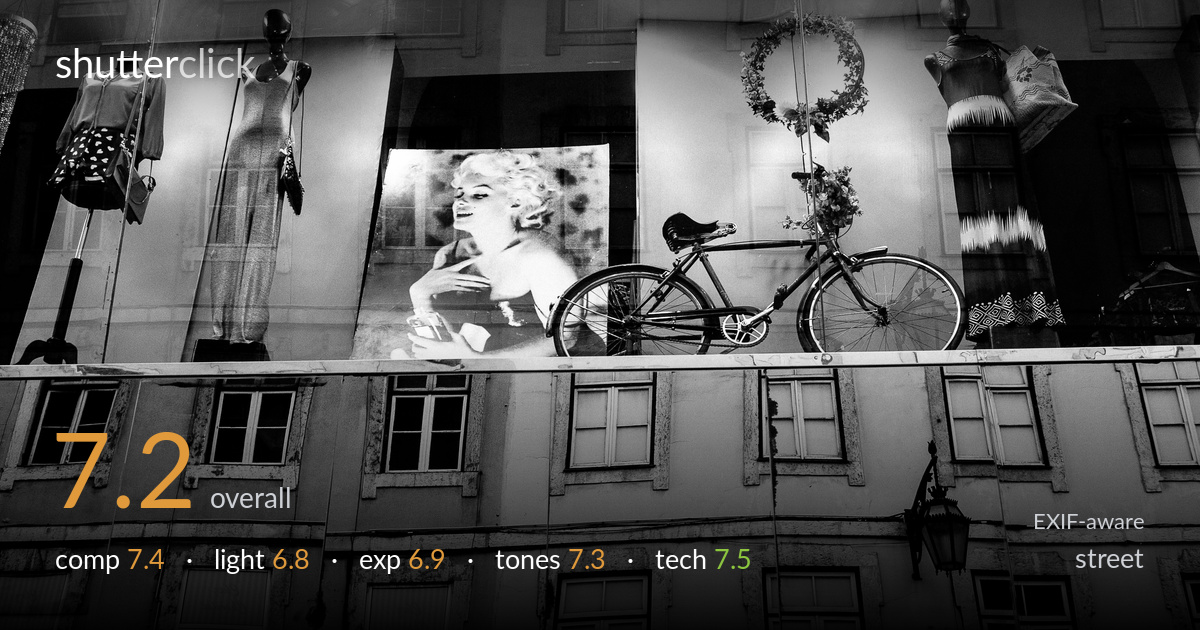
A layered shop-window study that uses reflection to fold a Lisbon facade into a display of mannequins, a vintage bicycle, and a Marilyn print — a smart visual play on glass that rewards a second look. The Marilyn portrait and the bicycle anchor the upper band with real graphic strength. What most holds it back is the competing zones: the lower reflected facade and the upper display read as two separate pictures stacked rather than one resolved frame, and the bright ceiling lights pull attention to dead space. A clearer hierarchy between layers would sharpen the idea into a stronger single statement.
The horizontal band of the display sits cleanly above the reflected facade, and the eye moves nicely from mannequins through the Marilyn print to the bicycle. The bicycle and portrait form a strong central pairing. The trouble is balance: the upper and lower halves carry roughly equal weight and read as two competing scenes rather than one. The row of ceiling lights along the top adds glare without structure. A composition that committed more decisively to the reflection layering — or cropped tighter on the display band — would resolve the split.
The interior lighting is flat and frontal, typical of shop-window illumination, which keeps the mannequins and print evenly lit but without much modeling or drama. The overhead spotlights create hot blooms across the top that compete with the subject. The reflected facade benefits from softer ambient light and reads more gracefully. There is little directional shaping to give the bicycle or print dimensionality. Catching the window at a different angle to suppress those ceiling hotspots would let the display breathe with cleaner separation from the glare.
Exposure is largely well judged for a tricky mixed-light window scene. The midtones in the facade hold detail, and the Marilyn print retains its tonal range. The overhead spotlights clip to pure white, which is hard to avoid here but draws the eye upward to empty space. Shadows in the recessed windows go fairly deep but stay believable. Overall the balance favors the brighter display, leaving the lower facade slightly muddy in places. A touch less exposure would have tamed the light blooms while keeping the reflection readable.
The black-and-white conversion suits the scene well, lending a timeless quality that flatters the vintage bicycle and the Marilyn print. Mid-tone gradation across the facade is smooth, and the contrast is pitched to keep both display and reflection legible. Highlight roll-off around the spotlights is abrupt, blowing to paper white. The darker mannequin heads and recessed windows give welcome shadow depth without going fully black. A slightly richer black point would add punch and help separate the layered planes that currently sit at similar grey values.
The Zeiss Distagon at f/4 and 1/100s, ISO 400 on the 6D is a sound choice for a static window scene, and the lens delivers the crisp rendering and clean micro-contrast it is known for. Focus appears to land on the display plane — the bicycle and print are sharp where it counts — while f/4 gives just enough depth to hold the reflected facade reasonably legible. At 1/100s there is no motion concern for a still subject, and ISO 400 keeps noise negligible with smooth tones in the greys. The 35mm focal length is well suited to this kind of layered street scene, capturing context without distortion. The main technical limitation is not the gear but the reflective glass itself: it blends two planes at similar focus distances, so neither layer is fully crisp throughout. A polarizing filter would have given more control over the reflection intensity, letting the layering be a deliberate choice rather than an unmanaged blend.
What would elevate it
Tags
Shot something like this?
Expert photo critique, on demand — scored across six categories, EXIF-aware. Start with 3 free critiques, no credit card.
critique my photo — free