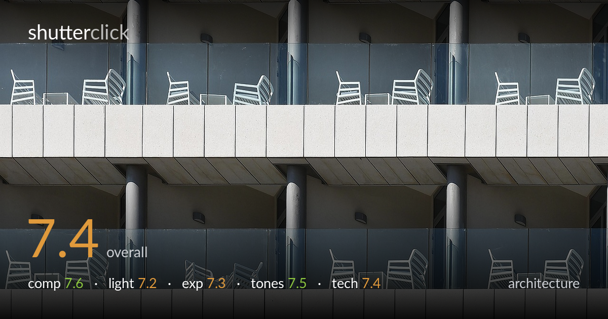
Repeating balcony facade
Photo by moshehar

No EXIF metadata in this file
Technical analysis based on visual assessment only.
A confident study in repetition that turns a hotel facade into a near-abstract rhythm of balconies, columns, and white chairs. The horizontal banding and tight frame fill work hard, and the white seating punctuates the muted concrete and glass with welcome variety. What most holds the image back is the slight loss of order at the edges and the very top, where the cropping clips chairs and the balcony band runs out of the frame awkwardly. The verticals also lean almost imperceptibly, undercutting the strict geometry the subject demands. A more rigorously levelled, deliberately framed grid would elevate this from strong pattern study to fully resolved.
The frame-filling repetition is the strength here — stacked balcony bands, recurring columns, and the scattered white chairs create a strong grid rhythm with no wasted space. The decision to crop into the pattern rather than show the whole building reads as intentional and modern. Where it weakens is the top edge, where chairs are clipped untidily and the partial balcony band feels arbitrary rather than chosen. Aligning the crop to a clean structural division — a full band of railing or a complete row of chairs — would lock the geometry tighter.
Hard, directional sun rakes across the facade, throwing the diagonal shadows of the chairs onto the glass and giving the white seating crisp form against the cool reflections. That side light is what animates an otherwise flat surface, and it's well timed for revealing texture in the concrete bands. The trade-off is that the contrast runs high in places — the lit chair backs verge on glare while the recessed soffits sit in deep shade. Slightly softer or lower-angled light would have eased that range while keeping the modelling.
Exposure is handled with restraint given the bright white chairs against darker glass and shadowed recesses. The highlights on the concrete and seating hold just short of clipping, and shadow detail survives in the soffits and under the balconies. The midtones of the grey-blue glass sit comfortably. A few of the brightest chair edges flirt with blowing out, and the deepest recesses lose some separation, but nothing reads as careless — the dynamic range is mostly within bounds and the placement feels deliberate.
A cool, restrained palette of concrete white, grey-blue glass, and muted shadow suits the architectural subject and keeps attention on form. White balance is neutral to slightly cool, which reinforces the clinical, modern feel. Contrast is healthy without crushing, and the tonal separation between the warm-tinged concrete and the cooler glass adds subtle depth. The blues in the glazing could be pulled back a touch where they verge on saturated, but overall the grade is coherent and appropriate to the material study.
Sharpness is consistent across the frame, suggesting a well-chosen aperture and a focal length long enough to compress the facade and flatten the planes into a graphic grid — the right call for this kind of repetition study. Focus holds on the chairs and railings throughout, and there's no visible motion blur or noticeable noise, indicating a clean capture in good light. The main technical shortfall is verticals: the columns and balcony edges lean very slightly off true, which a strict architectural subject punishes. Perspective control — either a tilt-shift lens, a more square-on shooting position, or careful correction in post — would straighten the geometry the composition is built on. The clipping of chairs at the top edge also points to framing that could have been planned more precisely against the building's structural rhythm. These are refinements rather than failures; the underlying capture is technically sound and the lens choice serves the abstraction well.
What would elevate it
Tags
Shot something like this?
Expert photo critique, on demand — scored across six categories, EXIF-aware. Start with 3 free critiques, no credit card.
critique my photo — free