Resting on the wooden bench
Photo by Erik_Lucatero

No EXIF metadata in this file
Technical analysis based on visual assessment only.
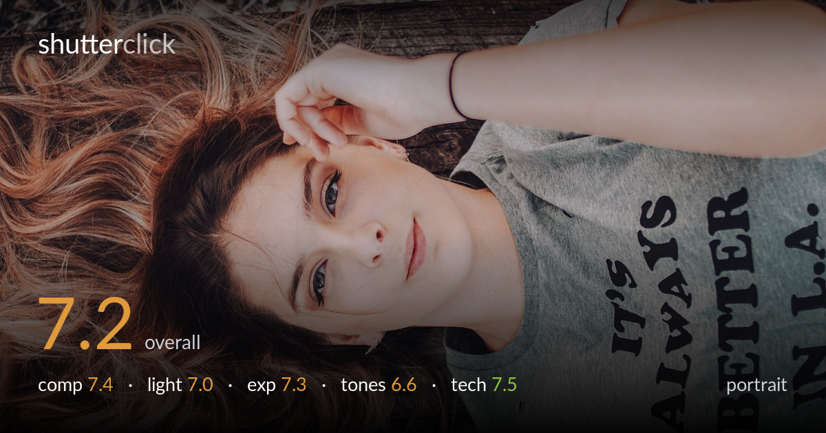
A relaxed, intimate lying-down portrait with genuine connection and beautifully rendered curls that fill the left of the frame. The overhead, sideways-oriented framing gives it a modern, casual feel and the hand-to-brow gesture reads naturally. What most holds it back is the colour grade: a heavy warm-orange cast pushes skin tones toward the artificial, and the muted, slightly muddy shadows flatten the wood background. The eyes are sharp and the expression is quiet and engaging. Cleaner white balance and a touch more separation from the ground would lift this from a strong casual frame to a polished portrait.
The sideways orientation and overhead angle create an easy, intimate mood, and the cascade of curls balances the mass of the grey shirt on the opposite side well. The face sits near centre-left, roughly on a thirds line, with the arm framing the top of the head effectively. The shirt text competes for attention and the elbow crops awkwardly at the frame edge. The busy debris along the top strip adds little and pulls the eye. A slightly tighter frame excluding that clutter would strengthen focus on the face.
Soft, diffused light — likely open shade — wraps the face gently and avoids harsh shadows, flattering for this relaxed portrait. Catchlights are present but faint, so the eyes lack the sparkle that would give them more life. The light is fairly flat and directionless, which keeps skin smooth but sacrifices the subtle modelling that a touch of directional light would bring to the cheekbones and jaw. A reflector or a more defined light source angled across the face would add dimension.
Exposure is well controlled for the subject. The face sits at a pleasing brightness with no clipped highlights on the skin, and shadow detail holds in the hair and the darker wood beneath. The grey shirt retains texture rather than blowing out. The overall balance leans slightly dark in the background, which is acceptable and keeps attention on the face. Midtones are placed sensibly. There is little to fault technically here — the exposure decisions read as deliberate and appropriate for the mood.
This is the weakest area. A strong warm-orange grade dominates, pushing skin and hair toward a uniform amber that reads unnatural and slightly muddy in the shadows. The wood and debris lose their natural colour to the same cast. Contrast is a touch low, giving a flat, hazy feel. Pulling the white balance back toward neutral, recovering some coolness in the shadows, and adding gentle contrast would restore realistic skin tones and let the hair's natural variation show through.
Focus is placed accurately on the eyes, which are crisp and well resolved, the most important call in a portrait. Depth of field is moderate — enough to keep the face sharp while the background falls off softly, though the separation is limited because the subject lies flat on the same plane as the wood. No motion blur is visible, and noise is well controlled, suggesting a sensible ISO for the shade. The lens appears to render without obvious distortion, and the working distance keeps facial proportions natural. The main technical limitation is the shallow tonal separation between subject and background caused by the flat lighting and heavy grade rather than any capture error. Sharpness across the hair holds detail nicely. Overall the capture is clean and competent; the room to improve lies in post-processing choices and in creating more physical or lighting separation between the subject and the ground she rests on.
what would elevate it
tags
Shot something like this?
Expert photo critique, on demand — scored across six categories, EXIF-aware. Start with 3 free critiques, no credit card.
critique my photo — free