Rhythm of glass and steel
Photo by wal_172619

No EXIF metadata in this file
Technical analysis based on visual assessment only.
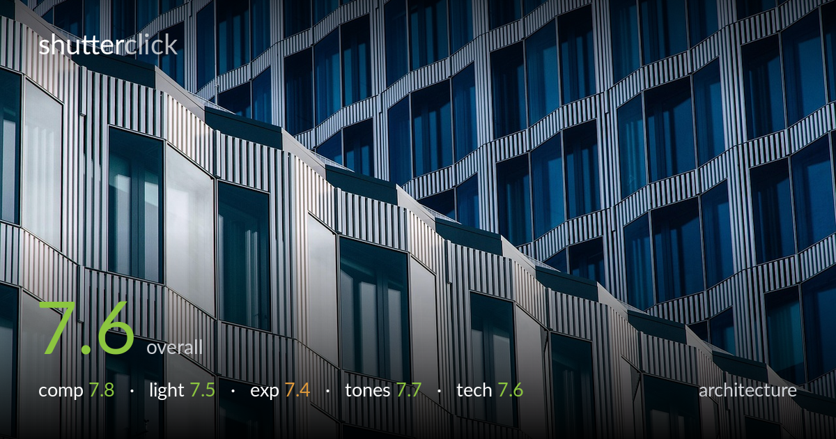
A strong study of facade rhythm, exploiting the diagonal split between the sunlit white wing and the cooler blue glass tower for tension and depth. The repeating zigzag of balconies and vertical ribbing builds a satisfying visual cadence across the frame. What holds it back most is the lack of an anchor — the eye wanders the pattern without ever resting, and the diagonal seam, while dynamic, slightly bisects the frame in a predictable way. A more decisive compositional choice — either tighter on the rhythm or a clearer focal hierarchy — would lift this from a clean abstract to a more memorable one.
The diagonal division between the bright lower-left facade and the receding blue tower gives the frame energy and a clear sense of layering. The repeated angular balcony forms create strong rhythm, and the fill-the-frame approach suits this abstract architectural treatment. The weakness is the absence of a resting point — the pattern is uniform enough that the eye drifts without anchor. The diagonal seam runs close to corner-to-corner, which works, but a slightly off-balance crop or an isolated irregularity would give the rhythm somewhere to resolve.
Hard, directional sunlight rakes across the white facade, separating the foreground wing from the shaded blue tower behind and giving the corrugated ribbing crisp definition. The contrast between lit and unlit planes is what makes the depth read. The light is doing real structural work here. The trade-off is that the brightest white panels approach blandness — the same raking angle that defines texture also flattens tonal interest in the sunlit areas, where the surfaces read as near-uniform highlight rather than detailed material.
Exposure is judged to protect the bright white facade, and the highlights hold detail in most of the sunlit panels without obvious clipping. The blue glass retains good interior gradation and reflection detail. Shadow areas in the recessed reveals stay readable. A few of the brightest white verticals sit very near the top of the range and lose some micro-texture, but this reads as a deliberate balance against crushing the blue tones. Overall a controlled, considered exposure for a high-contrast subject.
The cool blue-versus-warm-white palette is the image's strongest asset, the two temperature families playing off each other cleanly across the diagonal. White balance reads believable and the blues feel saturated without going synthetic. Tonal separation between the lit and shaded planes is well handled. The midtones in the blue glass carry subtle reflection gradation that rewards a closer look. Saturation could be eased a touch in the deepest blues, which edge toward heavy, but the overall grade is coherent and atmospheric.
Focus is accurate across the facade and sharpness holds well into the receding tower, suggesting an aperture and focal length suited to keeping the repeating planes crisp at distance. The vertical ribbing stays cleanly resolved without aliasing or moire, which is no small feat on a surface this regular. Noise is not a factor, and the image reads as captured at a low ISO in good light. The verticals appear well controlled — a tilt-shift discipline or careful camera alignment has kept the ribbing convincingly upright despite the steep diagonal of the design, an important detail in architectural work. The main technical limitation is depth of field at the extremes: the nearest white panels are marginally crisper than the farthest blue ones, though this falloff is slight and arguably enhances the sense of recession. A longer focal length stopped down a little further would tighten edge-to-edge resolution if absolute uniformity were the goal.
What would elevate it
Tags
Shot something like this?
Expert photo critique, on demand — scored across six categories, EXIF-aware. Start with 3 free critiques, no credit card.
critique my photo — free