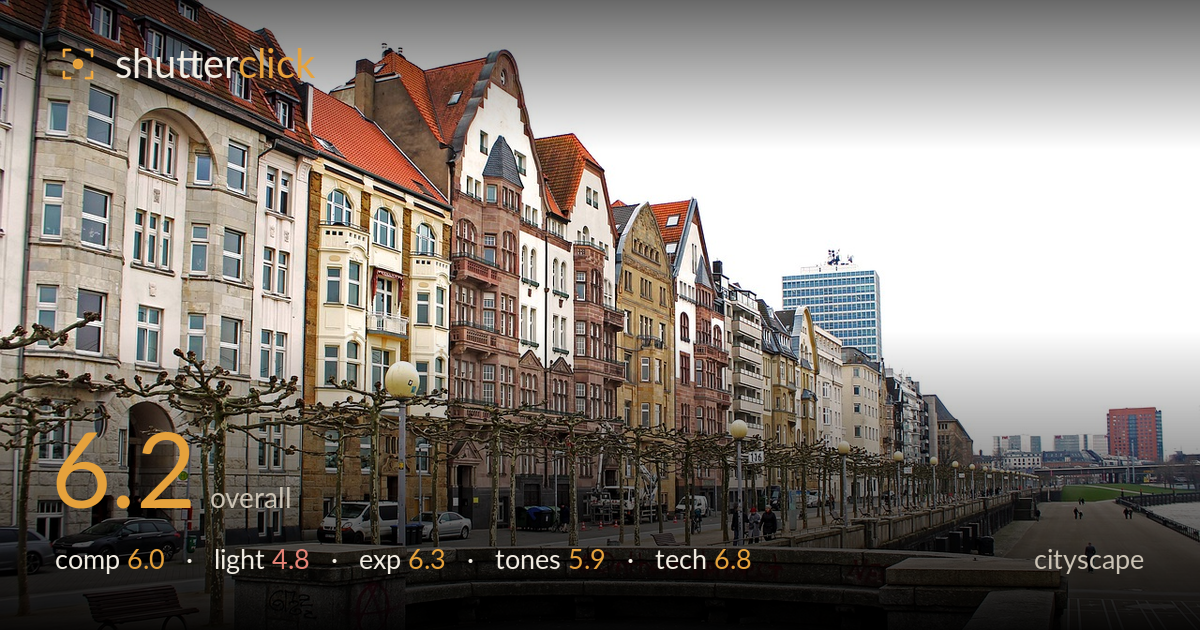
Riverside promenade under grey skies
Photo by robertino_wild

No EXIF metadata in this file
Technical analysis based on visual assessment only.
A competent record of a riverside promenade with a strong row of ornate gable-fronted buildings anchoring the frame, but flat overcast light drains the scene of the depth and glow a cityscape needs. The curved granite wall and receding line of pollarded trees create genuine perspective, yet the empty tiled foreground eats a third of the frame without earning it, and the blown white sky flattens the top edge. The architecture is the real asset here; a return in better light and a tighter relationship between foreground and buildings would lift this from documentation to a compelling image.
The receding line of pollarded trees and the curved granite parapet provide solid perspective and lead the eye toward the buildings, and the terraced promenade adds layering on the right. The problem is the vast expanse of empty paving in the lower frame, which dominates without a foreground anchor and pulls attention from the ornate facades that are the real subject. The horizon and building line sit reasonably placed, but the split between static pavement and busy architecture feels uneven and unresolved.
Flat, diffuse overcast light does the scene few favours here. The white sky offers no direction, so the facades receive even but lifeless illumination that suppresses the texture, colour, and dimensionality of the brickwork and gables. Shadows are minimal, which keeps detail readable but robs the buildings of the modelling that makes ornate architecture sing. A cityscape like this rewards golden or blue hour, or at least broken cloud, to bring warmth and directionality to the varied facades.
Exposure is handled reasonably given the difficult high-key sky. The building detail is well retained across the shaded facades and the darker stone of the foreground wall, with shadow information preserved under the parapet arches. The sky, however, is fully blown to paper white with no recoverable tone, a common overcast outcome that leaves the top of the frame dead. A graduated exposure or bracketing would have held some structure there and balanced the frame.
The muted palette reflects the grey day honestly, and the warm terracotta roofs and sandstone facades provide welcome colour against the cool paving. Overall contrast is low and the image reads slightly flat, with midtones bunched and no strong anchoring black or clean white beyond the blown sky. White balance sits neutral, perhaps a touch cool. A modest contrast lift and selective warmth on the buildings would give the tones more separation and vitality.
Focus and sharpness appear sound across the scene, with detail holding in the distant facades and the tiled foreground, suggesting a well-chosen aperture for deep depth of field appropriate to a cityscape. Verticals on the nearer buildings lean slightly and there is mild convergence, which stricter perspective control or a small correction in post would tidy. The wide framing captures the full sweep of the promenade but includes a lot of dead pavement that a modest crop or a step forward would have avoided. Noise is not an issue in this daylight capture. The graffiti on the granite parapet is a distracting element that draws the eye in the lower-middle of the frame; it is part of the scene, but its prominence undercuts the elegance of the architecture. Overall the execution is clean and technically reliable, with the main gains available in perspective correction and framing choices rather than in sharpness or exposure control.
What would elevate it
Tags
Shot something like this?
Expert photo critique, on demand — scored across six categories, EXIF-aware. Start with 3 free critiques, no credit card.
critique my photo — free