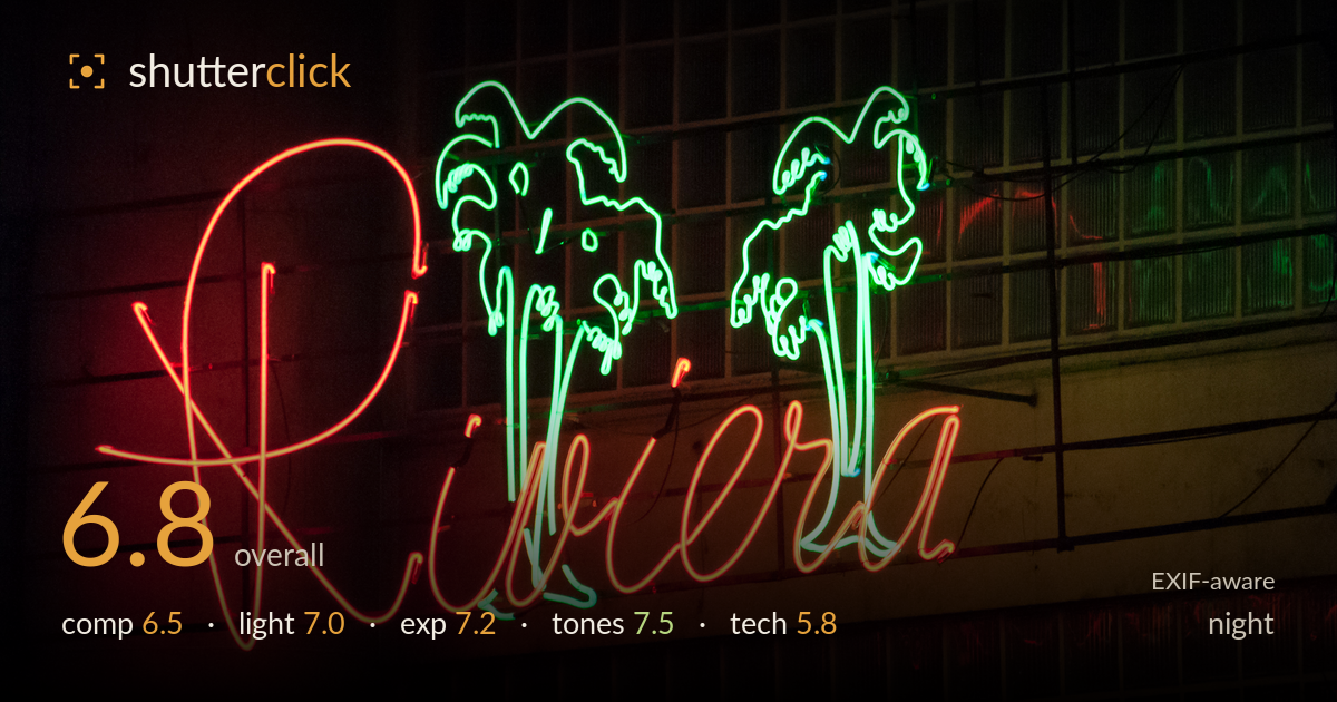
Riviera neon sign at night
Photo by Wilfredor

| Focal length | 240 mm |
| Aperture | f / 10.0 |
| Shutter | 1/400 s |
| ISO | ISO 3200 |
| Exp. comp. | 0.0 EV |
| Shot at | 16:36 · Aug 23, 2014 |
A neon 'Riviera' sign with two green palm trees against a tiled facade — a subject built on colour and glow, and the red-and-green complementary pairing is the strongest asset here. The exposure holds the neon without blowing the tubes to white, and the ambient wash on the wall gives context. What holds it back is technical execution: at 240mm and f/10, the script is soft and the tube edges lack crisp definition, and the framing crowds the sign against the right and top edges. The gridded background is busy and competes for attention rather than settling behind the subject.
The diagonal tilt of the sign gives energy, and the palm trees anchor the upper frame nicely. But the composition crowds the right edge — the final 'a' and the green palm nearly touch the border, leaving no breathing room, while the left side carries a large expanse of dim red wall that does little work. The gridded tile background is cluttered and pulls the eye across the frame. Repositioning so the sign sits with balanced margins, and either simplifying or embracing the grid as deliberate texture, would tighten the read.
The light source is the neon itself, and it does the heavy lifting — the tubes throw a soft red glow across the wall on the left and a cooler green cast up into the tiled panes, giving a genuine sense of place. The self-illumination reads honestly for the genre. The ambient spill is uneven, though, leaving the lower-right tiles muddy and the upper-left corner near-black. A slightly wider vantage capturing more of the reflected glow context would let the light tell more of the story.
Exposure is well judged for neon, which is easy to clip. The red tubes retain their core colour rather than blooming to white, and the green palms hold saturation through their brightest strokes. Shadow areas fall off into deep near-black without losing the whole background, and the tiled wall keeps just enough detail to place the sign. A touch more highlight restraint on the brightest red loops would preserve the last of the tube structure, but overall the brightness sits deliberately and the histogram is used sensibly.
The red-green complementary palette is the image's engine, and it works — the two colours sit opposite each other and reinforce the neon mood. White balance leans warm, which suits the ambient tungsten wash without turning the greens sickly. Contrast is strong between the glowing tubes and the dark surround. The muddy warm-grey of the lower tiles is the weak note, sitting in an awkward middle zone that neither reads as clean shadow nor useful detail. Slightly deepening those mid-shadows would clarify the tonal separation.
Shooting at 240mm from distance compresses the sign nicely, but the execution shows strain. f/10 is unnecessarily stopped down for a flat subject on a single plane — it forced ISO 3200 on the D300, a sensor that shows visible luminance noise and colour mottling in the darker wall areas at that setting. f/5.6 or so would have let the ISO drop by two stops for cleaner shadows with no depth-of-field penalty on a flat sign. The 1/400 shutter is far faster than a static sign requires; there was ample room to trade it for lower ISO. Focus is slightly soft — the neon script edges lack the crisp definition the subject demands, likely a mix of the long lens at range, diffraction creeping in at f/10, and imprecise focus acquisition on a low-contrast glowing target. A more open aperture, base or near-base ISO, and careful manual focus on a tube edge would sharpen the whole frame considerably.
What would elevate it
Tags
Shot something like this?
Expert photo critique, on demand — scored across six categories, EXIF-aware. Start with 3 free critiques, no credit card.
critique my photo — free