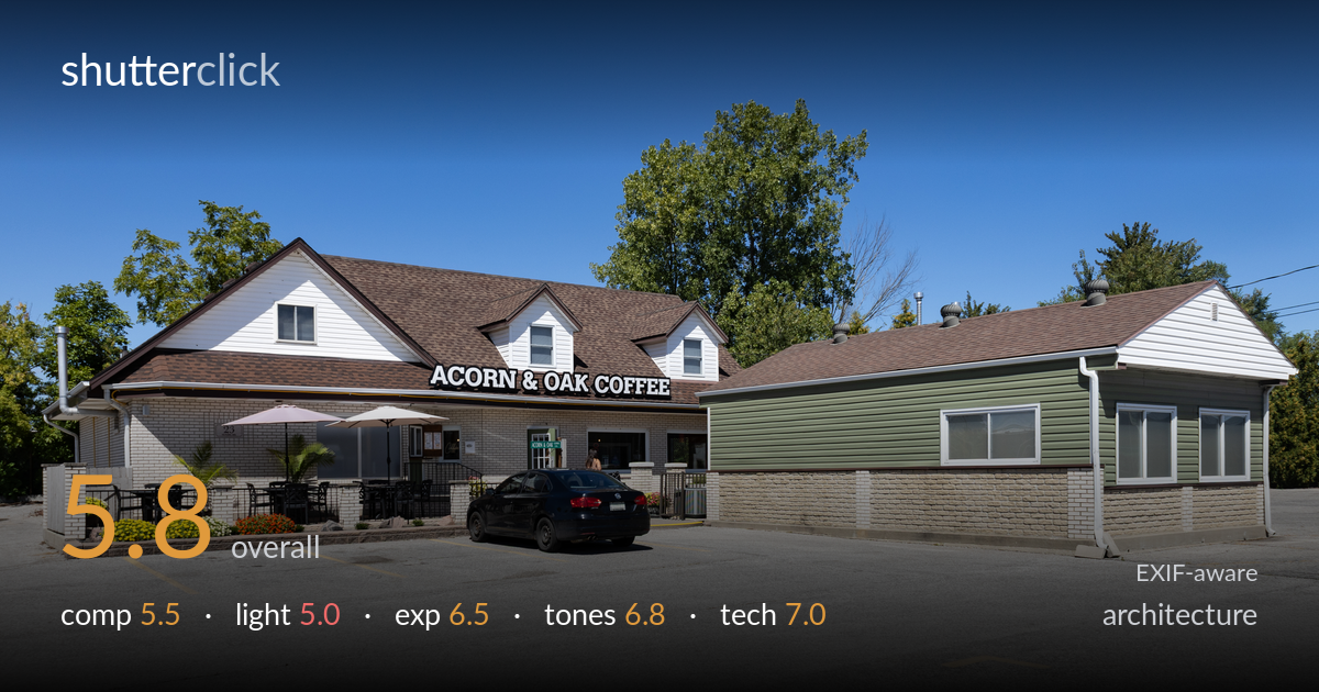
Roadside coffee shop
Photo by Chris Woodrich

| Focal length | 24 mm |
| Aperture | f / 9.0 |
| Shutter | 1/640 s |
| ISO | ISO 200 |
| Exp. comp. | 0.0 EV |
| Shot at | 17:36 · Aug 30, 2025 |
A clean, competent commercial record shot of a coffee shop that documents the building accurately but stops short of architectural distinction. The frame reads as functional real-estate or business documentation: the structure is fully described, the signage legible, the colour believable. What holds it back is flat midday light that gives the building little form, a large foreground parking lot that dominates the lower third without purpose, and a parked car cutting awkwardly across the entrance. Verticals are reasonably controlled. The image succeeds at its likely brief but lacks the timing, vantage, and light selection that would lift it into compelling architecture.
The full structure is captured with both wings legible and the signage clearly readable, which serves a documentary purpose. But the empty parking lot consumes nearly the bottom third and contributes little, while the black car sits squarely across the entrance, breaking the patio and doorway connection. The two buildings divide the frame into competing halves without a clear primary subject. A lower angle that minimised the asphalt, or a vantage favouring one facade, would tighten the read. The tree behind centre adds welcome height against the flat roofline.
Bright overhead midday sun produces flat, frontal illumination that flattens the building's form and renders the brick and siding without modelling. Shadows fall short and hard beneath the eaves, doing little to define the architecture's depth or texture. The patio umbrellas and entrance recess go murky where they should hold interest. Early-morning or late-afternoon raking light would skim across the clapboard and stone, revealing surface texture and casting longer, directional shadows that give the facades dimension rather than the uniform, document-style wash present here.
Exposure is well managed for the difficult midday range. The white siding holds detail without blowing out, the deep blue sky retains gradation, and the shadowed eaves and entrance keep recoverable detail. The histogram appears balanced with no significant clipping at either end. Midtones in the brick and green siding sit appropriately. The decision to expose for the highlights while preserving shadow information was sound under harsh light. Slightly more shadow lift would open the darker entrance area, but the technical brightness control here is solid.
White balance is accurate and natural, with the deep clear sky reading believably and the green siding, brown roof and warm brick all rendered without colour cast. Saturation is restrained and realistic, suiting the documentary intent. The flowers along the patio add welcome colour accents. Contrast runs a touch high from the midday sun, deepening the eave shadows, but the tonal range overall is handled cleanly. A gentle reduction in highlight contrast on the white siding would soften the harshest transitions.
The settings are well chosen for the task. At 24mm the wide RF24-105 captures the full frontage, and f/9 delivers front-to-back sharpness appropriate for architecture, keeping both buildings and the foreground crisp. ISO 200 keeps noise negligible and the 1/640s shutter is more than ample for a static subject handheld in bright light. Focus is accurate across the plane. The main technical compromise is perspective: at 24mm from this distance there is mild keystoning, with the verticals leaning slightly inward toward the top — the green building's right edge especially. A modest correction in post, or a longer focal length from further back, would straighten the lines. The wide angle also exaggerates the foreground parking lot. Lens choice is sound for the coverage required, but a tilt-shift or careful post-correction would deliver the clean verticals architecture rewards. Execution is clean; the limitation is timing and vantage rather than capture craft.
What would elevate it
Tags
Shot something like this?
Expert photo critique, on demand — scored across six categories, EXIF-aware. Start with 3 free critiques, no credit card.
critique my photo — free