Roadside shrine under a big sky
Photo by Tadeáš Bednarz

| Focal length | 50 mm |
| Aperture | f / 6.3 |
| Shutter | 1/1250 s |
| ISO | ISO 100 |
| Exp. comp. | -0.67 EV |
| Shot at | 17:17 · May 2, 2020 |
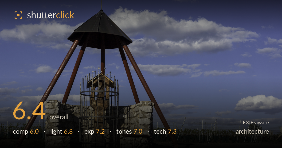
A distinctive roadside shrine rendered cleanly against a strong sky, but the framing places the structure squarely in the left half while the right is given over to a large expanse of vineyard and cloud that pulls attention away from the subject. The tripod-legged bell tower is a genuinely interesting form, and the wood carving and ironwork behind it reward a closer look, yet they read small within the frame. Sharp, well-exposed, and cleanly lit late-afternoon light. The main limits are an off-balance composition and a shrine base that competes with a busy background rather than isolating the structure.
The shrine sits in the left third, leaving a broad, less-eventful vineyard and sky filling the right half. That negative space isn't doing enough work — the cloud on the right is pleasant but doesn't counterweight the subject, so the frame feels tipped. The pyramid form is symmetrical and would benefit from more central placement or a tighter crop that lets the tapering legs dominate. The horizon sits low, which helps the tower's height, but the fenced vineyard behind the base clutters the transition between structure and ground.
Late-afternoon side light rakes across the stone base and the red legs, giving the masonry welcome texture and modelling the carved figure inside the cage. The dark conical roof holds its form against the bright sky without going fully black. Shadows are directional and add depth to the rough stonework. The light is workable rather than dramatic — a lower, warmer sun closer to golden hour would deepen the reds and lend the sky more gradation, but the current light renders the subject legibly and with dimension.
The slight negative compensation protects the sky, holding cloud detail and a rich blue without clipping the brightest highlights. Shadow areas under the roof and within the ironwork retain detail, and the histogram appears well spread with no crushed blacks. The stone reads with full tonal range. If anything the carved figure inside the cage sits a touch dark, and a hair more shadow lift there would reveal the woodwork detail that is currently muted. Overall a deliberate, well-judged exposure for a high-contrast sky scene.
The blue sky is saturated but stays believable, and the white cumulus retains soft highlight roll-off. The terracotta red of the legs and the warm tan of the stone sit well against the cool sky, giving a pleasing complementary balance. White balance looks accurate and neutral. Contrast is healthy without being heavy. The green fencing and grass tones are a little flat and muddy against the vivid sky, and slightly warming the foreground would help the ground plane hold up against the dominant blue above.
The f/6.3 aperture is a sensible middle ground for the EF 50mm f/1.8, keeping the whole structure sharp front to back while the more distant vineyard falls off gently. On the full-frame 5D Mark II, 50mm gives a natural perspective with minimal distortion, and the tower's lines stay honest — verticals read close to true, which matters for architecture. ISO 100 delivers clean files with no visible noise, and 1/1250s is far faster than a static subject needs, evidence of shooting wide open in mind rather than tuned to the scene, though it costs nothing here. Focus is accurate on the stone base and ironwork. The main technical opportunity is perspective: the camera position sits roughly level, so the pyramid apex and cross stay geometrically clean, but a marginally lower angle would emphasise the height without introducing keystoning. Stopping to f/8 would have added a touch more corner-to-corner bite in the vineyard without meaningful diffraction penalty.
What would elevate it
Tags
Shot something like this?
Expert photo critique, on demand — scored across six categories, EXIF-aware. Start with 3 free critiques, no credit card.
critique my photo — free