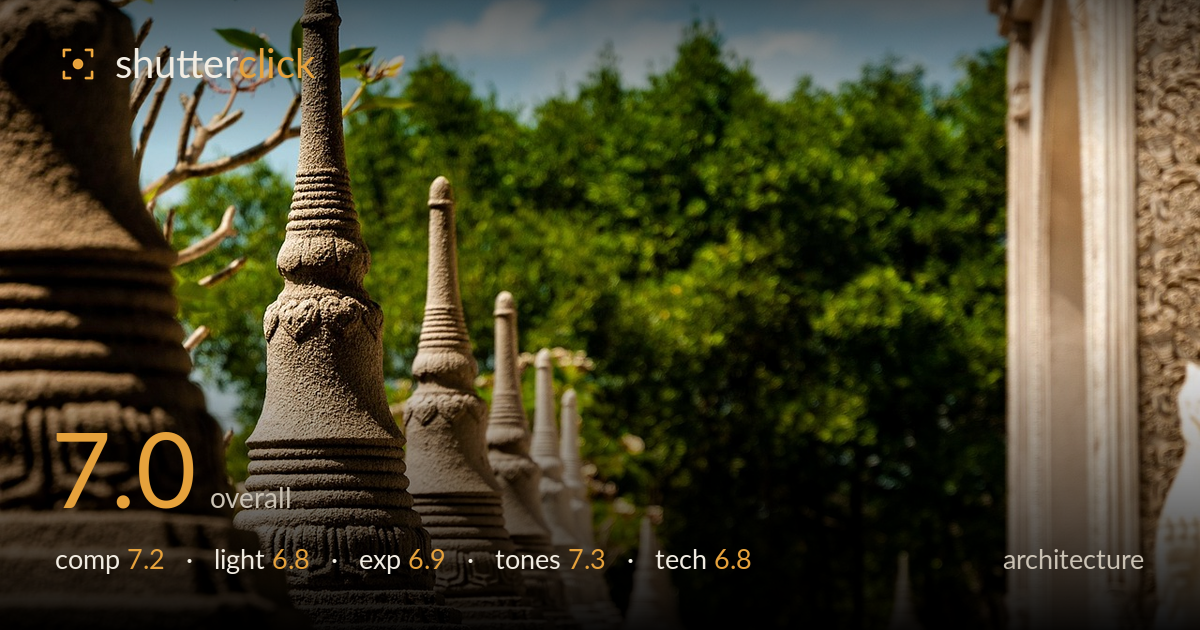
Row of carved temple spires
Photo by phong38theKOP

No EXIF metadata in this file
Technical analysis based on visual assessment only.
A repeating row of carved stone spires provides a strong rhythmic backbone, receding into a soft green canopy that keeps the eye on the ornament. The diagonal march of finials is the image's real strength, and the sandstone texture reads beautifully where it is sharp. What most holds it back is the depth-of-field decision: only the second spire is critically sharp, while the near foreground stupa and the receding line quickly dissolve, weakening the architectural clarity that this genre rewards. The building on the right is redundant negative space rather than a supporting element. Tighter focus discipline and a cleaner right edge would sharpen the whole idea.
The receding diagonal of spires is the backbone here, drawing the eye from the large foreground stupa deep into frame — a classic and effective use of repetition and rhythm. Placing the sharp second spire near a thirds line works. The weakness is the right third: the out-of-focus building and railing occupy significant real estate without contributing, and the pale statue at the far right edge feels clipped. A composition that either committed to that structure or excluded it would feel less divided between two competing ideas.
Bright midday sun under a blue sky lights the sandstone warmly and picks out the carved ridges on the front spire, which is where the light does its best work. However, the high overhead angle flattens much of the finer relief on the shadow-facing surfaces, and the contrast between lit stone and dark foliage is harsh. A lower, raking side light — earlier or later in the day — would rake across the carved rings and reveal far more of the texture that makes these forms interesting.
Exposure is broadly well judged for a high-contrast midday scene. The sandstone highlights retain detail without blowing out, and the sky holds its blue rather than clipping to white. The darker foliage keeps enough tonal separation to read as depth rather than a black mass. The deepest shadows in the foreground carving verge on losing detail, and a touch of shadow lift would recover the ornament there. Overall the tonal placement looks deliberate and the dynamic range is handled competently.
The warm sandstone against the saturated green canopy and blue sky is an appealing, natural palette, and white balance looks accurate for direct sun. The stone carries a pleasant golden warmth that suits the subject. Greens are rich without tipping into oversaturation, and the sky's blue is believable. Contrast is a little punchy in the transition between lit stone and shadow, which slightly hardens the mid-tones. A gentler contrast curve would smooth the gradation across the carved surfaces and preserve more of the subtle tonal shifts in the stone.
Focus is the central technical issue. The plane of sharpness sits on the second spire, leaving the large near stupa on the left soft and the entire receding line falling off quickly into blur. For architectural detail, this shallow rendering trades documentary clarity for a portrait-like isolation that only partly pays off — the front stupa's texture, arguably the most detailed element, is not critically sharp. A narrower aperture, or focus placed on the nearest important element with more depth carried through, would keep more of the row legible. Where focus does land, resolution and micro-contrast on the sandstone are excellent, capturing the grain and carved rings crisply. The background bokeh is smooth and unobtrusive. There is no visible motion blur or noise concern; this appears shot in ample light. Lens rendering is clean with no obvious distortion. The core decision to isolate with shallow depth of field is defensible but under-executed for the amount of architectural information in the frame.
What would elevate it
Tags
Shot something like this?
Expert photo critique, on demand — scored across six categories, EXIF-aware. Start with 3 free critiques, no credit card.
critique my photo — free