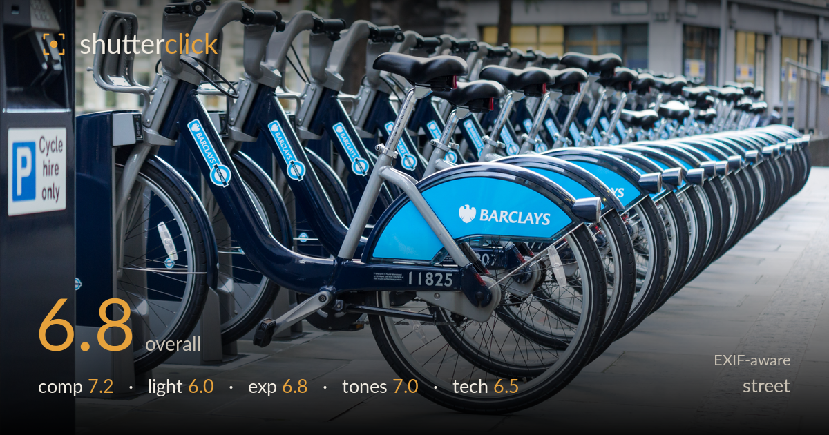
Row of hire bikes on the street
Photo by Colin

| Focal length | 50 mm |
| Aperture | f / 2.8 |
| Shutter | 1/60 s |
| ISO | ISO 400 |
| Exp. comp. | 1.0 EV |
| Shot at | 16:13 · Sep 14, 2011 |
A clean, graphic study of repetition — the receding line of hire bikes builds a strong diagonal that carries the eye deep into the frame, and the branded blue mudguard anchors the foreground with a clear focal point. What holds it back is that it reads more as a design or stock frame than a street photograph: no human presence, gesture, or decisive moment. The flat, overcast light keeps everything even but muted, and the shallow f/2.8 depth of field softens the repetition just as it becomes most interesting. Strong bones; it wants a human element and more front-to-back sharpness.
The receding rank of bikes is the whole idea, and it works — a powerful diagonal recession pulls the eye from the sharp foreground bike toward the vanishing point at right. The '11825' and Barclays branding give a clear anchor, and the 'Cycle hire only' sign at left adds context and balance. The empty pavement on the lower right is a touch dead and could be trimmed. Placing the lead bike slightly off-centre works, but the frame lacks a secondary point of interest to reward the eye once it travels down the line.
Flat, diffuse overcast light dominates — it renders the metal and paint evenly without harsh clipping, but it gives the scene no modelling or direction. The chrome and glossy frames get no defined highlights to make them sparkle, and the shadows under the mudguards are soft and shapeless. For a repeating graphic subject like this, low, raking light from the side would carve out each frame and give the row of wheels dimensional separation. As shot, the light is serviceable but adds nothing of its own to the image.
The +1.0 EV compensation was a sensible call against the bright pavement and lifts the shadows nicely — the dark blue frames retain detail rather than blocking up. Highlights on the pale paving and the blue mudguard hold together without clipping. Midtones sit slightly bright, which suits the airy overcast feel. The overall histogram is well controlled with no serious loss at either end. If anything, a touch less exposure would deepen the blues and add a little more punch to the branding, but this is a deliberate, safe exposure.
The palette leans cool and cohesive — navy frames, bright cyan mudguards, and neutral grey pavement all sit comfortably together. White balance reads accurate under the flat daylight, with clean whites on the paving. Contrast is a little gentle, which flattens the blues; the branded cyan could carry more saturation and pop to earn its place as the anchor. The greys are pleasant but risk monotony across so much of the frame. A modest contrast and vibrance lift on the blues would sharpen the graphic impact without pushing the scene unnatural.
The 50mm on the APS-C body gives a natural, slightly compressed perspective that suits the recession well. The core problem is f/2.8: wide open, depth of field is razor-thin, so only the '11825' bike is truly sharp while the row behind falls off into softness almost immediately. For a subject whose entire appeal is the repeated line of bikes marching into the distance, that sharpness is exactly where it's wanted — stopping down to f/8 or f/11 would keep the whole rank crisp and let the pattern read fully. Focus itself landed accurately on the lead bike. 1/60s is fine for this static subject and shows no motion blur, and ISO 400 keeps noise negligible in this even light. The lens choice is sound; the aperture is the one decision working against the image's own concept. A tripod would have allowed a smaller aperture and slower shutter with no ISO penalty.
What would elevate it
Tags
Shot something like this?
Expert photo critique, on demand — scored across six categories, EXIF-aware. Start with 3 free critiques, no credit card.
critique my photo — free