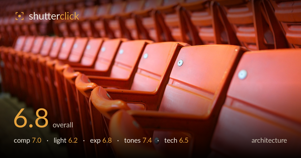
Rows of empty orange seats
Photo by LAWJR

No EXIF metadata in this file
Technical analysis based on visual assessment only.
The empty stadium seats resolve into a strong diagonal repetition that carries the eye deep into the frame, and the saturated orange gives the image real graphic punch. What most holds it back is the very shallow depth of field: only a narrow band of seats near the lower-right is sharp, so the pattern that is the whole point of the shot dissolves into blur across most of the frame. For architecture, more depth would let the geometry read fully. The light is flat and even, competent but not shaping the forms. The concept is sound; execution on focus and light is what stands between this and a strong graphic study.
The receding rows form a clean diagonal that pulls the eye from the sharp foreground seat back into the frame, and the tight crop on repeating forms is a good instinct for a graphic study. Filling the frame edge-to-edge with orange builds density and rhythm. The strip of concrete steps at lower left adds a useful anchor and hint of context. The main weakness is that the strongest focal seat sits low and right with no clear resolution to the diagonal — the pattern trails off rather than landing anywhere.
The light is soft, flat, and directionless — likely open shade or overcast — which keeps the orange even and free of blown highlights but does little to sculpt the seats. The forms read mostly through colour and edge rather than through modelled shadow, so the plastic looks somewhat lifeless. A lower, raking light would carve the ridges and curves of each seat and give the repeating pattern more dimensional relief. As it stands the lighting is serviceable and consistent but adds no drama to an otherwise bold subject.
Exposure is well controlled for a saturated colour this prone to clipping. The oranges hold detail in their brightest facets rather than blowing out, and the shadowed seat undersides retain enough information to read form. The metal bolts stay bright without flaring. The lower-left concrete falls a touch dark but keeps texture. Overall the midtones sit where they should and the histogram appears healthy with no reckless clipping. A slight lift in the deepest foreground shadows would open the frame, but this is largely a deliberate, accurate exposure.
The dominant orange is rich and consistent, and the white balance keeps it warm without tipping into false red. The narrow palette — orange against neutral concrete — gives the image a confident, near-monochromatic cohesion that suits the subject. Contrast is moderate and the tonal range across the seats reads smoothly from lit crown to shadowed base. The muted olive-grey of the steps provides a quiet complement. If anything the saturation edges toward heavy in the brightest seats; a fractional pullback would keep the colour bold without feeling synthetic.
The most limiting decision is the very shallow depth of field. Focus lands on a narrow band of seats in the lower-right foreground — the bolt and the front edges there are crisp — while the vast majority of the frame, including the entire upper block of seating, falls into soft blur. For an architectural pattern study, that blur works against the subject: the repetition and geometry that give the image its interest can only be appreciated where they are sharp, and here that is a small slice. Stopping down considerably would bring the rows into legible focus and let the pattern carry the frame. There is no visible motion blur and noise is well managed, so the exposure and stabilisation were handled cleanly. Focus placement is accurate for a shallow-DOF intent, but the intent itself sits at odds with the subject. A wider lens from a similar low angle could also exaggerate the diagonal while retaining more depth.
What would elevate it
Tags
Shot something like this?
Expert photo critique, on demand — scored across six categories, EXIF-aware. Start with 3 free critiques, no credit card.
critique my photo — free