Saints in golden afternoon light
Photo by Ronile

No EXIF metadata in this file
Technical analysis based on visual assessment only.
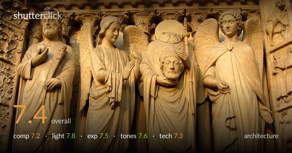
A warmly lit, well-resolved record of Gothic portal sculpture — the Saint Denis cephalophore group reads clearly and the carving detail is rendered with satisfying tactility. Late, raking sunlight is the photograph's biggest asset, modelling drapery folds and faces with depth. What most holds it back is the framing: the row of four figures is cropped at the feet and the right edge clips an extra figure awkwardly, leaving the composition feeling like a slice rather than a complete statement. Tighter intent about which figures to include, and a touch more breathing room, would lift it from good documentation toward a considered image.
The four standing figures fill the frame with a strong vertical rhythm, and the decapitated saint at centre anchors the eye effectively. But the framing is indecisive at the edges: feet are clipped along the bottom, and the right margin slices into a fifth figure and the carved jamb band, creating an unresolved cut. Including four full figures or committing to three with clean borders would read more deliberately. The slightly upward angle is appropriate for architectural sculpture, though it introduces mild convergence in the colonnettes behind.
Low, warm directional sunlight is the strongest element here — it rakes across the drapery, separating each fold and giving the stone genuine three-dimensionality. Faces are modelled with soft shadow that preserves expression, particularly on the angels. The light direction from the left builds form without crushing the shaded recesses behind the figures. Highlights on the foreheads and shoulders stay controlled rather than blowing out. The golden cast suits the limestone, lending the scene a glowing, late-afternoon presence that flat midday light would have flattened entirely.
Exposure is well judged for the lit stone. Highlights on the brightest faces and shoulders hold detail without clipping, and the shadowed recesses between figures retain enough information to read depth. The midtones sit comfortably, giving the carving its texture. A few of the deepest background shadows verge on blocking up, but not distractingly so. Overall the dynamic range of the scene is handled cleanly, and the brightness feels intentional rather than accidental — the warm faces are exposed for, not left to chance.
The warm golden palette is the dominant tonal signature, and it flatters the limestone, though it leans slightly heavy — the honeyed cast pushes toward orange in the brightest areas. Contrast is well balanced for sculptural relief, with enough separation between lit and shaded planes to convey form. The tonal gradation across the drapery is smooth and convincing. A marginally cooler white balance would render the stone closer to neutral, but the current grade has an appealing, sunlit warmth that suits the subject's age and material.
Focus and detail are handled well across the figures — the carving's chisel marks, drapery edges, and facial features resolve crisply through the central plane, suggesting an aperture that kept the whole relief acceptably sharp. There is no visible motion blur or camera shake, and noise is well controlled in the shadowed areas, pointing to a low ISO under good light. The lens renders the stone with pleasing micro-contrast. The main technical limitation is perspective: shot from below, the vertical colonnettes show slight convergence, and there is mild keystoning that a tilt-shift lens or careful post correction would tame. The right-edge crop also suggests the framing was constrained by reach or position rather than fully chosen. Sharpness falls off slightly toward the far right figure, though that may be depth of field at the frame's edge rather than a focus miss. Solid, controlled execution overall — the fundamentals are sound and the detail rendering does justice to the sculpture.
what would elevate it
tags
Shot something like this?
Expert photo critique, on demand — scored across six categories, EXIF-aware. Start with 3 free critiques, no credit card.
critique my photo — free