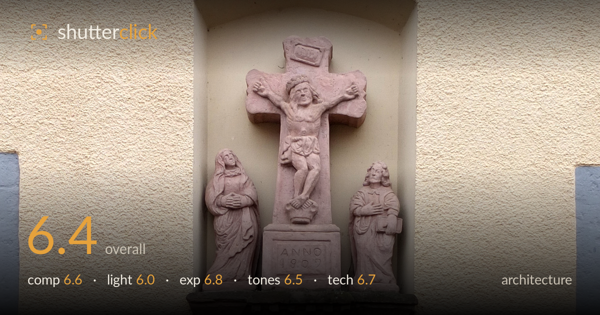
Sandstone crucifix shrine in a wall
Photo by Palauenc05

No EXIF metadata in this file
Technical analysis based on visual assessment only.
A carefully documented sandstone crucifix shrine set into a plastered wall, capturing the sculptural detail and the two flood-marker plaques that give it context and narrative. The near-frontal framing and level verticals suit documentary architecture well. What most holds it back is the flat, overcast light that leaves the carved relief lacking modelling, and a slight rightward lean in the wall lines. The centred shrine reads clearly, but the plaques and the stacked cobbles at lower right compete for attention without full inclusion. Tighter attention to level and light would lift this from a solid record to a compelling frame.
The shrine sits centred within its niche, a sensible choice for a symmetrical devotional object, and the arched recess frames it cleanly. The two "CRUE" flood plaques on either side add real documentary value, hinting at a story of water levels. However, the frame feels slightly unbalanced: the left plaque is nearly cut and the right-side cobble stack and spray can intrude awkwardly at the base. A hair of clockwise rotation would straighten the wall edges. More breathing room evenly around the niche would settle the geometry.
Soft, diffuse overcast light dominates, which keeps everything evenly lit and free of harsh shadow but does the carved relief no favours. The crucifix, the flanking figures, and the ornamental column all rely on surface modelling that flat light flattens further, muting depth in the detail. A lower, raking side light would carve out the folds, faces, and floral relief. The moss and lichen on the base plinth read well under this gentle light, but the sculpture itself asks for more directional shaping to reveal its texture.
Exposure is well judged overall, holding detail across the pale plaster wall and the darker stone base without clipping the highlights on the render or blocking the shadowed recesses of the niche. The histogram appears to sit comfortably in the midtones, appropriate for an evenly lit overcast scene. The inscribed "ANNO" panel and both black plaques retain legible text. Nothing appears crushed or blown. The exposure decisions read as deliberate and measured, letting the sandstone and plaster tones sit naturally without heavy contrast.
The palette is quiet and cohesive: warm cream plaster against the pinkish sandstone of the shrine, with the grey-blue base band and dark plaques adding restraint. White balance leans slightly warm, which flatters the stone but risks a faint muddiness in the plaster. Contrast is gentle, matching the flat light, though the relief could benefit from a touch more local contrast to separate planes. The mossy greens on the plinth add welcome tonal variety. A subtle cooling of the shadows would clean up the neutrality.
Focus is placed accurately across the shrine, with the carved figures and the plaques rendering sharp and legible, suggesting a well-chosen aperture that kept the full depth of the flat wall plane in focus. Detail resolution is good enough to read the inscriptions and the lichen texture on the base. There is no visible motion blur, and noise appears well controlled, consistent with adequate light. The main technical shortfall is not the capture itself but the framing discipline: the wall verticals lean slightly right, betraying a small perspective or level error that undermines an otherwise clean architectural record. The intrusive spray can and the abruptly cut cobble stack at the lower right also weaken the technical tidiness of the frame. For a documentary architecture record, a tripod and careful levelling, or a modest perspective correction in post, would tighten the geometry. The lens choice looks appropriate, with minimal distortion on the straight plaster edges.
What would elevate it
Tags
Shot something like this?
Expert photo critique, on demand — scored across six categories, EXIF-aware. Start with 3 free critiques, no credit card.
critique my photo — free