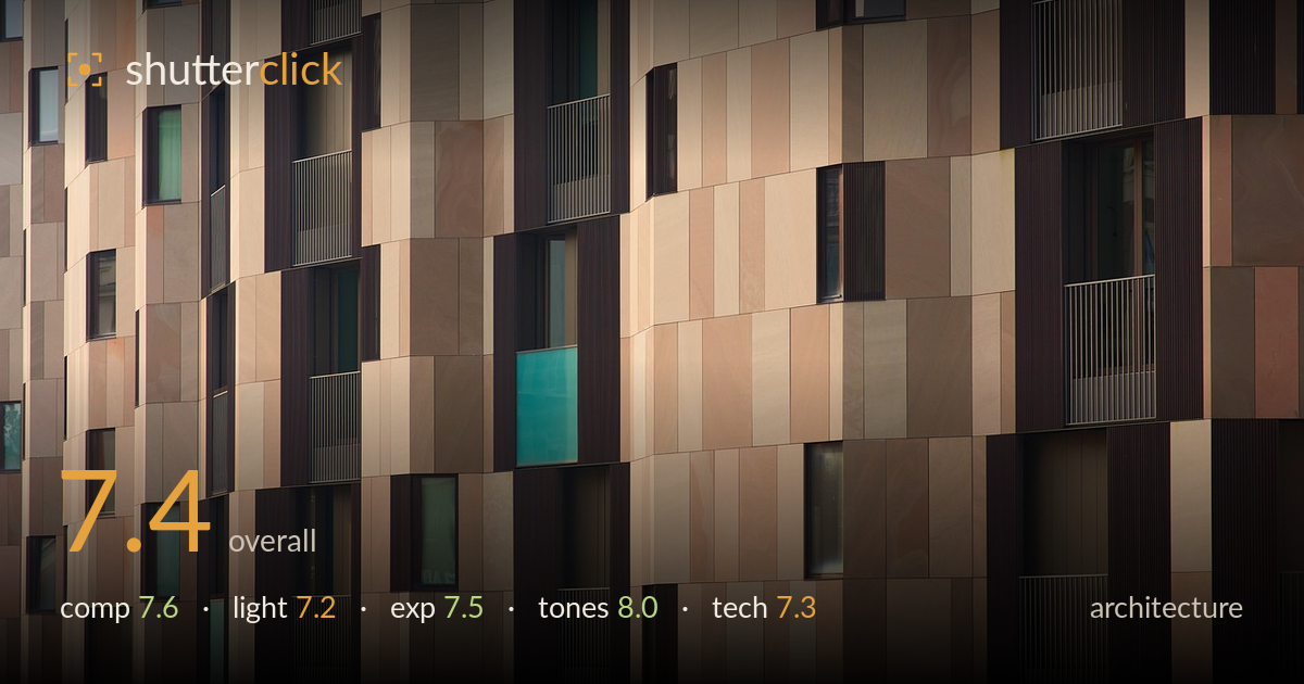
Sandstone facade with turquoise panes
Photo by ValterM

No EXIF metadata in this file
Technical analysis based on visual assessment only.
A confident study of facade rhythm, carried by a warm sandstone palette punctuated by cool turquoise glass. The staggered window placement and mottled cladding panels build a rich, patchwork texture that rewards a slow read. What holds it back is the absence of an anchor: the frame is uniformly busy edge to edge, so the eye wanders without a resting point or a hierarchy to organize the pattern. The oblique angle from the left adds welcome perspective but leaves the framing slightly ambiguous — neither a flat graphic wall nor a clear three-dimensional volume. A stronger compositional decision either way would sharpen the intent.
The full-frame facade approach works for a pattern study, and the offset windows keep the grid from feeling mechanical. The perspective sweeping in from the left adds depth and prevents a flat repetition. What weakens it is the lack of a focal anchor — every region competes equally, so the eye finds no entry or resting point. The turquoise panes are the natural accents but they're scattered rather than orchestrated. A crop that isolated one cluster of colour, or a framing that let the pattern build toward a corner, would give the composition a spine.
Low, raking light from the right grazes the cladding and pulls out the subtle grain and colour variation in the sandstone panels — exactly what a texture-driven facade needs. The warmth suggests late-day sun, which flatters the palette. The trade-off is that the recessed windows and balcony grilles fall into flat shadow, flattening the depth that oblique light usually creates. Slightly stronger directional contrast, or catching the sun a touch lower, would deepen the modelling of the reveals and make the three-dimensionality of the facade read more clearly.
Exposure is well controlled across a demanding range. The bright sandstone panels hold their highlight detail without clipping, and the dark window recesses retain enough information to read as glass and grille rather than empty black. The midtones sit comfortably, giving the panel colours room to breathe. A few of the deepest window interiors approach pure shadow, but that reads as intentional rather than accidental. Overall a balanced, deliberate exposure that serves the pattern without needing aggressive recovery.
The strongest element here. The warm sandstone spectrum — from pale cream through terracotta to deep chocolate — is beautifully graded and cohesive, and the turquoise glass provides a precise complementary counterpoint that lifts the whole frame. White balance is warm but appropriate to the light and material. Contrast is judged well: enough to separate panels without crushing the shadow reveals. Saturation stays restrained and natural. The tonal relationship between the earthy facade and the cool accents is the image's real signature.
Focus appears accurate across the plane, holding sharpness on the panel texture and window frames from the near left through to the far right — impressive given the oblique angle stretches the depth of field. There's no visible motion issue and noise is well controlled, consistent with a low-ISO daylight capture. The lens choice compresses the facade effectively, emphasizing the flat pattern. What could be refined is verticality: the panel edges lean slightly, a mix of genuine perspective from the shooting angle and possible uncorrected convergence. For architecture, deciding whether to embrace the diagonal fully or correct to true verticals matters — the current in-between state reads as neither a deliberate perspective study nor a clean orthographic elevation. A perspective-control adjustment in post, or a tilt-shift lens on a reshoot, would let the geometry declare itself. Sharpness and rendering are otherwise clean and professional.
What would elevate it
Tags
Shot something like this?
Expert photo critique, on demand — scored across six categories, EXIF-aware. Start with 3 free critiques, no credit card.
critique my photo — free