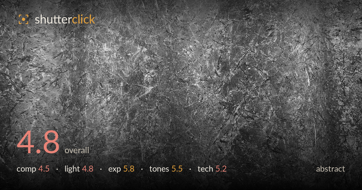
Scratched grey stone texture
Photo by Pexels

No EXIF metadata in this file
Technical analysis based on visual assessment only.
This reads as a texture study — a scratched, marbled grey surface filling the frame edge to edge. As abstract work, the fine web of striations and the crushed, crystalline quality carry genuine visual interest, but the frame lacks a compositional anchor or rhythm to organise the eye. The pattern is uniform enough that no region asserts itself, so it settles into wallpaper rather than image. Tonal range is decent but muddy in the midtones. The strongest path forward is finding contrast, direction, or a focal disruption within the texture — a raking light or tighter selective crop would give this surface the graphic tension it currently lacks.
The surface fills the frame completely, which suits a texture study, but there's no compositional strategy beyond flat coverage. The scratches radiate loosely from a vague centre, hinting at rhythm that never resolves into a clear structure. Nothing anchors the eye — no dominant line, no cluster of interest, no negative space to breathe against the busy areas. For abstract work the frame still needs internal tension or a governing pattern. A tighter crop isolating the densest cluster of striations, or one that emphasised diagonal flow, would give the composition intent.
The light appears flat and frontal, which flattens what could be a richly dimensional surface. The scratches and crystalline facets are precisely the kind of texture that comes alive under raking, low-angle light, yet here they sit with minimal shadow relief. Some tonal variation across the frame — brighter upper corners, a darker central band — suggests uneven illumination rather than deliberate shaping. A hard side light skimming across the surface would carve the striations into three dimensions and create the directional drama the flat lighting currently withholds.
Exposure is safe and controlled. Highlights on the brightest scratches hold detail without clipping, and the darkest crevices retain some information rather than blocking to pure black. The midtones carry the bulk of the image and sit slightly heavy, giving the frame a grey, low-energy weight. Nothing is technically wrong, but the histogram likely bunches in the middle without reaching either extreme cleanly. Pushing shadows deeper and lifting the brightest facets would extend the tonal range and add the punch this rendering lacks.
Rendered in monochrome (or near-neutral grey), the tonal palette is coherent but muddy. Contrast is modest, keeping most values clustered in the middle greys, which is why the texture reads as busy rather than sculptural. Shadow depth is shallow and highlights never quite sing. The white balance, if any colour is present, is essentially neutral. A stronger contrast curve — deeper blacks, brighter whites, a cleaner separation between the scratch lines and the base surface — would let the intricate detail carry far more visual weight.
Focus appears consistent across the plane, which is appropriate for a flat surface shot square-on, and there's no obvious motion blur — suggesting a stable platform and adequate shutter. Depth of field is a non-issue given the parallel subject plane. Detail resolution is reasonable; the fine scratches and crystalline structure hold up, though the image reads slightly soft in the finest textures, which may be a combination of flat lighting and modest sharpening rather than a focus miss. Noise is well controlled. The main technical limitation isn't gear execution but the lighting choice, which doesn't serve the subject. For a texture study, angling the camera precisely parallel to the surface (already largely achieved), then introducing a strong raking light and shooting at a low ISO with a small aperture for edge-to-edge sharpness, would extract far more from this surface. Careful sharpening tuned to the mid-frequency texture would also emphasise the striations without amplifying noise.
What would elevate it
Tags
Shot something like this?
Expert photo critique, on demand — scored across six categories, EXIF-aware. Start with 3 free critiques, no credit card.
critique my photo — free