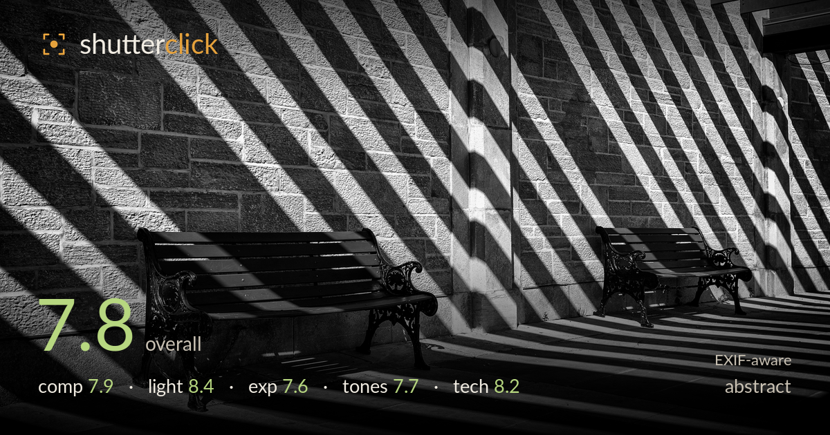
Shadow diagonals across a stone wall
Photo by Maksim Sokolov (maxergon.com)

| Focal length | 35 mm |
| Aperture | f / 7.1 |
| Shutter | 1/200 s |
| ISO | ISO 100 |
| Exp. comp. | 0.0 EV |
| Shot at | 19:54 · Jun 12, 2021 |
A strong graphic study built on diagonal shadow bands raking across coursed stone, with two benches anchoring the rhythm at ground level. The repeating diagonals carry real visual energy and the black benches punctuate the lighter wall with satisfying weight. What holds it back is a slightly unresolved right side, where the pergola beam and receding bay compete with the cleaner left-hand pattern, and shadow blacks that crush a touch too readily. The mid-tones in the stone are the real asset here; protecting them and tightening the frame edges would push a good abstract toward a genuinely striking one.
The diagonal shadow bands drive the frame and the two benches provide firm anchor points against the striped wall — a smart use of repetition and rhythm. Placement of the near bench in the lower left works well, its cast shadow leading down into the foreground. The right side is busier and less resolved: the pergola beam, the pillar, and the receding bay pull attention in several directions. A cleaner edge on the right, or a tighter crop favouring the dominant left diagonals, would strengthen the graphic clarity.
Hard, low, directional sun is the whole point here and it delivers — the crisp shadow lines have real edge definition and the raking angle reveals the stone's coursework beautifully. The alternation of lit and shadowed bands creates strong tonal separation and the benches sit convincingly in shade. Timing is well judged; a higher sun would have flattened the diagonals entirely. The only caution is how deep some shadow wedges fall, swallowing detail where a hint of texture would have added dimension.
Exposure is placed to hold the lit stone's texture, which is the correct priority, and the bright bands retain detail without clipping. The trade-off is deep shadow crush — the darkest diagonal wedges and the bench undersides go fully black with little recoverable information. For a high-contrast abstract that's a defensible choice, but a slightly lifted shadow floor would preserve just enough tonal gradation to keep the darks from reading as flat holes. The histogram clearly leans deliberate rather than accidental.
The black-and-white conversion suits the subject, with good separation between the light stone and the shadow bands. Mid-tone gradation across the wall is the strongest tonal element, rendering the masonry with texture and depth. Contrast is pushed hard, which powers the graphic effect but sacrifices shadow gradation and edges toward blocky blacks. Highlight roll-off on the brightest stone is clean. A marginally gentler contrast curve would recover mid-shadow nuance without softening the punch that makes the image work.
The settings are well matched to the task. At f/7.1 the 35mm holds sharpness across the wall plane and both benches, giving the deep, even focus an architectural abstract needs — no wasted shallow depth of field here. ISO 100 keeps the file clean, so the deep shadows stay noise-free rather than muddy, which matters when contrast is pushed this hard. 1/200s is more than enough for a static scene handheld, leaving no motion concern. The 35mm Art lens resolves the stone texture crisply and shows no distortion issues that would bend the diagonals. Focus appears accurate on the near bench and wall. The only technical consideration is dynamic range management rather than capture: the scene's contrast exceeds what a single frame comfortably holds, so the deepest shadows lose information. Bracketing or exposing marginally brighter and pulling highlights in post would have captured more of the tonal range these settings otherwise render very cleanly.
What would elevate it
Tags
Shot something like this?
Expert photo critique, on demand — scored across six categories, EXIF-aware. Start with 3 free critiques, no credit card.
critique my photo — free