Shadows of a spiral staircase
Photo by wal_172619

No EXIF metadata in this file
Technical analysis based on visual assessment only.
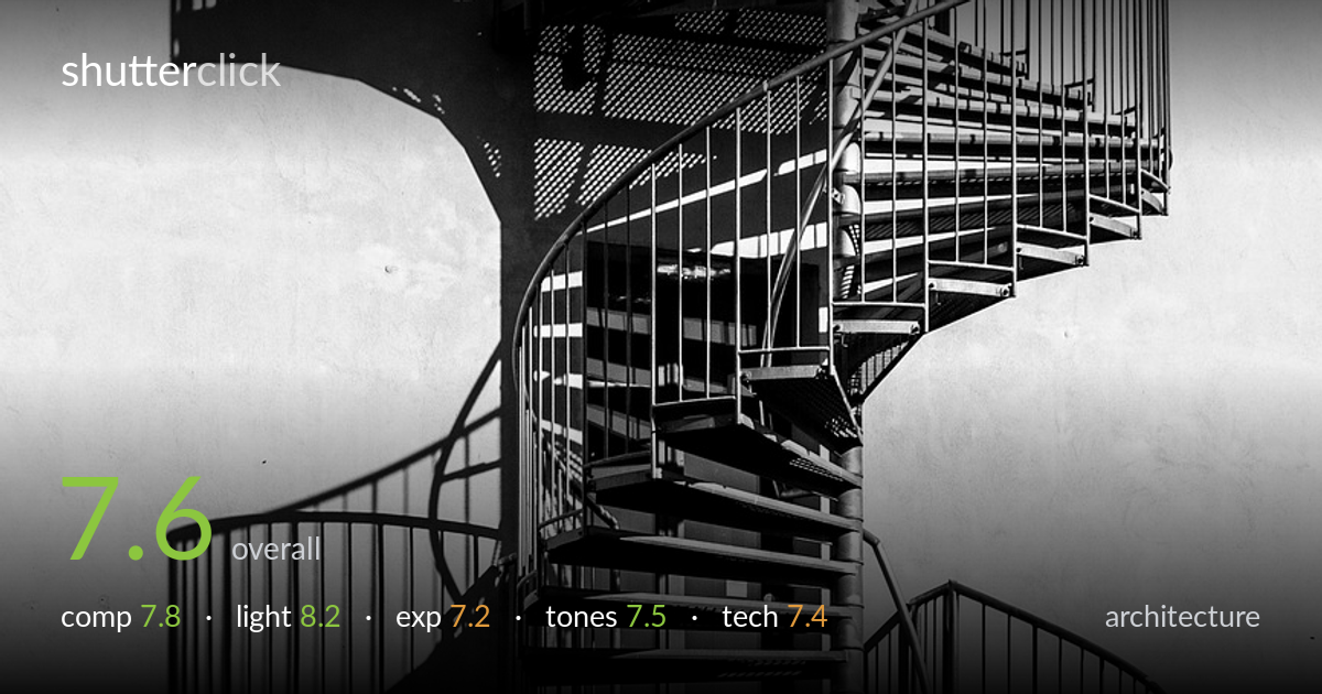
A strong graphic study of a spiral staircase, carried by hard directional light that throws crisp shadow echoes onto the pale wall. The repeating helix of treads and the cast-shadow doubling are the real subject, and they read clearly against the near-blank background. What most holds it back is exposure: the wall sits at the very top of the histogram with little texture left, and the brightest rail edges threaten to clip. The vertical centring of the staircase is safe rather than dynamic. Tightening the frame and protecting the highlights would lift a good idea into a confident one.
The spiral repetition and the mirrored shadow on the wall form a satisfying rhythm, and the high-key background isolates the structure cleanly. Splitting the frame between lit metalwork on the right and shadow-printed wall on the left is a deliberate, working tension. The staircase sits centrally and vertically, which feels stable but a touch static; weighting it slightly off-centre would energise the negative space. The top and bottom crops slice through treads abruptly — a hair more breathing room above and below would let the spiral resolve.
Hard, raking sunlight is the engine of this image — it carves the treads into sharp tonal steps and casts the secondary staircase as a graphic shadow on the wall, effectively doubling the subject. The low-ish angle rakes across the railings, separating each baluster. That same hardness blows the highlights on the brightest metal edges and leaves shadow cores nearly black, but for an architectural graphic study the drama is justified. Shooting marginally earlier or later would soften the most extreme contrast while keeping the shadow play.
The exposure is pushed bright to render the wall as clean white, and that choice mostly pays off as negative space. However, the wall sits right against the highlight ceiling with little retained texture, and the sunlit rail edges show signs of clipping. The deepest shadows under the treads go to pure black, sacrificing the mesh detail visible elsewhere. Pulling exposure down a third of a stop would protect those rail highlights while keeping the high-key feel, and the shadows could then be lifted selectively.
The black-and-white conversion suits the subject, leaning into a high-key, high-contrast palette that emphasises form over surface. Mid-tone gradation in the treads and railings is handled well, giving the metal a believable sheen. The shadow on the wall holds a pleasing soft grey that contrasts the harder blacks of the structure. The trade-off is a slightly hollow tonal middle — the jump from white wall to dark metal is abrupt. A touch more mid-tone presence in the wall would add depth without diluting the graphic punch.
Focus is accurate across the staircase, with the treads, balusters and mesh all rendering crisply where light reaches them — the depth of field is sufficient to hold the receding spiral sharp, suggesting a sensibly stopped-down aperture. There is no motion blur and noise is well controlled in the mid-tones, consistent with good light and a low ISO. The lens choice gives a fairly flat, compressed perspective that keeps the verticals of the rails close to true — appropriate for an architectural subject and avoiding distracting keystoning. The main technical limitation is highlight management rather than capture: the brightest metal edges look clipped, which a slightly more conservative exposure or shadow-and-highlight recovery in raw would have preserved. Edge sharpness holds well into the frame corners, indicating a capable lens and careful focus placement. Overall the execution is clean and intentional; the discipline shown in framing and focus is undercut only by the burnt highlights on the sunlit rails.
what would elevate it
tags
Shot something like this?
Expert photo critique, on demand — scored across six categories, EXIF-aware. Start with 3 free critiques, no credit card.
critique my photo — free