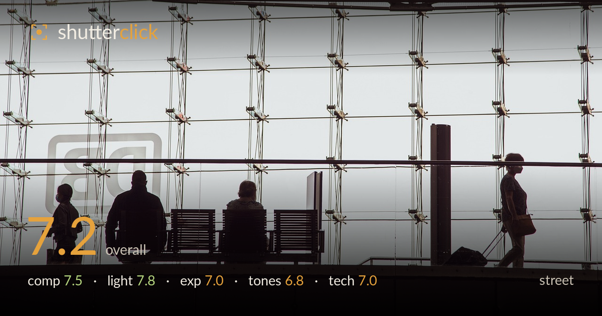
Silhouettes against a station glass wall
Photo by wal_172619

No EXIF metadata in this file
Technical analysis based on visual assessment only.
A clean, graphic silhouette study set against a glass curtain wall — the grid of cables and glazing clips provides a rhythmic backdrop that plays well against the human figures. The strongest element is the narrative contrast: seated figures at rest versus the walking woman with a rolling case, reading left to right as a small story of transit. What holds it back is a lack of tonal separation between the dark figures and the darker structural elements — the seated pair partly merge with the bench and beams, softening their readability. The heavy dark band across the top also steals vertical space without adding much.
The station glass wall sets up a strong repeating grid that anchors the frame, and placing the silhouettes along the lower third against it works. The walking figure on the right balances the seated cluster on the left, creating tension across the frame. The thick dark ceiling band eats roughly a fifth of the height without contributing, and the empty right-centre feels slightly slack. The subway roundel ghosted in the glass adds welcome context. Tightening the top edge would concentrate attention where the story lives.
Backlighting is used deliberately and it pays off — the bright, near-white glazing renders the figures as clean silhouettes, exactly the effect this kind of transit scene rewards. The soft, diffuse light behind avoids harsh hotspots and keeps the background from blowing to featureless white, so the cable grid stays legible. Directionality is entirely front-to-back, which flattens the figures into shapes; that is the intent here. The even illumination across the glass is what makes the graphic reading possible.
Exposure is judged to protect the silhouette, letting the figures fall to near-black while holding the bright glass just short of full clipping — the glazing clips and cables retain detail rather than burning out. That is the correct call for this treatment. The very darkest areas, particularly the seated figures and the bench, sit at a similar black level and lose separation. A slightly brighter overall exposure, or a touch of shadow lift in post, would let the figures read as distinct forms without sacrificing the silhouette effect.
The muted, slightly desaturated palette suits the scene, but the tonal range feels compressed in the shadows — too many important elements collapse into the same near-black, blurring the distinction between people, bench and structure. The highlights carry a faint warm-grey cast that keeps the glass from feeling clinical, which is pleasant. More gradation in the low midtones would give the figures shape and depth. As it stands the mid-tones are thin, leaving a somewhat two-toned image rather than a fully modelled one.
Focus appears to sit on the structure and figures accurately, with the cable grid crisply rendered across the frame, suggesting a small enough aperture to hold the whole plane sharp — appropriate for a scene where depth is uniform. There is no visible motion blur despite the walking figure, so shutter speed handled the movement cleanly. Noise is not apparent, consistent with the bright ambient light. The main technical limitation is not capture but tonal handling: the shadow region is so uniformly dark that detail which likely exists in the raw file is not being coaxed out. The lens choice reads as a moderate telephoto, which compresses the glazing grid attractively and keeps verticals reasonably controlled. Sharpness and clarity are solid throughout. Working the shadow curve to recover separation between the figures and the bench would extract more from what was already captured, since the exposure preserved usable information in those tones.
What would elevate it
Tags
Shot something like this?
Expert photo critique, on demand — scored across six categories, EXIF-aware. Start with 3 free critiques, no credit card.
critique my photo — free