Silver curves against the sky
Photo by cocoparisienne

No EXIF metadata in this file
Technical analysis based on visual assessment only.
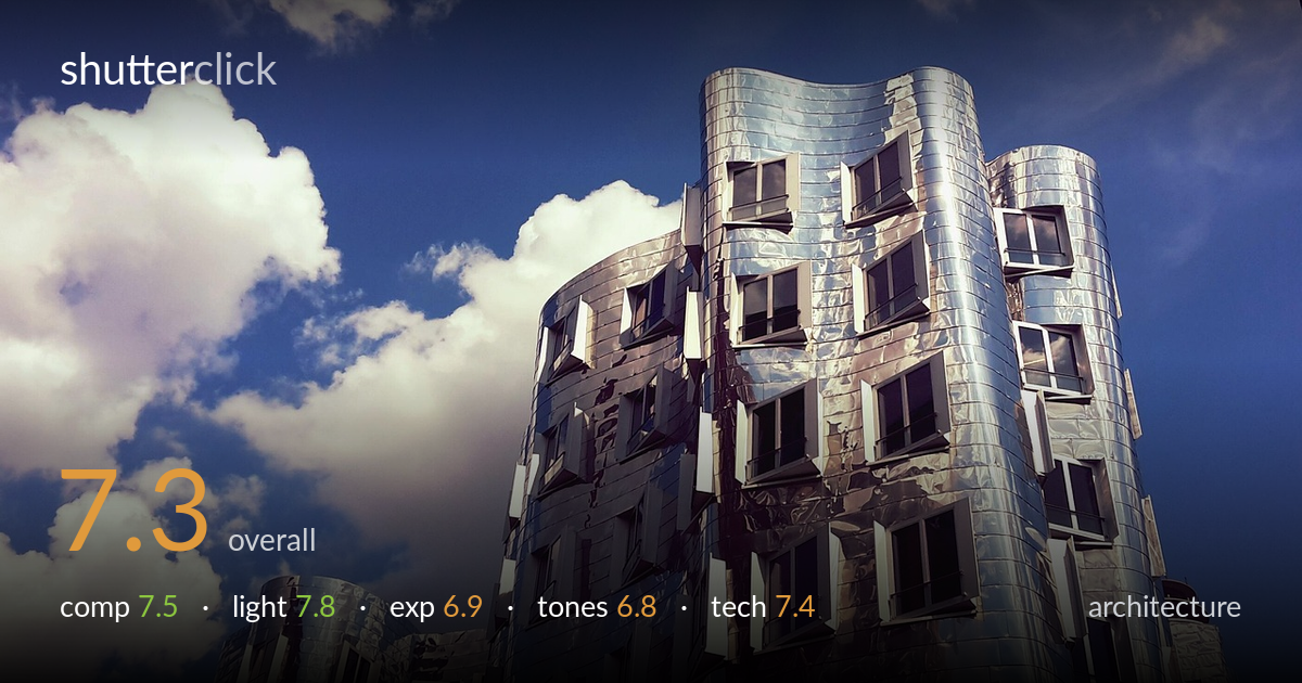
A confident, dynamic frame of a reflective deconstructivist facade, with the sweeping metallic curves set against a strong cloudscape that gives the geometry room to breathe. The upward angle suits the subject's organic, sculptural quality. What holds it back most is the highlight handling on the polished cladding — the brightest reflections clip toward pure white in places, flattening the surface texture that makes this material interesting. The colour grade also leans cool and slightly heavy in the blues, and the verticals lean in a way that reads as accidental rather than intentional. Strong bones, refinement needed in the tonal and edge decisions.
The off-centre placement of the tower against generous sky negative space works well, and the cloud formation balances the metallic mass on the left. The upward perspective emphasises the building's twisting, sculptural form and the secondary structure at lower left adds depth. The window grid provides repeating rhythm against the curves. The tight crop on the right clips the adjacent tower abruptly, and the building nearly touches the top edge — a touch more breathing room above would let the form resolve more comfortably within the frame.
Direct sunlight rakes across the metallic cladding, lighting the curved panels and producing the bright reflective sheen that defines this material. The clear sky with sculptural cumulus gives strong directional light and good modelling on the facade's folds. The contrast between sunlit and shadowed faces emphasises the building's three-dimensional twist. The brightest reflections push hard, though — softer light or a slightly hazier moment would have preserved more gradation in the polished metal rather than letting it blow toward white.
The exposure protects the sky and clouds well, holding cloud detail and a saturated blue without crushing the building into shadow. The midtones on the facade sit reasonably. The issue is the specular and near-specular highlights on the polished cladding, which clip toward pure white and lose the surface texture in the brightest panels. Exposing slightly darker, or recovering highlights from a raw file, would retain more of the metallic detail that gives this subject its character.
The cool, slightly stylised grade leans into the blue sky and silver metal, which suits the cold material — but the blues feel heavy and the overall balance reads a touch processed. The metallic surface picks up warm and cool casts that add interest, yet the saturation in the sky competes with the subject. A more neutral white balance, or pulling back the blue saturation slightly, would let the facade's tonal subtlety read more clearly against the sky.
Sharpness across the facade is good, with the window frames, panel seams and crumpled metallic texture rendering crisply where highlights aren't clipped. Depth of field is ample, keeping both the near tower and the secondary structure acceptably sharp, appropriate for architecture. Focus appears accurate on the main building. The wide focal length captures the full sculptural form but introduces noticeable converging verticals from the upward tilt — the building leans inward, which here reads as uncorrected rather than a deliberate dramatic choice. For architecture this is the main technical lever to address: a perspective-control correction in post, or a more frontal shooting position, would straighten the verticals. The highlight clipping on the cladding is the other limiting factor — bracketing exposures or shooting raw would give the latitude to recover those panels. Noise is well controlled and there's no visible motion issue. Solid execution overall, with line correction the clearest path to a more polished architectural result.
what would elevate it
tags
Shot something like this?
Expert photo critique, on demand — scored across six categories, EXIF-aware. Start with 3 free critiques, no credit card.
critique my photo — free