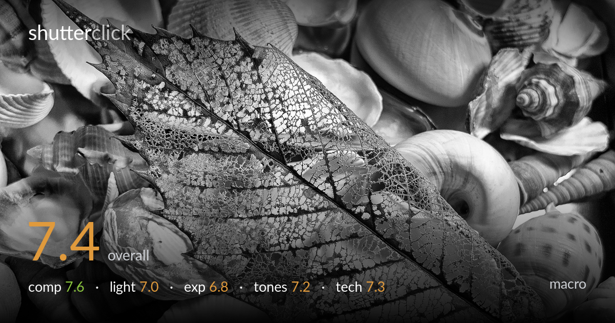
Skeleton leaf on a bed of shells
Photo by MichaelVines

No EXIF metadata in this file
Technical analysis based on visual assessment only.
A skeletonized leaf laid diagonally across a bed of shells makes a strong textural study, with the lace-like venation as the clear focal anchor. The diagonal placement gives the frame energy and the busy shell field provides context without fully competing. What holds it back most is the shell background's tonal busyness — it crowds the leaf's edges and the brightest shells pull attention away from the subject. A few highlight areas near the upper shells are pushed close to clipping. Cleaner tonal separation between leaf and bed, and slightly tamed highlights, would let the delicate lacework breathe and read with more impact.
The leaf's strong diagonal from upper-left tip to lower-right base is the right call — it carries the eye through the frame and the central midrib acts as a built-in leading line. Placing it across the densest part of the shell bed gives texture-on-texture interest. The trade-off is that the background is uniformly busy, so the leaf edges don't always separate cleanly. The lower-left shell cluster competes a little for attention. A slightly tighter framing on the leaf, or a less uniformly packed bed, would sharpen the hierarchy.
The light is fairly soft and frontal, which records the leaf's lace structure evenly and keeps detail in the skeleton — appropriate for this kind of texture study. But that flat, even quality also flattens the relief of both leaf and shells, so the spiral forms of the shells lack the dimensional modelling that a more raking, directional light would give them. The brightest shells in the upper region carry the strongest light and draw the eye outward. A lower side light would deepen the shell shadows and lift the subject.
Exposure is broadly well judged across a tricky high-key field of pale shells and a translucent leaf. The midtones of the venation hold detail and the darker midrib and veins retain structure. The weak point is the highlights — several of the brightest shells, particularly upper-right and the leaf's translucent gaps, sit close to clipping and lose some texture. The deepest crevices between shells go quite dark but that reads as intentional. Pulling exposure down a touch, or recovering highlights in post, would protect the brightest detail.
The black-and-white conversion suits the subject — stripping colour pushes attention onto the network of veins and shell ridges. Contrast is reasonable, with a decent spread from deep shell crevices to bright shell faces. The mid-tone gradation on the leaf is the strongest tonal element. The overall register leans bright, however, which slightly washes the upper highlights, and the leaf and shells occupy a similar tonal band, reducing separation. A gentle contrast lift on the leaf alone, or a darker background tone, would give the subject more pop.
Focus lands well on the leaf's central region, where the lacework and midrib are crisp and the fine vein detail resolves cleanly — exactly where it matters for a macro study. Depth of field is adequate to hold most of the leaf, though the upper-left tip and the lower base edges soften slightly, suggesting the focal plane wasn't perfectly parallel to the leaf or the aperture left a little too little margin. The surrounding shells fall off in sharpness toward the frame edges, which actually helps isolate the subject. Noise is well controlled and the image looks clean at this scale. For a flat textural subject like this, focus stacking would bring the entire leaf — tip to base — into uniform sharpness, and a slightly smaller aperture with the sensor plane aligned to the leaf would extend the in-focus zone without resorting to stacking. As shot, the execution is solid and the key plane is sharp; the gains are at the margins.
what would elevate it
tags
Shot something like this?
Expert photo critique, on demand — scored across six categories, EXIF-aware. Start with 3 free critiques, no credit card.
critique my photo — free