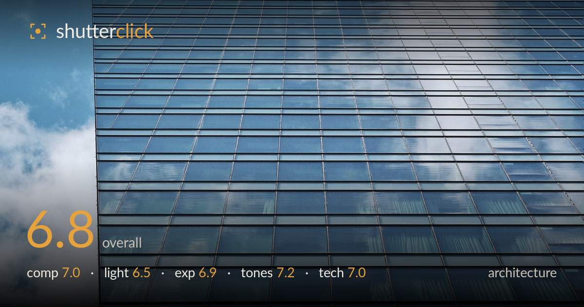
Sky reflected in a glass tower
Photo by Pix-Off

No EXIF metadata in this file
Technical analysis based on visual assessment only.
A clean study of a glass curtain wall that leans into converging lines and the interplay between reflected sky and the grid. The strongest feature is the visual rhythm of the mullions receding into the upper-right corner, with the sky-and-cloud reflections adding softness against the rigid geometry. What holds it back is a lack of a decisive anchor: the frame is nearly all repeated pattern, so the eye drifts without a clear resting point. The left edge, where the building meets open sky, is the most interesting boundary and could carry more weight. Sharpening the concept — either full abstraction or a stronger structural anchor — would lift it.
The diagonal recession of the window grid into the upper right creates real energy and a strong sense of scale. The exposed left edge, where the facade meets sky and cloud, is the composition's best moment — a genuine boundary against pure pattern. The weakness is that the grid fills most of the frame without a focal anchor, so the eye wanders. Placing that sky edge more deliberately, or including a corner of the building's top, would give the geometry something to resolve against rather than repeating uniformly.
Soft, slightly overcast daylight suits a reflective facade — it keeps the glass from blowing out into hard specular hotspots and lets the cloud reflections read as gentle gradients across the panels. The tradeoff is flatness: without directional light there's little modelling on the mullions, so the surface texture and depth of the recessed frames stay muted. A lower sun raking across the facade would carve shadow into each frame line and add dimensionality to the grid, though it would risk harsher reflections.
Exposure is well controlled for a bright reflective surface. The sky reflections in the upper right approach the highlights but retain cloud detail rather than clipping to white, and the darker mullions and lower panels hold their tonal separation. The overall brightness sits comfortably in the mid-to-upper range, appropriate for a high-key architectural subject. There's no evidence of accidental under- or over-exposure here — the values read as deliberate and the dynamic range of the glass is handled cleanly across the frame.
The cool blue palette is coherent and appropriate — the sky, its reflection, and the tinted glass all sit in a unified range of blues that reinforces the subject. Contrast is moderate, letting the grid lines stay crisp against the panels without crushing. The warmer neutral of the mullions provides just enough separation. White balance reads slightly cool, which flatters glass architecture. A touch more contrast or clarity would firm up the grid, but the tonal restraint here works in the image's favour.
Focus is accurate across the grid, and sharpness holds well into the receding upper-right corner, suggesting sufficient depth of field for the oblique angle — a good choice for this subject. Noise is not visible, consistent with good light and a low ISO. The lens appears free of obvious distortion, and the converging lines read as genuine perspective rather than uncorrected barrel or pincushion artefacts. The main technical consideration for architecture is deliberate perspective: here the strong convergence is clearly intentional and used as the compositional engine, which is a legitimate approach, distinct from correcting for straight verticals. The framing keeps the grid lines clean and unbroken, and the exposure preserves detail in both the reflective highlights and the darker frame elements. Execution is solid throughout; the limiting factor is conceptual rather than technical — the image demonstrates competent handling but doesn't push the tools toward a stronger statement.
What would elevate it
Tags
Shot something like this?
Expert photo critique, on demand — scored across six categories, EXIF-aware. Start with 3 free critiques, no credit card.
critique my photo — free