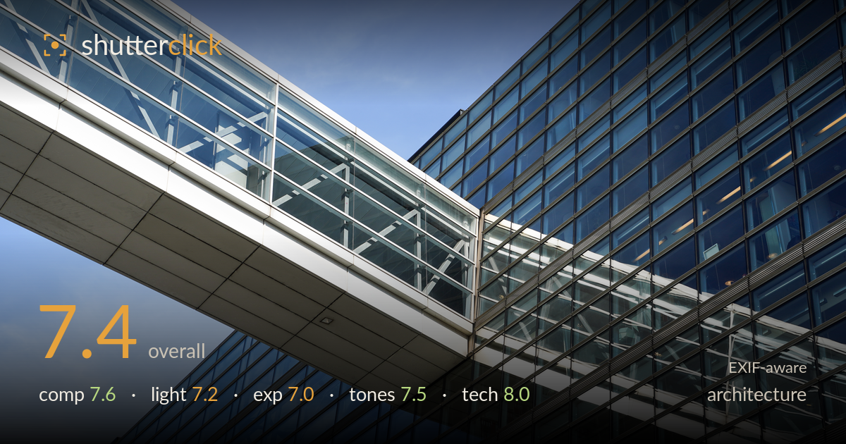
Skybridge crossing a glass facade
Photo by OleNeitzel

| Focal length | 54 mm |
| Aperture | f / 5.6 |
| Shutter | 1/500 s |
| ISO | ISO 125 |
| Exp. comp. | 0.3 EV |
| Shot at | 14:12 · Apr 10, 2025 |
A strong diagonal-driven composition that turns a glass skybridge into a clean graphic study, with the reflected bridge in the facade providing genuine visual interest. The main strength is the interplay between the physical structure and its mirror image, which doubles the diagonal rhythm across the frame. What most holds it back is the highlight handling on the bright white bridge underside and the reflective glass, which pushes toward clipping and flattens some detail. The blue-hour cool cast is pleasant but the shadows in the darker glass lack a touch of separation. Sharp, well-executed, and worth refining.
The dominant diagonal of the skybridge slicing across the frame is the anchor, and its echo reflected in the facade below creates a satisfying X-rhythm. The upward angle exaggerates the geometry effectively and the crop keeps the intersection point roughly at the visual centre, where the two diagonals meet. The strong repeated grid of the glass curtain wall gives texture without competing. A slightly lower framing to include more of the base, or shifting the convergence off-centre, would add tension rather than settling the eye at dead centre.
Direct, high sun rakes the white underside of the bridge and glances off the glass, giving the metal edges a clean, hard-lit crispness that suits the modern subject. The light separates the bright walkway from the darker facade well. The trade-off is harsh specular hits on the reflective glazing that blow out into pure white patches with no roll-off. Softer, lower-angle light near golden or blue hour would tame those hotspots and let the blue tones in the glass deepen with more graduated modelling.
Exposure holds the deep blues of the sky and glass nicely, but the white bridge underside and several glass reflections sit right at the edge of clipping, with the brightest panels reading as detail-free white. The 0.3 EV positive compensation likely nudged those highlights over. The shadow areas within the darker window mullions retain reasonable detail. Pulling exposure down a third of a stop, or bracketing for the highlights, would recover the texture in the white surfaces that currently reads flat.
The cool blue palette is coherent and appropriate for a glass-and-steel subject, with the sky and reflected sky tying together across the frame. Contrast between the white structure and the deep windows is punchy without crushing. The white balance leans cool, which reinforces the modern mood but risks feeling clinical. A touch more mid-tone gradation in the glass would add depth, and slightly warming the whites would keep them from reading grey. Saturation is well restrained.
The settings are well matched to the subject. At 54mm on the 28-75mm f/2.8, f/5.6 delivers front-to-back sharpness across a subject that lies at effectively infinity, which is exactly right for architecture where deep focus keeps every panel crisp. ISO 125 keeps noise negligible and preserves clean tonality in the shadowed glass. The 1/500s shutter is far faster than needed for a static building but does no harm handheld. Focus is accurately placed on the bridge structure and the grid detail holds sharp across the frame. The one technical caveat is the lack of perspective correction: the upward tilt produces converging verticals, which reads as intentional dynamism here rather than error, but a tilt-shift lens or software correction would offer a cleaner geometric option. Overall a technically sound capture with appropriate depth of field, low noise, and reliable focus.
What would elevate it
Tags
Shot something like this?
Expert photo critique, on demand — scored across six categories, EXIF-aware. Start with 3 free critiques, no credit card.
critique my photo — free