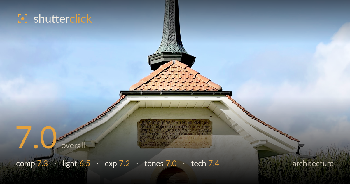
Small chapel at the end of the path
Photo by Conceptuel

No EXIF metadata in this file
Technical analysis based on visual assessment only.
A clean, disciplined symmetrical portrait of a small chapel, anchored by the cobblestone path that leads the eye straight to the arched door. The centred framing and vertical alignment through spire, cross and doorway are handled well and suit the subject. What most holds it back is the flat midday light, which leaves the white facade slightly hazy and the sky a little washed toward the horizon. Verticals are largely true, a real strength for architecture. Tighter attention to the surrounding clutter — the bench and rubble at frame edges — and a warmer hour would lift this from tidy record to atmospheric portrait.
The strict central symmetry is the right call here, and the cobblestone path is an effective leading line drawing the eye from foreground to arched entrance. Vertical alignment through cross, spire, tiled roof and doorway is carefully held. The generous sky gives the spire room to breathe. Less successful is the base: the bench at right, the stone pile and rustic bench at left, and the ragged shrub borders introduce small distractions that pull against the clean geometry. A hair more space at the frame edges would prevent the roof eaves feeling clipped at left and right.
Light is high and near-frontal, typical of midday, which flattens the white plaster and offers little modelling across the facade. The tiled roof and green spire hold some dimensional interest, but the front wall reads as an even, slightly hazy plane with few shaping shadows. The overhang casts a useful shadow line beneath the eaves, giving one band of relief. Softer, lower side light — early or late in the day — would rake across the render, revealing texture in the plaster and warming the sandstone door surround for far more presence.
Exposure is well judged overall. The bright white facade is held just short of clipping, retaining subtle tonal variation in the plaster, and the shaded doorway keeps legible detail. Shadow areas under the eaves and in the foliage stay open without muddiness. The sky is clean and gradates nicely from deeper blue at top toward paler near the horizon, though the lower band edges toward washout. A touch more restraint on the highlights, or a graduated recovery of the upper sky, would preserve richer blue without darkening the building.
White balance is neutral and believable, the blue sky reading cool and clean against warm terracotta tiles and honeyed sandstone. Contrast is moderate and appropriate — the white walls stay bright without glaring. The green corn and lawn are natural rather than oversaturated. The overall palette is pleasant but a little cool and even; the flat light limits tonal separation on the front wall. A slightly warmer grade and a modest lift in local contrast on the facade would give the render more life and better define the architectural detailing.
Execution is sound. Focus is accurate across the building, with the spire's ironwork cross, the tiled roof, and the door woodwork all rendering crisply, indicating a sensible aperture and a sharp lens. Depth of field is deep enough to keep both the foreground path and the distant corn acceptably resolved, appropriate for architecture. Verticals are close to true and the horizon sits level, suggesting either careful camera positioning or competent correction — a clear strength given how easily a tall spire invites keystoning. There is no visible motion blur or objectionable noise; the file looks clean throughout. The focal length compresses the scene naturally without distorting the geometry. The main technical limitation is not the capture itself but the timing of it: the light chosen offers the least dimensional information the subject can give. A polariser would have deepened the sky and cut the slight haze on the plaster, adding punch without post-processing effort.
What would elevate it
Tags
Shot something like this?
Expert photo critique, on demand — scored across six categories, EXIF-aware. Start with 3 free critiques, no credit card.
critique my photo — free