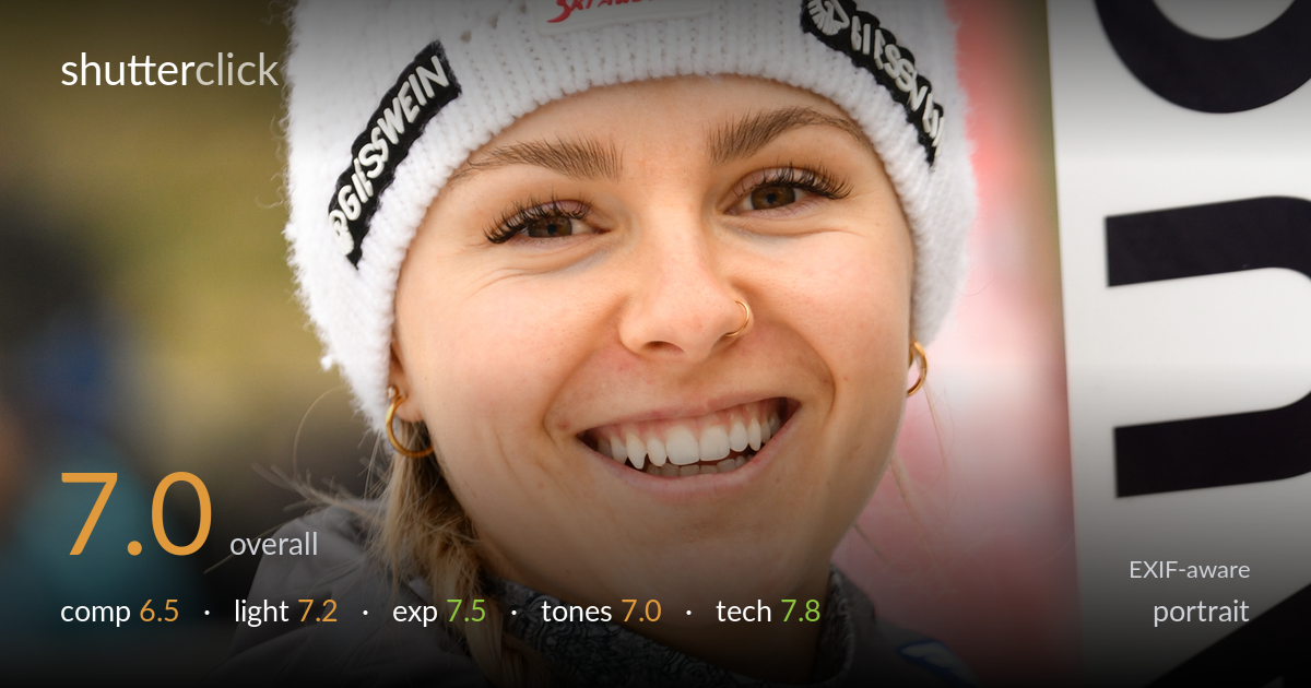
Smiling athlete in a winter cap
Photo by Granada

| Focal length | 125 mm |
| Aperture | f / 3.2 |
| Shutter | 1/320 s |
| ISO | ISO 320 |
| Exp. comp. | 0.0 EV |
| Shot at | 09:47 · Feb 11, 2023 |
A warm, genuine smile carries this athlete portrait, and the sharp eyes with soft natural light make it instantly likeable. The candid energy and clean exposure are the strongest assets. What most holds it back is the cluttered right edge — the dark sponsor banner and bold lettering crowd the frame and pull the eye away from the face. The composition also runs slightly tight, with the subject pushed left against a busy background. A cleaner background relationship and a touch more breathing room would let the expression do all the work it deserves.
The subject sits left of centre with the gaze directed across the frame, which gives the portrait some natural lean and energy. The vertical orientation suits the standing pose. The problem is the right third: the dark banner with hard white and red lettering competes aggressively with the face and flattens the depth. The branding-heavy jacket and signage make the frame feel busy. A wider gap from the banner, or framing that pushes the subject more central with softer surroundings, would let the smile anchor the image without distraction.
Soft, diffused overcast light flatters the skin and renders the smile evenly with no harsh shadows across the face. The catchlights in the eyes are present and lively, which keeps the portrait engaging. Direction is fairly flat and frontal, so the modelling on the cheeks and jaw is gentle rather than sculpted. A hint of directional or side light would add dimension to the features. For a candid event portrait, though, the gentle light is well suited and keeps the focus on the expression.
Exposure is well judged for the conditions. The skin tones sit in a healthy midtone range with no blown highlights on the bright white hat, which is the easiest area to clip here and it holds detail. Shadow areas in the dark jacket retain enough structure without crushing. The histogram appears balanced for an overcast scene, and the zero exposure compensation worked cleanly against the predominantly bright clothing. The face is rendered at a natural brightness that reads as deliberate rather than lucky.
Colour balance leans slightly cool, fitting the overcast snowsport setting, and the skin retains warmth without going sallow. The red of the jacket is saturated but not overcooked, and the white hat stays neutral. Contrast is moderate and pleasant. The mix of strong sponsor colours — red, blue, yellow — does create some visual noise that competes with the skin tones. A subtle warming of the white balance would lift the portrait further, but overall the tonal rendering is clean and believable.
The settings are well matched to the situation. At 125mm on the 70-200mm, the focal length gives flattering compression without distorting the features, an appropriate choice for a head-and-shoulders portrait. Focus lands accurately on the near eye, which is tack sharp with visible eyelash detail and clean catchlights. f/3.2 yields enough separation to soften the background while keeping both eyes and the face within the plane of focus — a sensible compromise. 1/320s is plenty to freeze a stationary subject and any minor head movement. ISO 320 is essentially noise-free on the D850 and well chosen for the overcast light. The only technical limitation is depth of field interacting with the busy background — even at f/3.2 the banner remains too legible to fully recede. A wider aperture or more distance from that signage would have melted it further. Execution overall is clean and confident.
What would elevate it
Tags
Shot something like this?
Expert photo critique, on demand — scored across six categories, EXIF-aware. Start with 3 free critiques, no credit card.
critique my photo — free