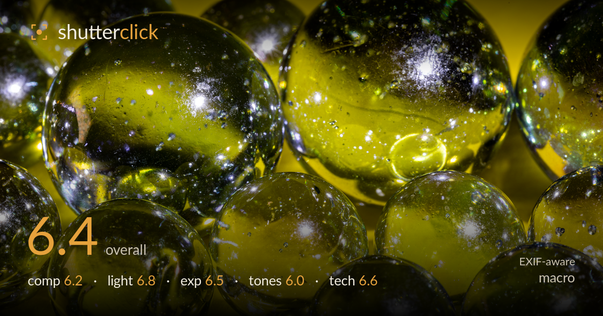
Sparkling yellow glass marbles
Photo by Dietmar Rabich

| Focal length | 105 mm |
| Aperture | f / 18.0 |
| Shutter | 1/20 s |
| ISO | ISO 100 |
| Exp. comp. | 0.0 EV |
| Shot at | 16:23 · Dec 2, 2021 |
The internal sparkle and bubble structure inside these glass marbles is the strongest asset — those pinpoint highlights read like tiny galaxies and reward close inspection. What most holds the image back is the monochromatic yellow overload: a single saturated colour flattens the tonal range and leaves nowhere for the eye to rest. The frame is also densely packed edge to edge without a clear anchor sphere. A cleaner focal hierarchy, one dominant marble sharp against softer neighbours, plus a touch of colour or tonal contrast would lift this from an interesting texture study into a resolved image.
The tight, edge-to-edge packing of spheres creates a pleasing all-over pattern and fills the frame with texture. The problem is the lack of a clear focal anchor — every marble competes equally, so the eye wanders without settling. The large upper-left sphere is the natural candidate for a lead subject but shares weight with several others. A slightly looser arrangement, or one sphere placed off-centre and rendered sharpest, would give the pattern a point of entry rather than an even field of competing highlights.
The light does the real work here, kindling the internal bubbles and cracks into bright specular pinpoints that carry the image. Direction appears frontal and slightly raking, which lifts the trapped-air detail well. The tradeoff is that the strong backlight through yellow glass floods everything in one hue, and the highlights on the glossy surfaces blow to pure white in places. A cooler fill or a secondary raking light would separate the spheres from each other and add dimensional modelling.
Exposure is broadly well judged for a difficult subject — the specular highlights inside the glass clip, which is largely unavoidable, while the deep greens and shadow pockets retain detail. The histogram leans toward the highlights given the bright yellow field, but midtones sit reasonably. A slight negative exposure compensation would have preserved a touch more texture in the brightest sparkles, though the trade against muddying the shadows is real. Overall it reads as deliberate rather than accidental.
The single dominant yellow is both the signature and the limitation. It's a bold, committed colour choice, but with no complementary or neutral tone to push against, the palette flattens and saturation edges toward oversaturated in the brightest areas. The green-to-yellow gradient within the glass is the most nuanced tonal passage. Introducing a cooler element, or dialling saturation back slightly, would restore separation between spheres and give the range more depth without abandoning the yellow mood.
At f/18 on the 105mm, depth of field is stretched to cover multiple spheres, and the diffraction penalty at that aperture is visible as a slight softening of the finest internal sparkles — f/11 would likely have held crisper detail on the key plane while still covering enough depth. Focus lands on the central and front marbles, which is a sound choice, though no single sphere is rendered decisively tack-sharp. ISO 100 keeps the file clean with no meaningful noise, ideal for this controlled setup. The 1/20s shutter is fine on a static subject and implies tripod support, which the sharpness supports. The main technical lever to reconsider is the aperture: closing all the way to f/18 chases depth at the cost of resolution, and a focus-stacked series at a wider aperture would deliver both edge-to-edge sharpness and maximum bubble detail. Execution is competent and clean; the ceiling is set by that diffraction-versus-depth compromise.
What would elevate it
Tags
Shot something like this?
Expert photo critique, on demand — scored across six categories, EXIF-aware. Start with 3 free critiques, no credit card.
critique my photo — free