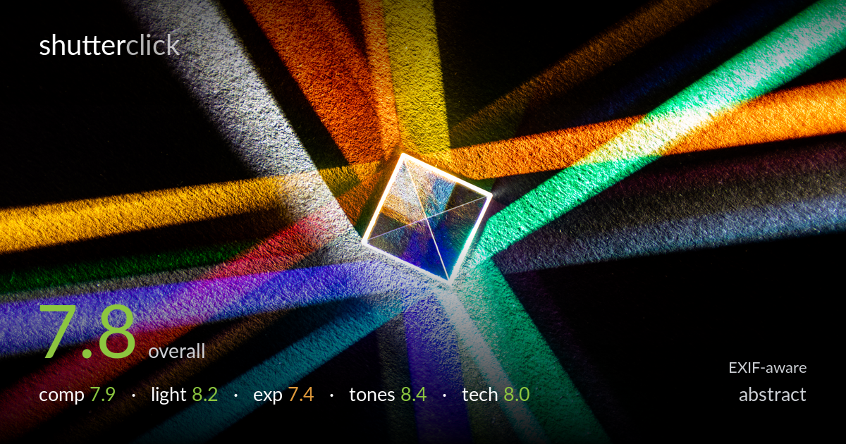
Spectrum beams from a glass cube
Photo by Dietmar Rabich

| Focal length | 105 mm |
| Aperture | f / 7.1 |
| Shutter | 13.0 s |
| ISO | ISO 400 |
| Exp. comp. | 0.0 EV |
| Shot at | 15:32 · Feb 15, 2020 |
A refracted-light study that delivers genuine graphic punch — a spray of coloured beams radiating from a central glass cube against pure black. The full spectrum is present and the radial burst of lines gives strong visual rhythm and energy. The prism placement just right and above centre gives the eye a clear anchor. What holds it back is the slightly cluttered convergence: several beams cross and muddy near the cube, and the brightest core around the glass sits close to blowing out, softening the very detail that would reward a viewer. Tightening the beam separation and protecting that highlight would lift a strong image further.
The radial arrangement of coloured beams is the strength here — lines fan outward and pull the eye straight to the glass cube, which sits just off-centre for a comfortable anchor. The pure black negative space lets the colours breathe. Where it weakens is the lower-right and right edges, where beams crowd and overlap into a tangle that reads as clutter rather than order. The near-symmetry of the burst is satisfying, but a cleaner angular spacing between beams would make each ray distinct and strengthen the star-like geometry.
The refraction is the whole show and it performs well — a single source split into a clean spectrum across the full colour wheel, from deep red through green to violet. The beams have convincing falloff as they travel across the textured surface, giving depth and direction. The glass cube glows with internal reflection, which sells the physics of the image. The main limitation is the intense hotspot at the cube itself, where the light concentration overwhelms the subtler internal facets. Slightly dimming the source would preserve that structure.
Exposure is largely controlled — the black background is genuinely black without crushing the beam edges, and most beams retain colour saturation and gradation. The problem area is the central cube and the whitest beams near it, which push toward clipping and lose the delicate facet detail inside the glass. The 13-second exposure at ISO 400 keeps noise negligible in the shadows, which is well judged. A stop less exposure, or bracketing for the highlight, would have held the core detail while keeping the beams luminous.
The colour rendering is the standout — a clean, believable spectrum with well-separated hues and no obvious cross-contamination in the cleaner beams. Saturation is rich without tipping into garish, and the contrast against the black ground makes each colour sing. White balance reads neutral, letting the spectral colours stay true. The textured surface adds tactile mid-tone gradation along each beam. Only where beams overlap near the cube do the tones muddy into a greyish wash; keeping those crossings cleaner would preserve the palette's clarity.
The settings are well matched to a static tabletop refraction study. The 13-second exposure at ISO 400 is a sound choice — long enough to gather the faint beam ends off the textured surface while keeping noise essentially invisible in the deep blacks, which is critical here. f/7.1 gives enough depth of field to hold the cube and the surrounding surface acceptably sharp at 105mm, a focal length that compresses the scene nicely and isolates the subject. Focus sits on the glass cube, which is where it belongs, and the facet edges are rendered crisply. The main technical shortfall is highlight management rather than gear: the brightest core and whitest beams edge into clipping, and the internal facets of the cube lose detail as a result. Stopping down marginally or reducing the source intensity would have retained that. A tripod was clearly used and paid off in stability. Overall a clean, deliberate technical execution with only the highlight ceiling to address.
what would elevate it
tags
Shot something like this?
Expert photo critique, on demand — scored across six categories, EXIF-aware. Start with 3 free critiques, no credit card.
critique my photo — free