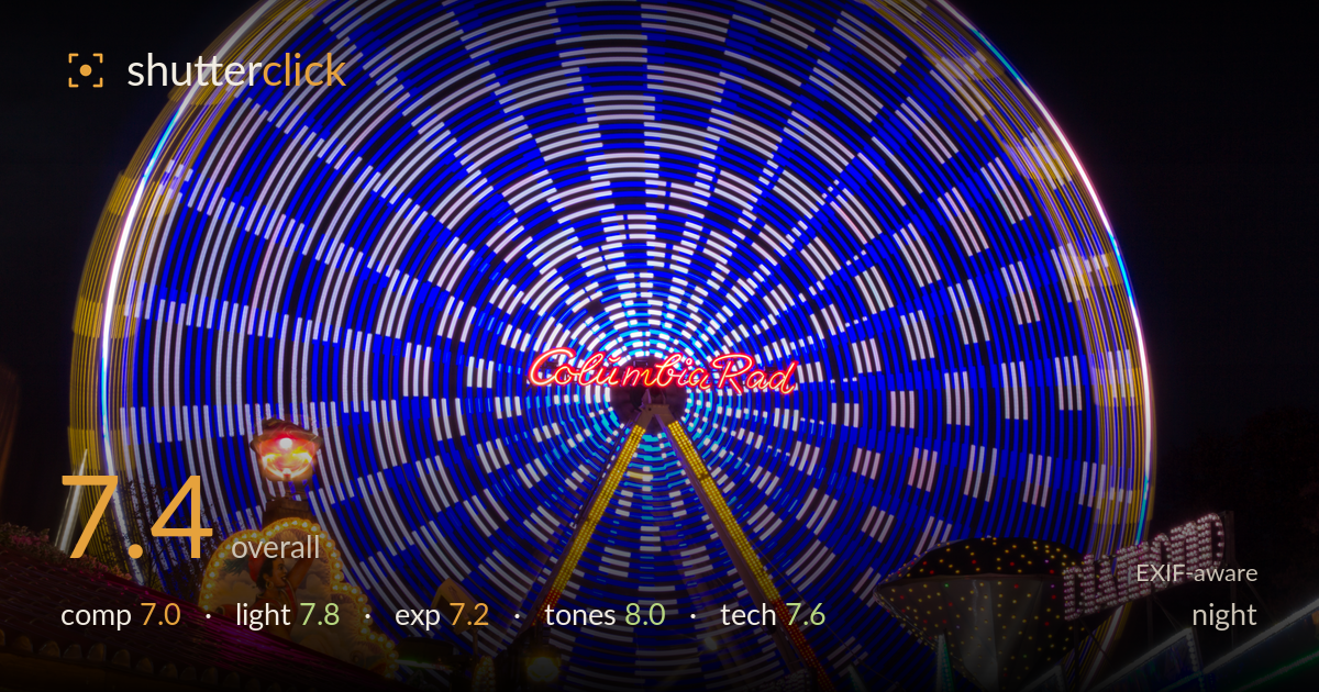
Spinning ferris wheel at the fair
Photo by Dietmar Rabich

| Focal length | 55 mm |
| Aperture | f / 22.0 |
| Shutter | 2.0 s |
| ISO | ISO 100 |
| Exp. comp. | 0.0 EV |
| Shot at | 19:22 · Oct 10, 2014 |
The spinning Ferris wheel is the clear star here, its long-exposure motion smearing the lights into a hypnotic mandala of blue and white that anchors the whole frame. The dense fairground clutter at the base gives context and colour, but it also competes hard for attention and crowds the lower third. The wheel sits well but reads slightly cramped at top and left. Colour is the standout strength — saturated, festive, and well controlled. The main improvements are taming the busy foreground, giving the wheel a touch more breathing room, and reining in a few blown highlights among the ride signage.
The wheel dominates as intended, its radial symmetry pulling the eye to the glowing 'Columbia Rad' hub, and the yoke legs converging toward the base add a pleasing anchor. The lower band of stalls and rides is dense and chaotic, though — many bright competing elements fight the wheel for attention without a clear secondary subject. The wheel also touches the top edge and crops tight at left, losing a little of its circular completeness. More sky above and a cleaner foreground element would let the main subject breathe and read as the singular focus it deserves.
This is entirely artificial fairground light, and the timing against a fully dark sky is right — the black backdrop isolates the illuminated wheel and lets the colours sing. The mix of warm tungsten bulbs on the left stall against the cool blue wheel gives good chromatic contrast and depth. The many point-source bulbs create pleasant sparkle. The trade-off is that with no ambient fill, the structural framework of the wheel and rides disappears into shadow, and some signage lights are locally overpowering, drawing the eye away from the intended centre.
The two-second exposure balances the dark sky against the bright lights reasonably well, holding the blue wheel's midtones without crushing them into a solid mass. Shadow areas are deep and clean thanks to base ISO. The weak point is highlight control: several of the warm bulb strings on the left stall and a few ride signs clip to pure white with no detail, and the central lamp near the wheel's hub blooms. A slightly shorter exposure or a stop of negative compensation would have preserved more of that bright signage detail.
Colour is the strongest element — the saturated electric blue of the wheel plays beautifully against the warm amber stall and the green and magenta accents, a genuinely festive palette that suits the subject. White balance reads natural for mixed artificial light, keeping the tungsten warm and the LED blues cool without an overall cast. Contrast between the black sky and lit elements is punchy. Saturation is pushed but stays this side of garish. The only caution is that the brightest reds and whites edge toward oversaturation in the clipped areas.
The settings are well matched to the goal. A two-second shutter is exactly what's needed to render the Ferris wheel as smooth continuous light trails rather than frozen bulbs, and it delivers that circular motion cleanly. ISO 100 keeps noise negligible and the shadows clean, appropriate for a tripod-based long exposure. The 55mm focal length on the crop body frames the wheel and its surroundings sensibly. The one questionable choice is f/22 — while it maximises depth of field and produces the pointed starbursts on the static bulbs, that aperture pushes well into diffraction territory on this sensor, softening fine detail across the frame. Something around f/11 would have preserved the long-exposure effect and most of the depth of field while keeping the stationary lights and signage crisper. Focus is accurate on the static elements. Overall a technically sound execution of a demanding long exposure, held back only by the diffraction cost of that very small aperture.
What would elevate it
Tags
Shot something like this?
Expert photo critique, on demand — scored across six categories, EXIF-aware. Start with 3 free critiques, no credit card.
critique my photo — free