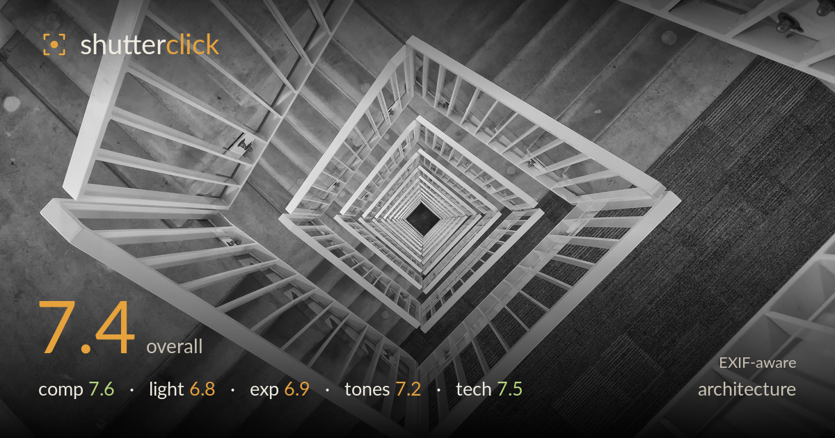
Spiral staircase from above
Photo by Virtual-Pano

| Focal length | 28 mm |
| Aperture | f / 6.7 |
| Shutter | 1/30 s |
| ISO | ISO 400 |
| Exp. comp. | 0.0 EV |
| Shot at | 15:32 · Aug 16, 2018 |
A downward stairwell spiral built on nested concentric squares that recede convincingly toward the dark void at centre — the recurring geometry is the picture's engine and it delivers a satisfying vortex. What holds it back is that the vanishing point sits slightly off-centre and the surrounding floor is given too much weight, so the eye splits between the graphic spiral and expanses of plain concrete and carpet. Tightening the frame around the spiral and squaring the alignment would concentrate the impact. Tonally it's clean and the white rails read crisply against the mid grey, but the range is a touch flat.
The nested squares create a strong recursive pull toward the black centre, and the diagonal orientation of the rails adds energy over a flat top-down. The problem is balance: the spiral sits left of centre while the right third is dominated by carpet and concrete that add little, and the top-left flight competes with the main vortex. A tighter, more centred crop on the recursion would let the geometry breathe without the dead surrounding floor diluting it. The off-axis vanishing point weakens the symmetry the subject invites.
The light is soft, flat interior illumination — even across the stairwell, which keeps the rails legible at every level but gives little modelling or drama. Shadows are gentle and there's no directional raking to reveal the concrete's texture or carve depth between the descending flights. For a graphic subject like this the flatness is workable, but a stronger fall-off toward the centre void would deepen the sense of plunge. The bright rails hold their edges cleanly, which matters most here.
Exposure is safely placed — the white rails sit just below clipping and retain edge detail, while the central void reads as true black without swallowing the innermost squares. Midtones on the concrete and carpet are held well. It's a touch flat overall, sitting in a compressed grey band that could use more separation, and some of the lower rails lose contrast against the mid-grey floor. Nothing is lost at either end, so the latitude for a stronger contrast curve in post is fully there.
The monochrome conversion is clean and appropriate for this geometric subject, letting form dominate over colour distraction. Whites are bright, the void is deep, but the mid-tones — concrete, carpet, shadowed rails — cluster into a narrow grey range that flattens the image. A firmer contrast curve or a slight black-point lift would give the descending flights more tonal separation and reinforce the sense of depth. Highlight roll-off on the rails is well controlled with no harsh blowouts.
The settings are reasonable for a static handheld interior. At 28mm and 1/30s, camera shake is a genuine risk, but the rails hold acceptably sharp at the near levels, suggesting steady handling — though the innermost squares soften slightly, partly from distance and the compressed depth of field at f/6.7. That aperture is a sensible middle ground: enough depth to keep the layered rails legible while not forcing the shutter dangerously slow. ISO 400 keeps noise unobtrusive in the shadows and the carpet texture. The 28mm focal length suits the wide, enveloping look-down and its mild distortion actually aids the spiral effect. Focus appears set on the mid rails, which is the right call for a recursive subject. A slightly faster shutter, or bracing against the rail, would guarantee critical sharpness through more of the frame; stopping to f/8 with the camera steadied would have added little penalty and marginal depth. Solid, deliberate execution overall.
What would elevate it
Tags
Shot something like this?
Expert photo critique, on demand — scored across six categories, EXIF-aware. Start with 3 free critiques, no credit card.
critique my photo — free