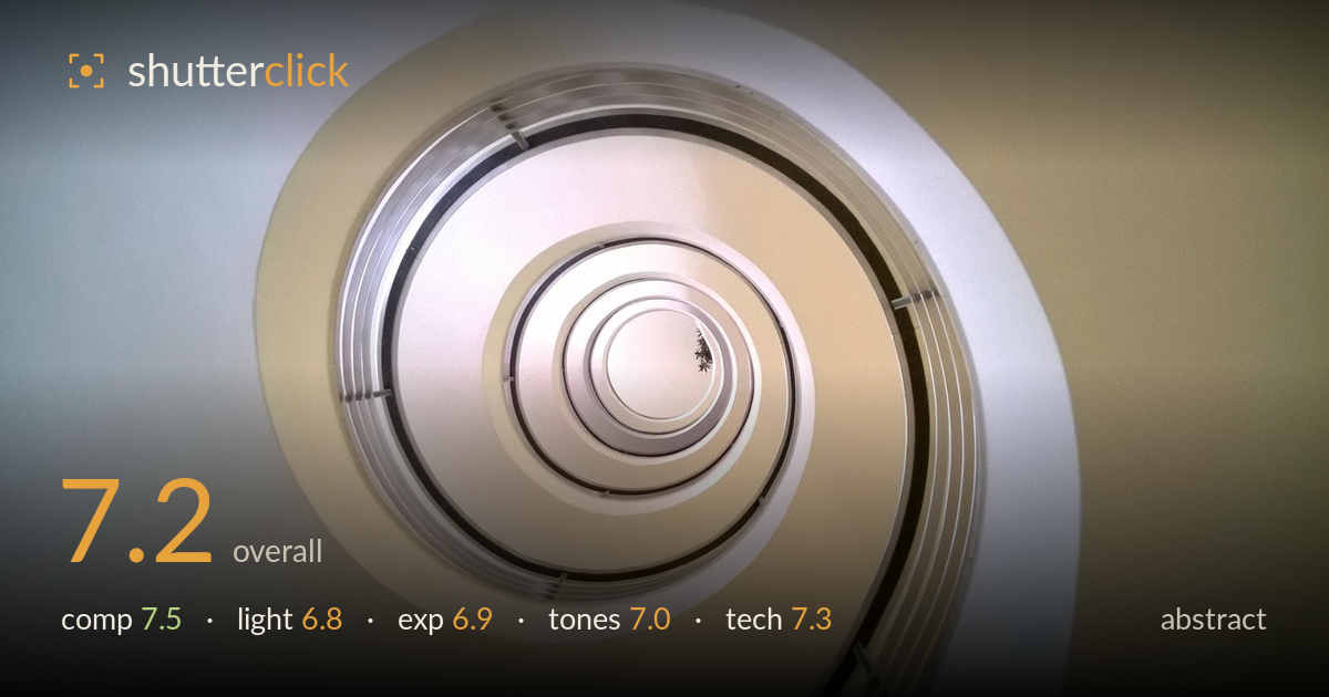
Spiral staircase from below
Photo by gourmasia

No EXIF metadata in this file
Technical analysis based on visual assessment only.
A spiral staircase seen from below reads as a clean, satisfying abstract — the concentric rings and inward pull toward the pale core carry real graphic momentum. The spiral's natural logarithmic curve is the strongest asset, guiding the eye inward with rhythm. What most holds the frame back is the placement of the spiral's centre: pushed toward the middle-left, it leaves the right and lower-right corners as broad, empty warm-grey fields that dilute the tension. The tonal palette is soft and coherent but slightly flat, and the brightest inner rings edge toward washing out. Tightening the crop and adding contrast would sharpen the impact of an already promising shape.
The spiral is the whole picture and it works — concentric rings drawing the eye inexorably toward the bright core, a satisfying use of natural rhythm. The off-centre placement of that core, sitting left of middle, creates asymmetry that mostly helps. What weakens it is the large expanse of empty wall filling the right and lower-right, which reads as dead space rather than intentional negative space. A crop that pulls the spiral's centre nearer a thirds intersection, or fills more of the frame with the coils, would concentrate the graphic pull.
The light is soft and even, natural for an indoor stairwell shot upward, and it renders the metallic rings with gentle gradation rather than harsh glare. That softness suits the calm, minimal mood. The trade-off is a lack of directional modelling — nothing rakes across the surfaces to reveal texture or add dimensionality, so the coils read as slightly flat. The subtle brightness gradient from the darker lower-left to the lit core does create a mild sense of depth, which is the lighting's best contribution here.
Exposure is generally controlled, holding detail across most of the frame with no gross clipping. The brightest inner rings near the core do push toward the top of the range and lose a little separation, flattening the very centre where the eye lands. Shadow areas in the darker ring bands retain adequate detail. The overall placement is a touch high and low-contrast, giving a slightly hazy, milky feel. Pulling the highlights back a fraction would restore definition to the innermost coils that currently blend together.
The palette is a restrained blend of warm cream and cool blue-grey, and that split between the two wall fields gives the frame quiet colour interest without distraction. White balance sits neutral-to-warm, appropriate for the setting. The main limitation is low overall contrast — the tones cluster in a narrow midtone band that mutes the image and softens the spiral's punch. A modest contrast lift, deepening the darker ring bands while protecting the brightest core, would give the coils more separation and make the graphic form snap.
Focus is accurate across the plane of the spiral, with the metallic ring edges and the small central detail rendered crisply enough to hold up, and depth of field is sufficient to keep the whole coil sharp — appropriate for a static architectural abstract. Noise is well controlled and the surfaces stay clean, suggesting a sensible ISO for the available light. The lens choice captures the full spiral without obvious distortion warping the circles, which matters for this kind of geometric subject. What could be executed more deliberately is framing precision: the spiral isn't quite squared to the frame, leaving those uneven empty corners. Levelling the camera axis so the outermost coil relates more symmetrically to the edges, or shooting from a position that centres the vanishing point more purposefully, would tighten the geometry. Technically this is competent, clean work; the room to grow is in compositional discipline at capture rather than in exposure or focus.
What would elevate it
Tags
Shot something like this?
Expert photo critique, on demand — scored across six categories, EXIF-aware. Start with 3 free critiques, no credit card.
critique my photo — free