Spiral staircase from below
Photo by JessicaKwok

No EXIF metadata in this file
Technical analysis based on visual assessment only.
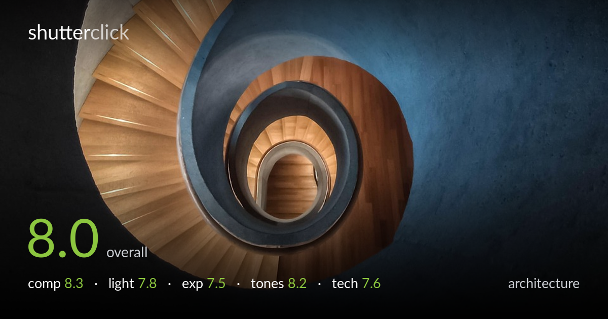
A spiral staircase shot from below that reads as a clean, deliberate study of form — the eye spirals inward toward the bright core almost effortlessly. The interplay of warm timber treads against the cool blue inner wall is the image's strongest asset, and the geometry is genuinely satisfying. What most holds it back is the heavy dead weight of the upper-frame ceiling, which occupies the top third with little reward, and a slightly muddy shadow transition at the right edge. Tightening that empty zone and recovering a touch of shadow detail would let the spiral do all the work.
The spiral is the whole picture and it's well exploited — the curve of treads winds the eye steadily toward the bright central well, a textbook use of a natural leading form. Placement of the core in the lower-left of centre keeps it from feeling static. The weakness is the upper third: a large expanse of dim ceiling and concrete that adds atmosphere but little structure, pulling weight away from the subject. A tighter framing or a viewpoint that fills more of the frame with the spiral would intensify the graphic pull.
Light is the quiet hero here, raking along the underside of the treads to model each step and separate the warm timber from the cool wall. The glow at the central well gives the spiral a destination and depth. Direction is largely soft and ambient, which suits the architecture, though the upper ceiling falls into flat, undifferentiated shadow that reads as absence rather than mood. The brightest highlight on the outer concrete ring is handled well and anchors the curve without blowing out.
Exposure is well judged for a high-contrast interior — the bright central core holds detail and the timber midtones sit cleanly. Shadow areas in the upper frame and along the right wall slide into near-black with little recoverable information, which is partly intentional but borders on muddy rather than deep. The histogram appears weighted toward the low end with a controlled highlight spike at the centre. A touch more shadow lift in post would reveal texture in the concrete without flattening the mood.
The warm-cool contrast is the tonal signature here and it works beautifully — amber timber against the desaturated slate-blue inner wall creates a calm, considered palette. White balance feels deliberate, leaning cool overall with the wood providing the only real warmth. Tonal gradation across the blue wall is smooth and free of banding. Saturation is restrained and tasteful. The only caveat is that the darkest shadows lose tonal separation, collapsing detail that could add richness to the lower corners.
Focus appears accurate across the spiral, with the treads holding crisp edges and the central well staying legible despite its distance — depth of field is sufficient for the geometry, suggesting a sensible aperture for the available light. There's no obvious motion blur, so the camera was held or supported steadily through what was likely a longer exposure given the dim interior. Noise is well controlled in the midtones, though the deep shadows show some softness and loss of fine texture that may be exposure-driven rather than a focus issue. The wide framing captures the full spiral cleanly without obvious distortion bending the curves unnaturally. Verticals aren't the concern in an upward spiral study, so keystoning isn't a factor here. Overall execution is solid and unfussy; the main technical gain would come from bracketing or a slightly brighter base exposure to preserve shadow detail without lifting noise in post.
what would elevate it
tags
Shot something like this?
Expert photo critique, on demand — scored across six categories, EXIF-aware. Start with 3 free critiques, no credit card.
critique my photo — free