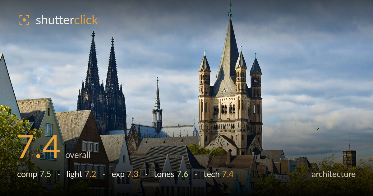
Spires above the old town
Photo by gaocg2018

No EXIF metadata in this file
Technical analysis based on visual assessment only.
A well-layered cityscape-style architectural view that stacks the colourful gabled townhouses against the massive spires of the cathedral and the Romanesque church tower, building genuine depth. The strong point is the tiered composition and the tonal contrast between warm facades, blue sky and green foliage. What most holds it back is the heavy foliage intrusion along the bottom third, which crowds the lower buildings, and a slightly flat, hazy midday light that mutes the stonework. The two dominant vertical structures compete a little for attention without a clear hierarchy, and the framing feels tight at the top.
The layered stacking of trees, gabled townhouses, and towering spires creates strong depth and a satisfying sense of a dense old town. The colourful facades anchor the lower band well. However, the foliage along the bottom edge climbs too high and swallows the base of the houses, denying them a clean footing. The two tallest structures — cathedral spires and church tower — pull the eye in opposite directions without a resolved hierarchy. The tip of the church spire also nearly grazes the top edge, leaving little breathing room.
The light is soft and diffused under a partly cloudy sky, which keeps shadows gentle across the facades and avoids blown highlights. Some warmth reaches the sandstone of the church tower, giving it modelling and separating it from the cooler grey cathedral spires. Overall, though, the illumination reads as fairly flat midday light — the stonework lacks the raking directionality that would carve out its Gothic tracery and relief. A lower sun would add dimensionality and richer shadow play across the ornate surfaces.
Exposure is well controlled across a tricky range. The bright cloudy sky retains detail without clipping, and the shadowed dark spires of the cathedral still hold structure rather than crushing to black. The colourful facades sit at a natural, readable midtone brightness. The dynamic range is handled competently for a high-contrast scene of dark stone against bright sky. Nothing here reads as accidental — the balance across highlights and shadows appears deliberate and even, with only the darkest spire recesses approaching the shadow floor.
The colour palette is a real strength — the pastel yellows, pinks, blues and whites of the townhouses read cleanly against the cool grey sky and the fresh and turning greens of the trees. White balance is neutral and believable, with the warm sandstone tower holding its own hue against the cooler cathedral. Saturation is pleasing without tipping into garish. Contrast is moderate, appropriate to the soft light, though the greyer sky and stone occupy a slightly flat middle band that could use a touch more separation.
The image shows good sharpness across the frame, with fine architectural detail resolved in the cathedral tracery and the church tower's arched windows, suggesting a well-chosen aperture and a focal length in the moderate-telephoto range that compresses the layers effectively. Depth of field is deep enough to hold both the near houses and distant spires acceptably crisp. Noise is not a visible concern. The main technical consideration is verticals: the towers lean very slightly and could benefit from perspective correction, though the deviation is modest for a long lens. Focus appears accurately placed on the mid-to-far architecture, which is the right decision. The compression flattens the depth relationship a little, making the church tower and cathedral feel closer together than they are — a natural consequence of the lens choice rather than an error. Overall execution is clean and controlled; the frame is well resolved from foreground foliage through to the most distant spire.
What would elevate it
Tags
Shot something like this?
Expert photo critique, on demand — scored across six categories, EXIF-aware. Start with 3 free critiques, no credit card.
critique my photo — free