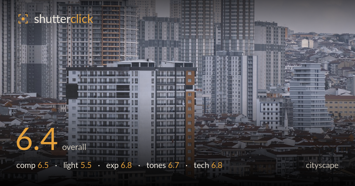
Stacked towers over a sea of rooftops
Photo by mostafa_meraji

No EXIF metadata in this file
Technical analysis based on visual assessment only.
A dense, layered study of urban sprawl that reads well as a document of high-rise saturation. The compression of towers stacked against low red-tiled rooftops gives a strong sense of scale and repetition. What most holds it back is the flat, overcast light that flattens depth and leaves the frame tonally uniform, and the lack of a clear anchor — the white central tower competes with several others of equal weight. A stronger focal hierarchy and a moment of directional light would lift this from a competent record into a compelling statement about the density it depicts.
The stacking of towers behind a sea of red-tiled roofs conveys density effectively, and the white central building gives the eye a provisional resting point. The telephoto compression works in the image's favour, flattening layers into a wall of urbanity. Balance is decent but the frame lacks a decisive anchor — several towers pull equally for attention. The sky occupies a large flat band across the top with little to justify it. A tighter crop that reduced dead sky and elevated one dominant structure would sharpen the read.
Flat, diffuse overcast light dominates, and it suits the muted, documentary mood of concrete uniformity — but it does the buildings no favours. Without direction, the facades lack modelling; windows and balconies read as texture rather than form, and the towers merge tonally into one another. There are no shadows to separate planes or lend depth. A low, raking side light near golden hour, or the blue-hour balance of window lights against ambient sky, would carve dimension into this dense grid and give the scene the drama its scale deserves.
Exposure is handled carefully for the difficult flat conditions. Highlights on the pale sky and white tower hold without clipping, and shadow detail survives in the darker recesses between buildings. The histogram sits compressed in the midtones, which is honest to the overcast conditions rather than a fault. Nothing is blown or crushed, and the balance across the frame is even. The trade-off is a lack of tonal punch, but that stems from the light, not the exposure decision itself, which reads deliberate and controlled.
The desaturated, cool-leaning grade reinforces the concrete-jungle mood, and the restrained palette of greys punctuated by rusty rooftops holds together well. White balance sits slightly cool, which fits the atmosphere. Contrast is intentionally low, keeping the flat, hazy feel, though it borders on muddy in the mid-grey towers where separation suffers. The red-tiled roofs provide the only meaningful colour accent and anchor the lower third. A touch more local contrast on the towers would restore separation lost to the atmospheric haze without breaking the mood.
The image shows the hallmarks of a long telephoto lens, which compresses the layers of buildings into the dense stack that defines the frame — a sound choice for this subject. Focus falls on the central white tower and the mid-ground buildings, which are acceptably sharp, though fine detail softens toward the hazy background, partly from atmospheric distance rather than focus error. Depth of field appears broad enough to hold the layers, appropriate for a cityscape where front-to-back sharpness matters. Noise is well controlled and the file looks clean in the shadows. The main technical limitation is the haze eating micro-contrast in the distant towers, which no aperture choice fully solves — it is a condition of the day. Verticals read reasonably true, without obvious keystoning, suggesting a level shooting position. A slightly faster shutter or steadier support would ensure the finest window detail is critically sharp, but overall execution is solid and controlled.
What would elevate it
Tags
Shot something like this?
Expert photo critique, on demand — scored across six categories, EXIF-aware. Start with 3 free critiques, no credit card.
critique my photo — free