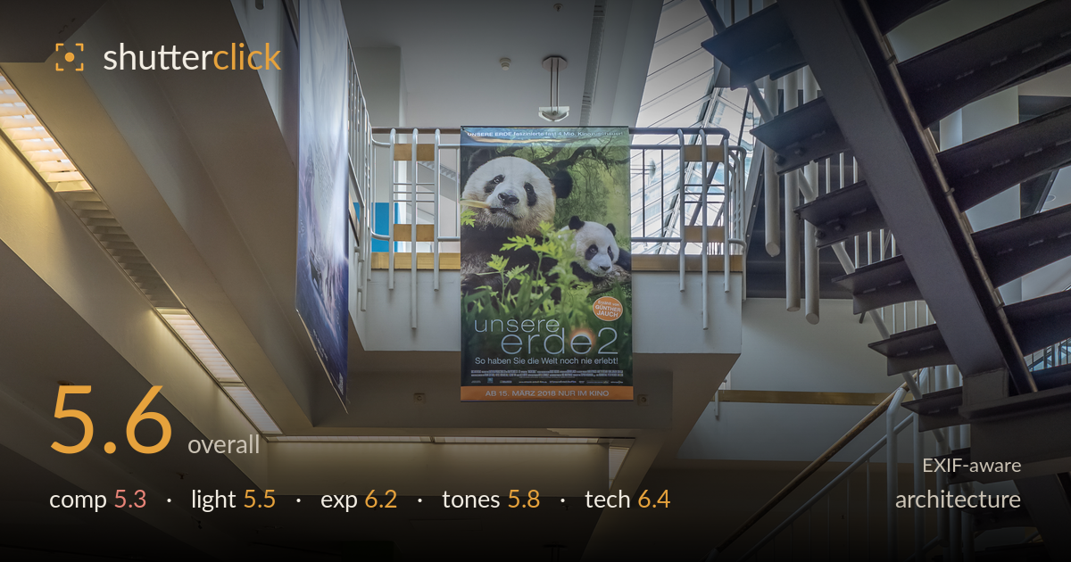
Staircase in a cinema lobby
Photo by Ermell

| Focal length | 12 mm |
| Aperture | f / 2.8 |
| Shutter | 1/60 s |
| ISO | ISO 200 |
| Exp. comp. | 0.0 EV |
| Shot at | 17:16 · Apr 17, 2018 |
A busy cinema-lobby interior that reads more as documentation than composed architecture. The suspended panda poster anchors the frame and the diagonal staircase brings genuine energy, but the two compete rather than cooperate, and the space overall feels cluttered — posters, railings, signage and floor decals all pulling attention with no clear hierarchy. Verticals lean inward, which for an architectural frame undercuts the sense of built order. The strongest asset is the layered depth across three floor levels. Tightening the geometry, correcting the leaning verticals and choosing a single dominant subject would lift this from record shot to considered interior.
The frame carries a lot at once: the hanging panda poster centred high, the staircase cutting diagonally through the right, floor decals bottom-left, and movie posters far left. That layering builds real depth, but there's no clear hierarchy, so the eye wanders without settling. The staircase diagonal is the most dynamic line and could carry the shot on its own with a tighter frame. As it stands, the poster and stair fight for dominance. A decisive choice between the two, with the other reduced to context, would strengthen the read.
The interior is lit by a mix of overhead fluorescents, cove lighting and daylight spilling from skylights, giving generally flat, even illumination with few strong shadows. That evenness keeps detail readable throughout but offers little drama or modelling to shape the architecture. The brightest patches near the ceiling skylights and the fluorescent strips draw the eye upward, competing with the poster. Directional or raking light across the stair structure would reveal its form far more; the current flat wash leaves the metalwork reading as silhouette rather than sculpted volume.
Exposure is well managed for a high-contrast mixed-light interior. The bright skylight areas and fluorescent strips near the ceiling hold just short of blowing out, while the darker stair treads and shadowed left side retain workable detail. The midtones on the tiled floor and walls sit at a natural brightness. A few of the brightest ceiling patches show minor clipping, but nothing distracting. Overall the dynamic range is used sensibly with no obvious lift-the-shadows crush or accidental underexposure — a solid, deliberate-looking balance for a tricky scene.
White balance drifts cool overall, with a slight green-cyan cast typical of fluorescent lighting that leaves the whites and ceilings looking clinical rather than neutral. The green pillar and the panda poster foliage add welcome colour anchors. Contrast is moderate and the tonal range is broad, but the palette feels muted and slightly muddy in the shadowed left third. A warmer, more neutral white balance would clean up the ceilings and give the tiled floor more life. Saturation is restrained and appropriate for the setting.
At 12mm on the E-M1 Mark II this is a sensible wide choice for a cramped interior, and ISO 200 keeps noise negligible with clean shadow detail. The main technical weakness is aperture: f/2.8 is unnecessarily wide for an architectural scene that wants front-to-back sharpness. Stopping down to f/5.6–f/8 would sharpen the far posters and near floor decals alike while still leaving 1/60s manageable — or a tripod would allow a slower shutter at base ISO. Focus appears set around the mid-ground stair and poster, which holds, but the corners soften. The bigger issue is uncorrected perspective: the verticals converge noticeably inward, a hallmark of tilting the camera up with a wide lens. A level camera position, a shift lens, or careful post correction would fix the keystoning. Sharpness where focused is good and the lens handles the wide field with controlled distortion. The settings suggest a grab-shot approach rather than the deliberate technical setup architecture rewards.
What would elevate it
Tags
Shot something like this?
Expert photo critique, on demand — scored across six categories, EXIF-aware. Start with 3 free critiques, no credit card.
critique my photo — free