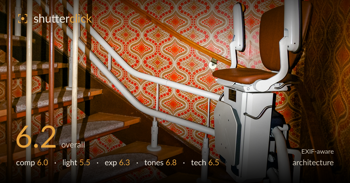
Stairlift in a retro stairwell
Photo by Friedrich Haag

| Focal length | 10 mm |
| Aperture | f / 4.0 |
| Shutter | 1/60 s |
| ISO | ISO 400 |
| Exp. comp. | 0.0 EV |
| Shot at | 17:09 · May 8, 2009 |
This reads more as documentary interior than pure architecture, and its strongest asset is the collision of eras: a clinical white stairlift bolted into a boldly patterned retro-orange stairwell. The wallpaper and step runners give the frame character and a genuine sense of place. What holds it back is spatial legibility — the stairlift, banister rails, and stair treads compete for the same visual weight, and the wide 10mm lens stretches the geometry so nothing settles as a clear subject. Softer, uneven ambient light flattens the forms. A more considered angle and cleaner light would let the contrast of old and new land with more force.
The diagonal of the staircase gives the frame a natural line, and the stairlift anchored to the right creates a deliberate old-versus-new tension worth pursuing. But the vertical banister rails slice through the foreground and clutter the left third, and the busy wallpaper flattens depth rather than adding it. The subject is ambiguous — eye bounces between chair, treads, and pattern with no clear resting point. A position that isolated the stairlift against the pattern, or led the eye cleanly up the steps, would resolve the competing elements.
The light is soft, ambient, and largely directionless — practical for showing the scene but doing little to shape it. Shadows fall unevenly, with the rail casting a harder line across the left steps while the right side sits flatter, giving an inconsistent read of form. Nothing models the sculptural curves of the stairlift or brings out the depth of the runner texture. A raking window light or a considered fill would carve out the geometry and separate the white chair from the busy backdrop rather than letting both sit in the same muted glow.
Exposure is broadly well judged for a difficult mixed interior. The white stairlift holds highlight detail without clipping, and the warm midtones sit at a reasonable level. Shadow areas on the left stair returns and beneath the treads go murky and lose separation, which is where the frame is weakest. The overall balance leans slightly dark, muting the energy of the wallpaper. A touch more brightness in the shadows, whether via exposure or a lifted curve in post, would open the lower steps and let the pattern breathe.
The warm palette is the frame's most cohesive quality — the orange wallpaper, honey timber treads, and greige runners hold together in a consistent retro register. White balance leans warm, which suits the domestic mood, though it edges toward a slightly heavy amber cast that mutes the reds. The neutral grey of the stairlift provides useful tonal relief against all that warmth. Contrast is a little flat in the shadows. A minor pull back on the warmth and a small contrast lift would let the pattern's oranges read with more punch.
The 10mm focal length is the defining technical decision, and it cuts both ways. It captures the full stairwell in a tight space, but it stretches the geometry hard — the banister rails bow, the treads exaggerate, and the stairlift looms disproportionately large at the right edge. For architecture this distortion works against the clean verticals the genre rewards. At f/4 depth of field is sufficient across this near-far scene given the wide angle, and focus appears accurate on the stairlift and steps. 1/60s handheld is on the edge for a static interior but has held sharp enough here, and ISO 400 keeps noise controlled with only mild grain in the shadows. The older 350D sensor limits dynamic range, which shows in the blocked-up shadow areas. A longer focal length shot from further back, or careful perspective correction in post, would tame the keystoning and let the space read more honestly.
What would elevate it
Tags
Shot something like this?
Expert photo critique, on demand — scored across six categories, EXIF-aware. Start with 3 free critiques, no credit card.
critique my photo — free