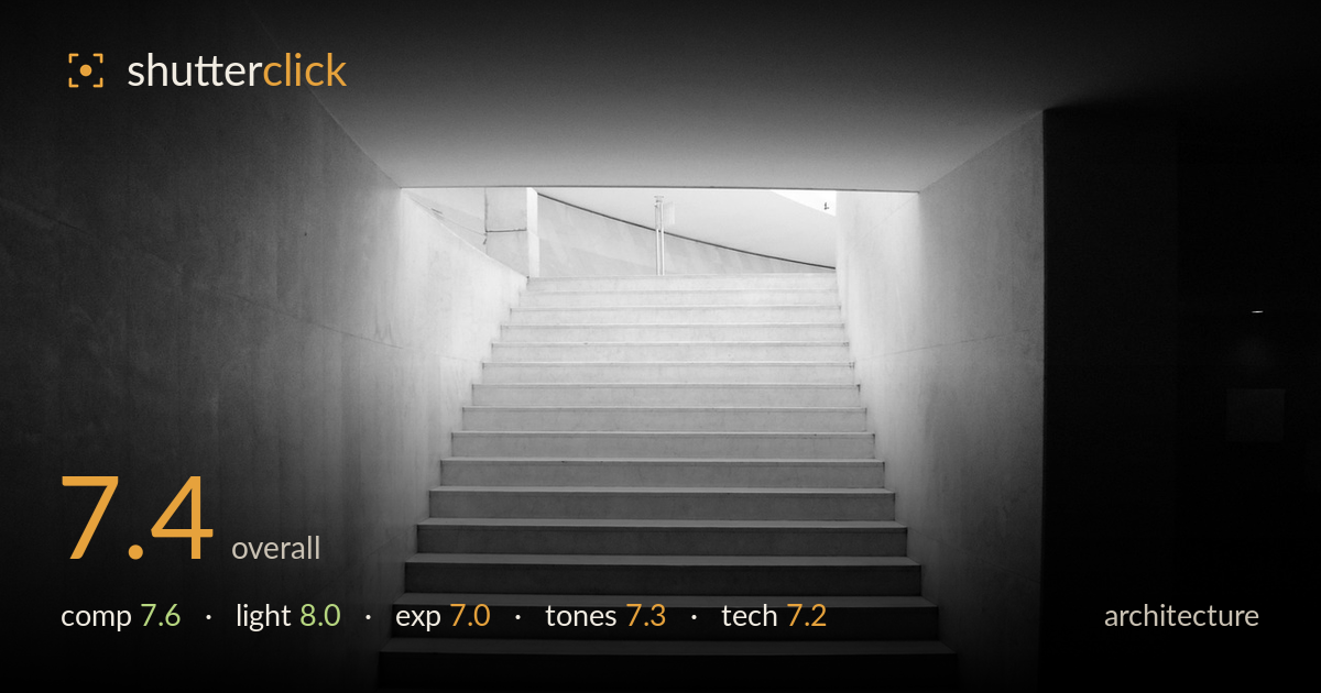
Stairway toward the light
Photo by JoseBenedito1307

No EXIF metadata in this file
Technical analysis based on visual assessment only.
A confident use of light and dark that turns a plain staircase into a study of emergence from shadow. The flanking walls funnel the eye upward toward the bright opening, and the monochrome treatment suits the minimal geometry. What most holds it back is the near-central symmetry that isn't quite symmetrical — the right wall is heavier and swallows more frame than the left, tipping the balance slightly. The bright top-right corner also pulls attention away from the stair. Tighter control of the framing and a touch more shadow separation in the darkest walls would sharpen an already striking concept.
The converging walls act as strong leading lines, drawing the eye up the stairs to the light. The near-symmetrical, centred placement of the staircase reads as deliberate and works for the architectural subject. However, the balance is slightly off: the right-hand black wall consumes more frame and weighs the composition down on that side, while the small bright cutout top-right competes with the main light source. Squaring the verticals and evening the two side masses would lock the geometry more precisely.
The light is the strongest element here — a single bright source at the top of the stairs glows against the surrounding darkness, giving the image its sense of drawing toward an exit. The raking illumination skims across the step edges, defining each tread and giving the flight rhythm and depth. Shadow gradation on the left wall reads naturally. The high-key opening avoids feeling blown thanks to the enclosing dark frame, which makes the transition from dark to light the entire point of the picture.
Exposure is judged for effect rather than even coverage, and mostly succeeds. The bright opening holds just enough detail before rolling to white, and the step highlights retain texture. The darkest walls, particularly the right side, block up into near-total black with no recoverable detail — acceptable as a compositional device but it flattens that side of the frame. A slightly lifted shadow floor would reveal the wall's concrete texture without weakening the contrast that makes the image work.
The black-and-white conversion suits the austere concrete geometry. Mid-tone gradation across the steps is smooth and describes the surface well, and the highlight roll-off at the top is controlled. The overall contrast is punchy but leans slightly heavy — the deep blacks are more crushed than the subject strictly needs. A little more separation in the lower shadow values would add tonal range without diluting the mood. Highlight and shadow balance is otherwise convincing for the minimal palette.
Focus sits accurately on the steps, and the stair edges are crisp where the light catches them, which is where sharpness matters most. Depth of field appears ample, keeping the full flight and both walls acceptably rendered, consistent with a moderate aperture. There's no visible motion blur, suggesting a steady hand or support in a low-light interior. Noise is well controlled in the mid-tones; the darkest areas are too far into black to judge grain, which is a reasonable trade for this look. The lens choice frames the space cleanly without obvious distortion, and the verticals are close to true though not perfectly plumb — the right wall leans slightly. For an architectural interior of this contrast range, execution is solid. Careful attention to keeping the camera dead-level and perpendicular to the stair axis would tighten the geometry, and bracketing would give more latitude to recover shadow detail in post while preserving the bright opening.
What would elevate it
Tags
Shot something like this?
Expert photo critique, on demand — scored across six categories, EXIF-aware. Start with 3 free critiques, no credit card.
critique my photo — free