Starlit arches of an ancient ruin
Photo by mostafa_meraji

No EXIF metadata in this file
Technical analysis based on visual assessment only.
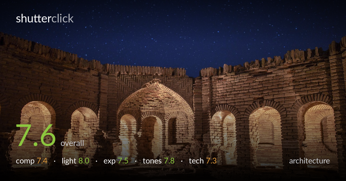
A confident night-architecture shot that pairs warm artificial light on ancient brickwork against a deep, star-filled sky to genuine effect. The curving sweep of arched niches creates rhythm, and the warm/cool colour split carries real mood. What most holds it back is symmetry that isn't quite resolved — the central arch sits slightly off the frame's middle, and the foreground is empty and undefined. The artificial uplighting is uneven, leaving hot pools beneath some arches and darker gaps between. With cleaner symmetry and a more deliberate foreground, this becomes a stronger image rather than a very good one.
The repeating arches form a strong rhythmic arc across the lower frame, and the sky fills the top half with effective negative space. The central recessed arch reads as the intended anchor, but it sits a touch left of true centre, so the symmetry feels almost-but-not-quite resolved. The wide foreground of bare ground is featureless and pulls weight without giving the eye anything to read. A camera position aligned precisely on the central axis, or a lower angle bringing brick texture into the foreground, would tighten the structure.
The warm artificial uplighting genuinely shapes the brick, raking across courses to reveal texture and giving each arch its own glow. Set against the cool natural blue of the night sky, the colour temperature contrast does a lot of the emotional work here. The weakness is evenness: light pools intensely beneath a few arches while others fall into shadow, breaking the rhythm the architecture sets up. More balanced placement of the light sources, or a longer exposure to lift the darker niches, would let every arch read with equal presence.
Exposure is well judged for a difficult scene. The brightly lit foreground brick holds detail without blowing out badly, and the sky retains stars and gradation rather than crushing to black. A few of the hottest pools beneath the arches push close to clipping, losing some brick texture at their brightest. The darker recesses between arches sink into near-black with little recoverable detail. Bracketing and blending, or a slightly shorter exposure protecting the brightest brick, would preserve highlight texture while still keeping the sky rich.
The amber-to-blue split is the image's signature and it's handled with restraint — the warm brick stays believable rather than oversaturated, and the sky's deep blue holds its star detail. Tonal range is broad, spanning bright lit stone to dark sky. The transition zone where warm light meets cool shadow on the walls gets slightly muddy in places, and the warmest pools verge on orange-heavy. A touch of white-balance refinement in the hottest areas would keep the brick tone consistent across the frame.
Focus appears accurate across the brickwork, with the arches and their texture rendered crisply, and depth of field looks sufficient to keep both near and far walls sharp — consistent with a stopped-down aperture suited to architecture. The stars register as clean points rather than trails, suggesting an exposure short enough to avoid noticeable star movement, or a wide enough field that any motion stays sub-pixel. Noise in the sky is well controlled for night work, with the blue staying smooth rather than blotchy. The lens choice captures the full arc of arches and a generous sky without obvious distortion bending the verticals, which is the right call here. The main technical limitation is the lighting balance rather than capture: the uneven artificial illumination is an on-location issue more than a settings one. Verticals on the side walls hold reasonably true, with no severe keystoning, which keeps the geometry honest. Overall execution is solid and clean for the conditions.
what would elevate it
tags
Shot something like this?
Expert photo critique, on demand — scored across six categories, EXIF-aware. Start with 3 free critiques, no credit card.
critique my photo — free