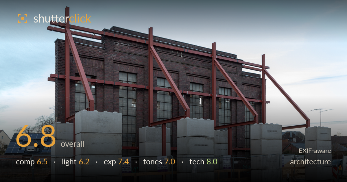
Steel-braced brick facade held upright
Photo by Dietmar Rabich

| Focal length | 32 mm |
| Aperture | f / 11.0 |
| Shutter | 1/2 s |
| ISO | ISO 50 |
| Exp. comp. | 0.0 EV |
| Shot at | 08:50 · Jan 7, 2018 |
A documentary-strong record of a facade preservation — the brick wall braced by red steel and propped by concrete blocks tells a clear story of a building held up mid-demolition. The rhythm of the diagonal braces against the industrial brick is the real subject, and it reads well. What holds the shot back most is the flat, cool light of a hazy afternoon, which mutes the textures the scene depends on, and a foreground of asphalt and clutter that eats space without adding much. The frontal, level treatment suits the architecture but leaves the composition a touch static.
The facade is presented squarely and levelled, with verticals kept true — appropriate for the subject. The repeating red diagonal braces create a satisfying rhythm across the frame, and the concrete blocks form a strong base line. Weaknesses lie at the edges: the broad band of empty asphalt along the bottom adds little, the red-and-white barrier at right feels tacked on, and the solar-panelled house at left competes for attention. A composition weighted more toward the brace-and-brick interplay, with less dead foreground, would concentrate the story.
The light is soft and directionless — a hazy late-afternoon sky that produces even, low-contrast illumination across the brick. This keeps highlights controlled but flattens the very textures that make the wall interesting; the mortar lines and steel edges lack the modelling that a raking side light would deliver. Shadows are weak and offer little dimensionality. Golden-hour or a low sun skimming the facade would carve the brickwork and make the red steel glow rather than sit dull against the muted scene.
Exposure is well managed. The pale sky retains gradation without clipping, the shadowed brick holds detail, and the concrete blocks aren't blown despite their brightness. At ISO 50 the file is clean with ample dynamic range, and the histogram appears to sit comfortably across the range. The overall rendering is very slightly flat, but that reflects the light rather than an exposure error. A hair more midtone contrast in post would give the frame more punch without risking the highlights already handled well here.
The palette leans cool — the blue-grey sky and neutral concrete set against the oxide-red steel and dark brick. White balance reads a touch cold, which suits the overcast mood but drains warmth from the brick. The red braces are the strongest colour note and carry the frame. Tonal range is adequate but the midtones sit close together, giving a slightly muted feel. A warmer balance and a modest contrast lift would separate the brick from the shadows and let the steel read with more saturation.
The settings are sound and deliberate. f/11 is the right call for a facade at this distance, delivering front-to-back sharpness across the wall and blocks with the lens near its optimal aperture. ISO 50 maximises image quality and keeps noise negligible, and 32mm on full frame gives a natural perspective with minimal distortion — verticals stay clean without heavy correction. The one setting worth questioning is the 1/2s shutter: at this speed a tripod is essential, and while the static architecture is sharp, the overhead cables and thin tree branches at frame edges show no motion issue, so stability held. Focus is accurately placed on the facade plane. The choice invites the question of whether so slow a shutter was needed at all given the still subject — 1/60s at a higher ISO would have achieved the same result with more shooting flexibility — but the outcome here is technically clean. Solid, well-considered execution throughout.
What would elevate it
Tags
Shot something like this?
Expert photo critique, on demand — scored across six categories, EXIF-aware. Start with 3 free critiques, no credit card.
critique my photo — free