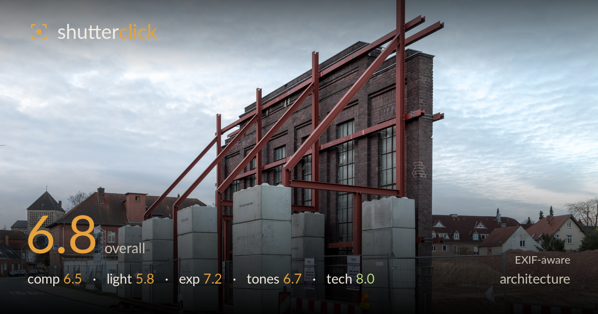
Steel-braced facade of a demolition site
Photo by Dietmar Rabich

| Focal length | 32 mm |
| Aperture | f / 11.0 |
| Shutter | 3/5 s |
| ISO | ISO 50 |
| Exp. comp. | 0.0 EV |
| Shot at | 08:48 · Jan 7, 2018 |
A documentary-strong record of a facade retained on steel bracing while the building behind it is demolished — a genuinely interesting subject captured with clarity. The rust-red steelwork against dark brick is the real visual hook, and it reads clearly. What holds the frame back most is flat, overcast light that drains the scene of depth and drama, plus a busy foreground of concrete counterweights and construction barriers competing for attention. The three-quarter angle documents the structure honestly but doesn't find a strong graphic composition. Sharp, well-exposed, technically clean — the raw material is here, but the light and vantage point leave it feeling more like a record than a statement.
The angled three-quarter view documents the retained facade and its steel bracing effectively, and the diagonal struts lead the eye up and across the frame. But the composition is cluttered: the row of concrete counterweight blocks, red-and-white barriers, and mesh fencing fill the lower third with competing detail that fragments the subject. The building sits slightly right of centre without a strong anchoring line, and the wide sky and roadway on the left add space without purpose. A tighter framing on the steel-and-brick relationship would concentrate the impact.
Flat, diffuse overcast light is the biggest limitation here. It renders the brick and steel evenly but kills any sense of relief or texture on the facade, and the sky is a featureless pale grey that offers no drama. The rust-red steel still reads because of its colour contrast against dark brick, not because light shapes it. Directional side light — late afternoon raking across the brick — would model the surface, deepen the steel's dimensionality, and turn a documentary record into something with atmosphere.
Exposure is well controlled across a tricky brightness range. The dark brick retains detail, the pale sky holds without significant clipping, and the bright concrete blocks aren't blown despite their reflectivity. The histogram is being used sensibly for the flat conditions. Midtones sit a touch low, contributing to the muted feel, and lifting the brick's shadows slightly would reveal more of its structure. But overall this is a deliberate, technically accurate exposure that handles the scene's range cleanly.
The rust-red steel against dark, cool brick is the strongest tonal relationship in the frame, and white balance looks neutral and accurate. The palette is otherwise muted and grey — appropriate to the overcast day but low on impact. Contrast is gentle, keeping the image looking a little flat. The pale blue-grey sky and warm concrete blocks add some tonal variety. A modest contrast lift and slight clarity boost on the brick would give the tones more separation and stop the mid-greys from flattening the whole scene.
Execution is excellent and the settings are well chosen for the subject. At f/11 on a 32mm lens, depth of field carries the foreground blocks through to the distant houses in acceptable sharpness — the right call for an architectural record demanding front-to-back clarity. ISO 50 keeps noise entirely absent and maximises dynamic range, well suited to a static subject. The 3/5-second shutter is unusual handheld and points to tripod use, which the sharpness confirms. Focus is accurate on the steelwork and brick. One consideration: at 32mm the verticals show mild convergence — the steel columns lean slightly inward toward the top — which strict architectural work would correct with a shift lens or in post. The choice of a moderate wide focal length keeps perspective distortion manageable while still fitting the whole structure. Clean, competent, deliberate technical work throughout; the gear was used to its strengths and nothing here undermines the image.
What would elevate it
Tags
Shot something like this?
Expert photo critique, on demand — scored across six categories, EXIF-aware. Start with 3 free critiques, no credit card.
critique my photo — free