Steel framework mirrored at blue hour
Photo by MarcVanduffel

No EXIF metadata in this file
Technical analysis based on visual assessment only.
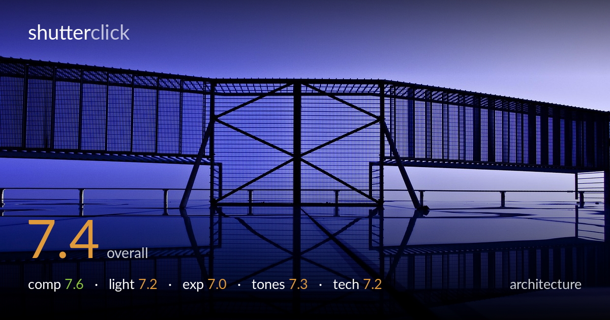
A graphic, near-symmetrical study of steel framework mirrored in still water, carried by strong geometry and a moody blue-hour palette. The central truss and its reflection anchor the frame with satisfying linear rhythm. What most holds it back is the cropping at left and right edges, where the structure runs out of frame without resolution, and a slightly soft, murky reflection that mixes water and structure ambiguously. The horizon-line of the bridge deck sits flat, and the foreground ramp in the lower right adds little. Tightening the symmetry and lifting shadow separation would sharpen the abstract intent already present.
The X-braced truss centred over its reflection builds a confident vertical axis, and the repeating bars create strong horizontal rhythm across the upper half. Symmetry is the organising idea and it mostly holds. The weakness is the edges: the structure is clipped abruptly left and right so the eye exits without resolution, and the diagonal foreground ramp in the lower right corner intrudes on the otherwise clean mirror. A slightly higher or more centred viewpoint would balance the left and right walkways more evenly and let the reflection carry the lower frame.
Blue-hour ambient light renders the steelwork as near-silhouette against a smoothly graded sky, which suits the graphic intent well. The soft, directionless light flattens the framework into clean dark shapes — appropriate here, though it sacrifices any sense of surface or material. The gradient from deeper blue at left to paler lavender at right gives the sky gentle movement. A touch more residual light raking across the trusses would have separated the foreground bars from the reflected ones, which currently merge in the dimmer central zone.
Exposure is judged for the structures to read as dark silhouettes against the luminous sky, and that decision holds together. The sky retains smooth gradation without clipping, and the brightest water reflections stay controlled. Shadow detail within the steel is largely gone, which is acceptable for the silhouette approach but leaves the central reflection muddy where structure and water blur together. Lifting the deepest shadows a fraction in post would recover separation in the mirrored truss without breaking the mood or the clean highlight roll-off in the sky.
The cool blue-to-lavender palette is the photograph's signature and it is handled with restraint — saturation stays believable rather than gaudy, and the gradient across the sky is clean. White balance is deliberately pushed cool to reinforce the blue-hour feel. The water picks up the same tones, unifying the frame. The main limitation is tonal compression in the mid-shadows, where the central structure and its reflection flatten into a single dark mass. A little more contrast separation there would give the tones more depth without warming the overall cast.
Without EXIF, the assessment rests on visual evidence. Depth of field appears sufficient — the framework reads sharp across its visible run, and the repeating bars hold detail into the distance, suggesting a well-chosen aperture for an architectural subject. Focus sits correctly on the steel structure. The reflection is softer, partly from water surface texture rather than focus error, and the central mirrored zone loses crispness where light falls off. No obvious motion blur or handshake is visible, implying a stable platform or fast-enough shutter for the low light. Noise is well controlled in the smooth sky, indicating a modest ISO. Verticals on the central truss read true, and the converging horizontals are honest to the perspective rather than distorted. The main technical gain would come in post: micro-contrast and shadow recovery to lift the murky reflection, and possibly a slightly cleaner edge treatment where the structure meets the frame borders. Execution is solid and the geometry is rendered with discipline.
what would elevate it
tags
Shot something like this?
Expert photo critique, on demand — scored across six categories, EXIF-aware. Start with 3 free critiques, no credit card.
critique my photo — free