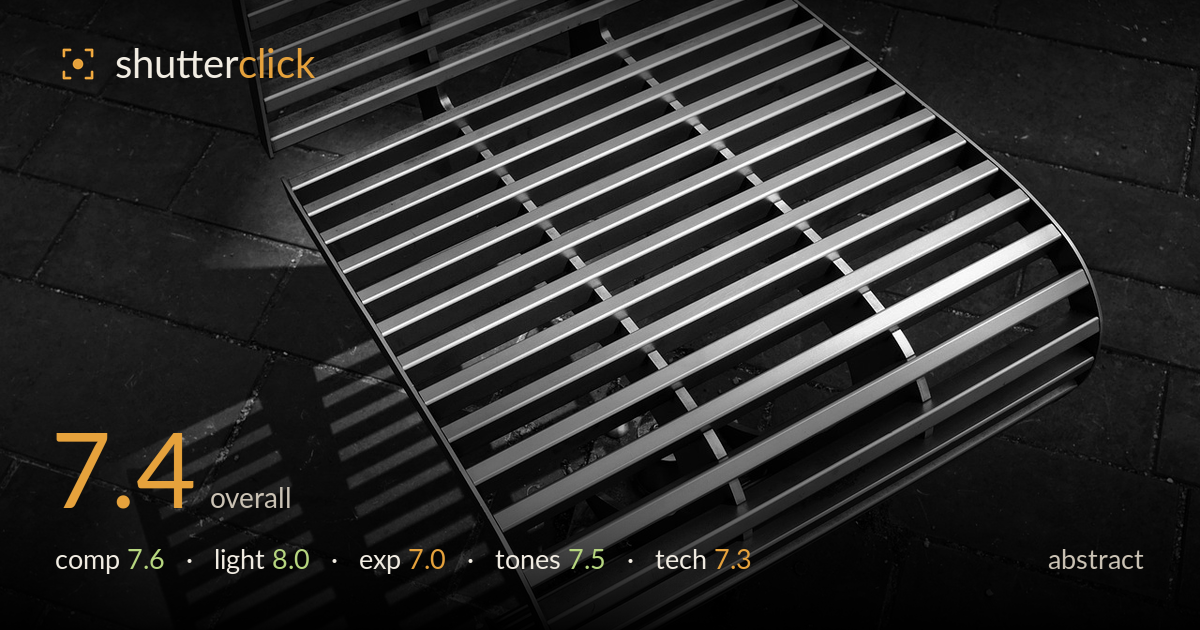
Steel slats and their shadow
Photo by argoon

No EXIF metadata in this file
Technical analysis based on visual assessment only.
The interplay between the metal slats and their cast shadow is the real strength here — two rhythmic grids echoing each other across the frame, one solid, one drawn in light. The curved sweep of the bench pulls the eye through diagonally, giving the geometry motion rather than static repetition. What holds it back is the near-black paving, which flattens into an undifferentiated mass and swallows detail that could have added texture and depth. The composition leans heavily on the right edge, leaving the top-left corner slightly empty. A cleaner tonal separation between object and ground would let this abstract sing.
The curving line of slats sweeping from upper left down to lower right gives this repetitive subject real dynamism, and the shadow projecting toward the lower-left corner is an inspired counterweight — a second grid answering the first. The diagonal flow works. The framing does crowd the right edge, where slats run off with little breathing room, while the top-left corner sits comparatively empty. Balancing that negative space, or pulling back slightly to complete the curve, would tighten the graphic tension the geometry already promises.
Hard, directional light is exactly right for this subject — it carves crisp specular highlights along the top of each slat and throws the long, sharp shadow that doubles the composition. The raking angle reveals the aluminium's brushed sheen and gives the ridges dimensional form rather than flat outline. This is the strongest element of the frame. The only cost is that the same hardness plunges the paving into near-total shadow, but for the abstract intent, the trade favours the drama of the light.
Exposure is placed to protect the bright slats, which hold their specular highlights without blowing out — a sensible choice given the extreme contrast. The consequence is a very heavy shadow floor: the paving crushes to near-black across much of the frame, and the shadow-grid on the ground loses gradation where it could have kept subtle texture. Some of that is intentional for the graphic effect, but lifting the darkest quarter-tones slightly would recover the paver detail without diluting the punch.
The monochrome conversion suits the industrial subject, with clean silver highlights rolling off the slats and deep blacks anchoring the ground. Mid-tone gradation on the metal is the standout, describing the curved surface convincingly. The overall contrast runs high, which serves the abstract but sacrifices the paving's mid-greys almost entirely — the ground reads as one tonal block rather than a textured surface. A gentler shadow curve would restore some tonal range beneath the object and add depth to the lower half.
Focus is sharp where it counts, running crisply along the slat edges through the central band, and the perspective handling keeps the receding grid coherent rather than distorted. Depth of field appears sufficient to carry both the metal and its shadow, appropriate for a subject built on pattern and edge definition. Noise is well controlled in the highlights. The main technical limitation is in how the deep shadows resolve — the paving mass shows little recoverable detail, suggesting the tonal range was pushed hard in processing at the expense of the darkest values. The curved geometry is rendered cleanly without visible aberration along the bright edges, and the brushed-metal texture reads well under the raking light. For an abstract resting on line and repetition, the execution is solid; a slightly less aggressive black point and attention to the shadow-grid's texture on the ground would lift the technical craft to match the strength of the concept and the light.
What would elevate it
Tags
Shot something like this?
Expert photo critique, on demand — scored across six categories, EXIF-aware. Start with 3 free critiques, no credit card.
critique my photo — free