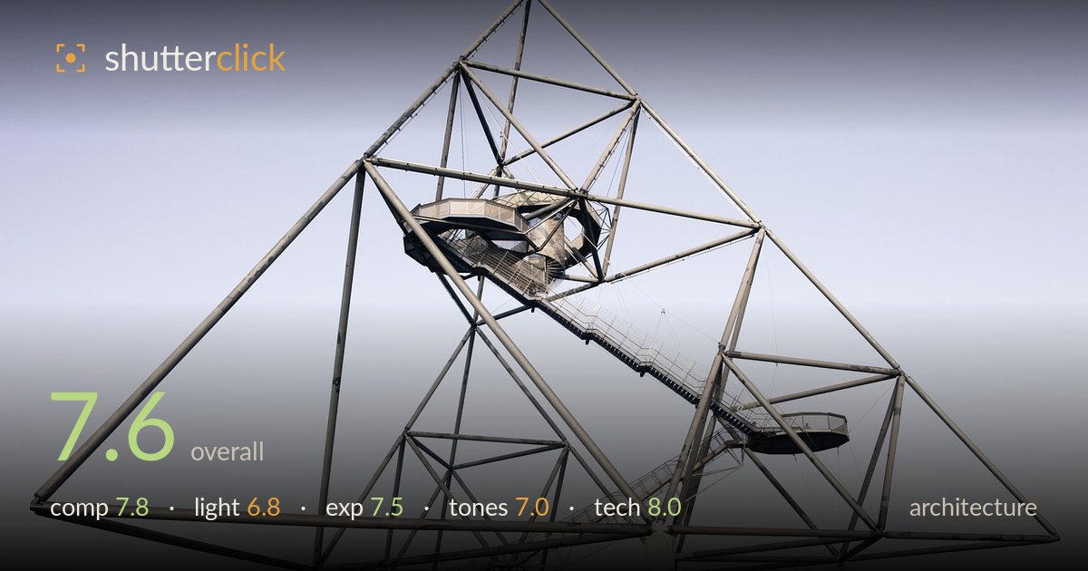
Steel tetrahedron against a pale sky
Photo by CapeCom

No EXIF metadata in this file
Technical analysis based on visual assessment only.
A well-observed take on the Tetraeder that reads the sculpture as a dense lattice of triangles against clean sky. The strongest decision is the human scale: the cyclist bottom-right and the small figures on the staircase anchor the monumental scale and give the eye a way in. What most holds it back is flat, overcast light that mutes the metalwork and leaves the sky a featureless gradient, so the structure lacks the modelling and drama the geometry deserves. The composition also leaves generous empty sky above while the base crowds the frame edge. Strong bones, a touch under-lit.
The tetrahedral geometry is captured with real clarity, the overlapping triangles building a satisfying web of lines that draw the eye through the frame. Placing the cyclist and the small figures on the stairs gives essential scale and a narrative foothold. The apex sits comfortably high, but the upper third is a large expanse of empty sky while the base and its pillars press near the bottom edge, leaving the structure feeling slightly bottom-heavy. A touch more headroom traded for base breathing room, or a lower angle, would balance the negative space better.
Flat, diffuse overcast light dominates, and it is the weakest element. The soft, directionless illumination renders the steel members evenly but without modelling, so the tubes read as uniform grey rather than revealing their round, three-dimensional form. There are no shadows to describe depth within the lattice, and the sky is a featureless gradient offering no drama. Raking side light near golden hour, or a moody sky at blue hour, would sculpt the metalwork and separate the layered triangles that currently flatten into one plane.
Exposure is handled sensibly for a bright, hazy sky. The steel structure retains detail across its span without the sky blowing to pure white, and the shadowed undersides of the walkways hold information. The pale sky gradient sits near the top of the histogram but stops short of clipping. The white support pillars keep just enough texture. Given the flat source there was little dynamic range to manage, and the midtones of the metal sit a little low; a slight lift would give the greys more presence without risking the highlights.
A restrained, near-monochrome palette of cool grey steel against a pale blue-to-cream sky gradient suits the industrial subject. The muted rendering feels intentional and coherent. The steelwork, however, sits in a narrow band of similar mid-greys that flattens the tonal separation between near and far members. The dead winter scrub along the base adds a dull ochre band that slightly muddies the bottom edge. A modest contrast bump on the metal, and a cooler, more deliberate white balance on the sky, would sharpen the graphic read.
Execution is clean and disciplined. Focus appears accurate across the lattice, with the steel members holding crisp edges from the near foreground pillars back to the apex, suggesting a well-chosen aperture with ample depth of field for the whole structure. There is no visible motion blur on the cyclist, so the shutter was fast enough for the modest movement. Noise is a non-issue in this bright, even light. Lens choice reads as a moderate wide angle that takes in the full sculpture without gross distortion, and the verticals of the white pillars stay largely upright, indicating careful camera positioning rather than aggressive correction. One thing to watch: the wide framing gathers a lot of empty sky, so a slightly longer focal length from further back would compress the layers and reduce dead space while preserving line integrity. Overall a technically sound capture with no significant flaws in focus, sharpness, or geometry.
What would elevate it
Tags
Shot something like this?
Expert photo critique, on demand — scored across six categories, EXIF-aware. Start with 3 free critiques, no credit card.
critique my photo — free